Machine Generated Data
Tags
Color Analysis
Feature analysis
Amazon
Clarifai
AWS Rekognition
| Book | 58.5% | |

Categories
Imagga
created on 2023-02-02
| text visuals | 100% | |
Captions
Microsoft
created by unknown on 2023-02-02
| text, letter | 98.2% | |
Salesforce
Created by general-english-image-caption-blip-2 on 2025-07-01
a poster with black and white text and numbers
Created by general-english-image-caption-blip on 2025-05-12
a photograph of a poster with a black and white type of font
OpenAI GPT
Created by gpt-4 on 2024-12-06
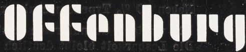
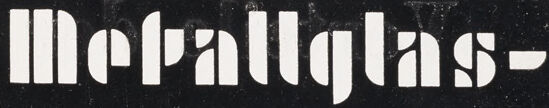
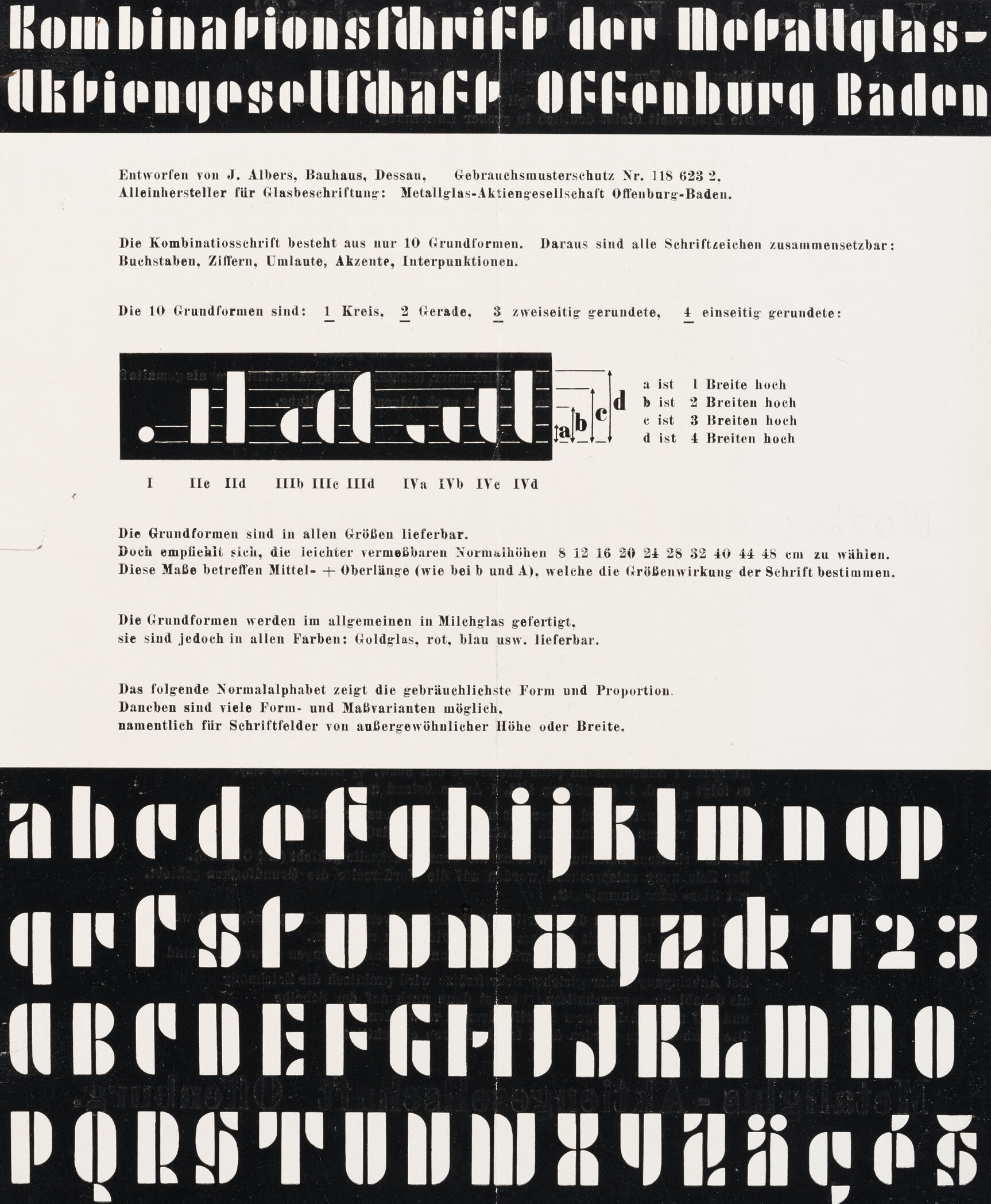
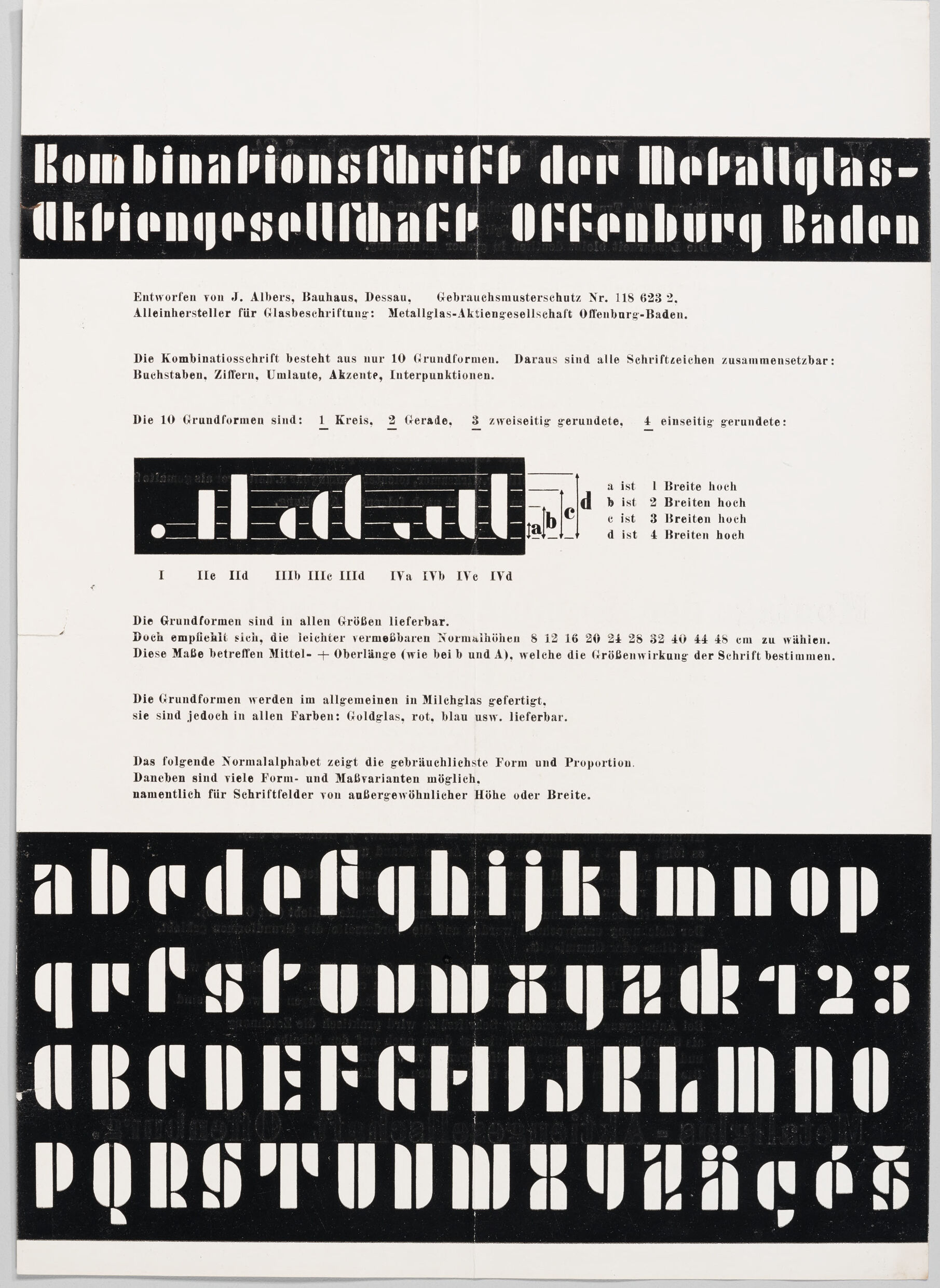
The image shows a vintage document in black and white featuring typography design. At the top, it has a title in a bold, stylized font that reads "Kombinationsschrift der Metallglas-Aktiengesellschaft Offenburg Baden". Below the title is a paragraph of German text referencing the Bauhaus, Dessau, and a design by J. Albers. It mentions that the typeface consists of only 10 basic forms which can be combined to create all necessary characters, including letters, numbers, uppercase letters, umlauts, accents, and punctuation marks.
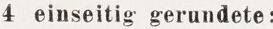
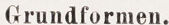
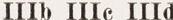
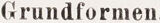
The document then lists and visualizes the 10 basic shapes used to build the characters, categorized as circle (Kreis), rectangle (gerade), semicircle (zweiseitig gerundet), and quarter-circle (einseitig gerundet). Below this explanation are several rows showcasing the construction of individual letters and numbers using the 10 basic shapes. The sizes of the basic shapes vary from one to four units in height.
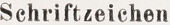
Below the explanation, there is an alphabet and numbers designed according to this combination font system, displayed in both upper and lower case. The font style is very geometric, with clear, simple shapes that give it a modernist feel typical of Bauhaus design ethos.
This image provides an overview of a geometric, modular typeface and illustrates the principles of minimalist typographic design that was central to the Bauhaus philosophy.
Created by gpt-4o-2024-05-13 on 2024-12-06
The image appears to be a typographic design document written in German. It details a typeface called "Kombinationsschrift der Metallglas-Aktiengesellschaft Offenburg Baden," designed by J. Albers from Bauhaus, Dessau. The document outlines the fundamental shapes that make up the letters of this typeface, which include circles, straight lines, and various rounded forms. Additionally, there is information concerning variations and proportions of the typeface.
Below this description, there is a demonstration of the alphabet in both lowercase and uppercase letters, as well as numbers and some symbols. The typeface shown is stylized with a stencil-like appearance, characterized by simple geometric shapes and high contrast.
Anthropic Claude
Created by us.anthropic.claude-3-5-sonnet-20241022-v2:0 on 2025-06-28
This is a historic typographic specimen sheet showing the "Kombinationsschrift" (Combination Font) created for the Metallglas-Aktiengesellschaft Offenburg Baden. The document, designed by J. Albers at Bauhaus Dessau, displays a unique modular typeface system based on just 10 basic geometric forms.
The top section shows the title in the typeface itself, followed by technical information in German about the font system. In the middle, there's a diagram showing the basic geometric elements used to construct the letters, labeled from a to d with different height measurements.
The bottom portion of the document shows the complete alphabet in this distinctive geometric style, displayed in both lowercase and uppercase letters, along with numbers. The typeface is characterized by its strong geometric shapes, using circles, straight lines, and rounded elements to create each character. The letters are shown in white against a black background, creating a striking contrast.
The document explains that the font was available in various sizes and could be produced in milk glass, as well as other colors like gold glass, red, and blue. This appears to be a significant example of Bauhaus typography and industrial design from the modernist period.
Created by claude-3-haiku-20240307 on 2024-12-06
This image appears to be a technical document or manual related to typography and graphic design. It contains a title "Kombinationsschrift der Metallglas-Aktiengesellschaft Offenburg Baden" (Combination Font of the Metal Glass Company Offenburg Baden) and details about a set of 10 typographic forms or elements that can be combined in various ways.
The image also includes samples of the font or typeface, showing both uppercase and lowercase letters as well as numbers. The text discusses the different sizes and proportions of the typographic elements and how they can be used. Overall, this seems to be a technical instruction or specification related to a particular typeset or typography system.
Created by claude-3-5-sonnet-20241022 on 2024-12-06
This is a historical typographic specimen sheet for the "Kombinationsschrift der Metallglas-Aktiengesellschaft Offenburg Baden" (Combination Font of the Metallglas Corporation Offenburg Baden). It was designed by J. Albers at the Bauhaus in Dessau and was protected under design patent No. 118 623 2.
The document shows a modular typeface system based on just 10 basic geometric forms that could be combined to create all letters, numbers, umlauts, accents, and punctuation marks. The top section includes a diagram showing these basic forms with different heights labeled a through d (1-4 widths high).
The typeface was typically produced in milk glass but was also available in various colors including gold glass, red, and blue. The specimen shows recommended standard heights ranging from 8 to 48 cm for optimal visual effect.
The bottom portion of the document displays the complete alphabet in this distinctive geometric style, showing both lowercase and uppercase letters, as well as numbers and special characters. The letters are characterized by their strong geometric construction, using circles and straight lines in a very modernist, Bauhaus-influenced design approach.
This is a significant example of early modernist typography and the Bauhaus school's influence on graphic design and industrial production.
Meta Llama
Created by us.meta.llama3-2-11b-instruct-v1:0 on 2024-12-06
The image depicts a page from a German typography book, featuring a bold, black-and-white design with a prominent title at the top. The title, "Kombinationsfdrift der Metallglas-Akpiengesellschaft Offenburg Baden," is displayed in large, white letters within a black rectangle, set against a white background.
Below the title, a series of paragraphs and diagrams are presented in German, accompanied by a large black rectangle at the bottom containing a sample of the font. The overall design suggests that this page is part of a comprehensive guide to typography, likely intended for use in printing or publishing.
The use of a bold, black-and-white color scheme and the inclusion of a sample font suggest that the book is focused on exploring the possibilities of typography and its applications in various contexts. The inclusion of diagrams and paragraphs in German adds a layer of complexity and depth to the content, indicating that the book may be aimed at a more advanced audience interested in the technical aspects of typography.
Created by us.meta.llama3-2-90b-instruct-v1:0 on 2024-12-06
The image is a vintage German advertisement for a font, featuring a black and white design with bold typography. The top section displays the title "Kombinationschrift der Metallglas-aktiengesellschaft Offenburg Baden" in large letters, followed by a paragraph of text in smaller font.
Below this, there are two sections showcasing the font's versatility. The first section presents a series of letters and numbers in different sizes and orientations, demonstrating the font's adaptability. The second section features a large block of text that reads "abcdefghijklmnopqrstuvwxyz" in the same font, highlighting its legibility and aesthetic appeal.
Overall, the image effectively promotes the font as a versatile and stylish option for various applications, likely targeting graphic designers, typographers, and other professionals in the field.
Amazon Nova
Created by amazon.nova-lite-v1:0 on 2025-02-28
The image is a black-and-white printed document featuring a bold title at the top in German, "Kombinationsschrift der Metallglas-Ukpionengesellschaft Offenburg Baden." Below the title, there is a smaller text that reads "Entworfen von J. Albers, Bauhaus, Dessau." The document appears to be a technical manual or specification sheet for a type of metal glass-based signage or lettering system.
The main body of the document contains a combination of text and diagrams. The text is in German and discusses the characteristics and usage of the metal glass lettering system, including details about the 10 basic shapes or forms that make up the system. It also mentions that these forms can be combined to create all possible letters, numbers, punctuation, and accents.
The document includes a diagram illustrating the 10 basic shapes, labeled with letters from "I" to "IVd." Below the diagram, there is a table showing the widths of the shapes in various sizes, from 8 cm to 44 cm. The text also mentions that the shapes can be produced in different colors, such as gold, blue, or black.
The document concludes with a large section of the alphabet, showing the possible combinations and proportions of the basic shapes to form different letters and characters. This section is presented in a large, bold font to emphasize the versatility of the system.
Overall, the image depicts a technical document for a metal glass lettering system, providing details about the basic shapes, sizes, and color options available, as well as examples of how the shapes can be combined to create a wide range of characters.
Created by amazon.nova-pro-v1:0 on 2025-02-28
The image shows a page of a document that is a combination of text and diagrams. The text is written in German and is titled "Kombinationsschrift der Metallglas-Ukpiegensellschaft Offenbach-Baden". The text explains the combination of different types of fonts and their sizes. The diagram shows the different font sizes and their combinations. The text is written in a combination of uppercase and lowercase letters, and the diagram is in black and white.
Google Gemini
Created by gemini-2.0-flash on 2025-04-28
Here is a description of the image:
The image is a black and white poster showcasing a typeface called "Kombinationsschrift der Metallglas-Aktiengesellschaft Offenburg Baden." The design is attributed to J. Albers from Bauhaus, Dessau. The poster outlines the principles of the typeface, stating that it is based on only 10 fundamental forms, which comprise all letters, numbers, umlauts, accents, and punctuation.
The poster elaborates on the 10 basic forms, listing them as 1 circle, 2 straight lines, 3 doubly rounded, and 4 singly rounded. A visual representation shows these forms in black on a white background, labeled with Roman numerals and measurements. Text explains that these forms are available in all sizes, recommending specific heights, and are generally made of milk glass but can be produced in various colors like gold, red, and blue.
Below, the poster features the complete alphabet in both lowercase and uppercase, along with numbers and some accented letters, all rendered in a distinct, geometric style characterized by thick strokes and rounded edges. The typeface is presented in reverse—white letters against a black background. The overall layout is clean, minimalistic, and indicative of the Bauhaus design principles it represents.
Created by gemini-2.0-flash-lite on 2025-04-28
Here is a description of the image:
Overall: This is a black and white printed advertisement for a custom typeface, likely for glass inscriptions or signage. The design is clean, modern, and geometric, typical of the Bauhaus style. It showcases the alphabet and provides details on the typeface's construction and usage.
Text & Typography:
- Header: The title "Kombinationsthrift der Metallglas-Aktien gesellschaft Offenburg Baden" is printed in a bold, sans-serif typeface, with a clear break in the word "Aktien gesellschaft" to emphasize the two parts of the name.
- Body Text: The body text is in a clear, easy-to-read sans-serif font. The text is neatly organized and provides information about the typeface's design, construction, and features.
- Alphabet Display: The main part of the advertisement features a demonstration of the entire alphabet (uppercase and lowercase), numerals, and a few punctuation marks. The letters are designed with geometric shapes, as can be seen by the use of squares, rectangles, and circles.
- Emphasis on Geometry: The image emphasizes the ten basic shapes used to form the alphabet.
Design Elements & Information:
- Bauhaus Influence: The overall design clearly reflects the Bauhaus style, with its emphasis on functionality, geometric forms, and clean lines.
- Customization: The text indicates that the typeface can be customized in various sizes and colors, appealing to clients.
- Usage Details: The advertisement provides information on the available sizes, materials (milk glass, gold glass, etc.), and the construction of letters using geometric forms.
- Manufacturer Information: The document provides details such as the designer, patent number, and manufacturer.
Overall Impression:
The image is a well-designed advertisement for a functional and aesthetically pleasing typeface. The clear layout and informative text make it easy for the reader to understand the typeface and its benefits. The Bauhaus style adds a sense of modernity and precision.
Mistral Pixtral
Created by us.mistral.pixtral-large-2502-v1:0 on 2025-04-28
The image is a historical document from the Metallglas-Aktiengesellschaft Offenburg Baden, detailing a combination typeface. Here is a detailed summary of the content:
Title:
- Kombinationsschrift der Metallglas-Aktiengesellschaft Offenburg Baden
Introduction:
- Designed by J. Albers, Bauhaus, Dessau.
- Patent Number: Gebrauchsmusterschutz Nr. 118 623 2.
- The typeface is intended for glass inscriptions and is produced by Metallglas-Aktiengesellschaft Offenburg Baden.
Description of the Typeface:
- The typeface consists of 10 basic shapes.
- These shapes can be combined to form letters, numbers, and punctuation marks.
- The 10 basic shapes are: 1 circle, 2 semicircles, 3 double-curved shapes, and 4 single-curved shapes.
- The basic shapes are labeled as I, IIa, IIb, IIc, IId, IIIa, IIIb, IIIc, IIId, IVa, IVb, IVc, IVd.
- The shapes are available in various sizes: 8, 12, 18, 20, 24, 28, 32, 40, 44, 48 cm in width.
- The shapes are made of opaque milk glass and are available in different colors: gold, red, blue, and white.
Usage:
- The typeface is suitable for creating inscriptions on non-transparent glass surfaces or boards.
- The accompanying normal alphabet follows the same style and proportions, allowing for uniform design in inscriptions.
Visual Representation:
- The document includes a visual representation of the basic shapes and how they can be combined to form letters and numbers.
- The alphabet and numbers are displayed in a grid format, showcasing the versatility and modular nature of the typeface.
This document provides a comprehensive overview of a modular typeface system designed for glass inscriptions, highlighting its versatility and aesthetic appeal.
Qwen
Text analysis
Amazon