Machine Generated Data
Tags
Color Analysis
Feature analysis
Amazon

| Poster | 53.4% | |
Categories
Imagga
| paintings art | 96.8% | |
| text visuals | 1.9% | |
| food drinks | 0.6% | |
| events parties | 0.3% | |
| streetview architecture | 0.2% | |
| interior objects | 0.1% | |
Captions
Microsoft
created on 2018-03-16
| a close up of a sign | 82.6% | |
| close up of a sign | 77% | |
| a sign on a wall | 57% | |
OpenAI GPT
Created by gpt-4 on 2024-12-16
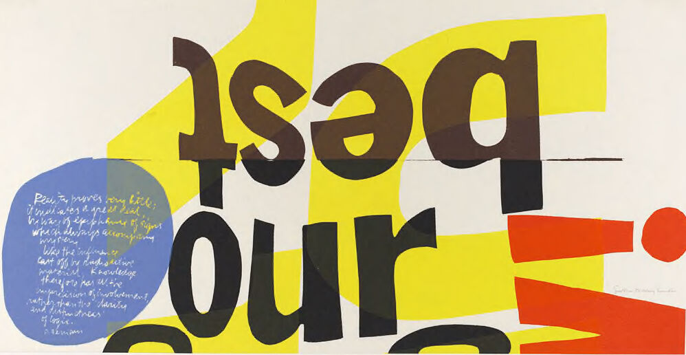
You're looking at a graphic artwork that features bold typography. The central focus of the image is the jumbled, oversized text in various colors that overlap and interlock with each other, creating a dynamic and abstract composition. The letters are brown, black, and yellow, with a section of blue that has smaller, white text forming a readable block of text within it. Below the large letters, there appears to be a thin, black, horizontal line that spans the width of the image. The large letters, although jumbled, spell out "asadvert" when looking at the overall arrangement, though this might not be a coherent word and could represent a play with typography and abstraction. To the right side of the image, there's a curved red shape that resembles a "C", and beneath it, a red rectangle positioned vertically, with a small red circle near the bottom-right corner. On the bottom left in the blue circle, the small white text is written in cursive and appears to be a narrative or poem, though it’s too small to read in its entirety in this representation. At the bottom right corner, there's smaller text that seems to be a signature or an attribution but isn't clearly legible in this view. The background of the artwork is a neutral off-white or light gray, which allows the bright colors and stark black elements of the typography to stand out sharply. The use of geometric shapes and vivid primary colors suggests a modern or contemporary style, with possible influences from movements such as pop art or postmodern design.
Created by gpt-4o-2024-05-13 on 2024-12-16
The image appears to be a modern and abstract poster with bold, overlapping text and colorful shapes. The words "our best" are prominently displayed, with "best" being upside down. The text is in large, black letters. The background features large, abstract shapes in yellow, red, and blue. Additionally, there is a blue circular area on the left side with white handwritten text inside. The overall effect is dynamic and visually engaging, combining text and shapes in a creative layout. The artist's signature is seen in the lower right corner of the image.
Anthropic Claude
Created by claude-3-haiku-20240307 on 2024-12-16
This image appears to be a work of abstract art featuring bold, geometric shapes and text. The dominant elements are large, stylized letters spelling out "USED OUR" in brown and yellow colors against a white background. The letters are flanked by various shapes and forms, including a blue oval shape with handwritten text inside. The overall composition has a playful, graphic design aesthetic with a mix of typographic and abstract visual elements.
Created by claude-3-5-sonnet-20241022 on 2024-12-16
This appears to be a piece of graphic design artwork featuring bold typography. The word "pour" is partially visible in large black letters against a yellow background. There's a blue circular or speech bubble shape on the left containing white text, and a red geometric shape on the right side. The overall style appears to be modernist or mid-century modern in its use of bold colors, simple shapes, and strong typography. The composition uses a limited color palette of yellow, blue, red, and black, creating a striking visual contrast. The design has a clean, graphic quality typical of poster or advertising design from that era.
Meta Llama
Created by us.meta.llama3-2-11b-instruct-v1:0 on 2024-12-16
The image is a graphic design featuring the words "Rise of Our Time" in large, stylized letters. The text is arranged in a way that creates a sense of movement and energy, with the words overlapping and intersecting each other. Here are the details of the image: * **Background**: The background of the image is a light beige color, which provides a clean and neutral backdrop for the text. * **Text**: The text "Rise of Our Time" is written in large, bold letters, with each word overlapping the next to create a sense of depth and dimensionality. The letters are a combination of serif and sans-serif fonts, with some letters being thicker or thinner than others to add visual interest. * **Colors**: The text is colored in a palette of yellow, orange, brown, and gray, which gives the image a warm and earthy feel. The colors are used in a way that creates a sense of contrast and visual hierarchy, with the yellow and orange colors drawing attention to the most important words. * **Shapes**: In addition to the text, the image features several shapes and lines that add to the overall design. There are curved lines and geometric shapes in yellow and orange, which create a sense of movement and energy. There is also a blue circle with handwritten text in the bottom-left corner, which adds a touch of whimsy and personality to the design. * **Overall effect**: The overall effect of the image is one of dynamic energy and creativity. The overlapping text and shapes create a sense of movement and flow, while the use of bright colors and bold typography adds to the overall sense of excitement and enthusiasm. In summary, the image is a visually striking graphic design that effectively communicates the message "Rise of Our Time" through its use of bold typography, bright colors, and dynamic shapes. The design is energetic and creative, with a sense of movement and flow that draws the viewer's eye through the image.
Created by us.meta.llama3-2-90b-instruct-v1:0 on 2024-12-16
The image features a vibrant and abstract composition of text and shapes, with the prominent phrase "used our" in large, bold letters. The word "used" is rendered in brown, while "our" appears in black. To the left of the text, a blue circle contains illegible white writing, which may be a quote or passage. The background of the image is a light beige color, providing a subtle contrast to the bold typography and colorful shapes. Overall, the image presents a visually striking and thought-provoking arrangement of text and design elements.
Amazon Nova
Created by amazon.nova-lite-v1:0 on 2025-02-26
The image is a vibrant and abstract artwork, featuring a mix of bold colors and geometric shapes. The background is predominantly white, with splashes of yellow, red, and blue. The central focus is a large, stylized word "our" in black, with each letter separated and arranged in a dynamic, almost chaotic manner. Surrounding this word are various other shapes and text, including a blue circle with white text and a red arrow pointing upwards. The overall composition is dynamic and visually engaging, with a mix of contrasting colors and shapes.
Created by amazon.nova-pro-v1:0 on 2025-02-26
The image is a poster, and it is a combination of different colors and texts. The poster is a combination of yellow, red, and blue colors, and the text is written in black and brown. The text "IsaQ our" is written in a slanting manner, and it seems like the text is cut into pieces and pasted on the poster. There are some other texts written in blue and red colors.


