Machine Generated Data
Tags
Color Analysis
Categories
Imagga
| text visuals | 100% | |
Captions
Microsoft
created by unknown on 2019-11-10
| a close up of a piece of paper | 86.6% | |
| close up of a piece of paper | 85.1% | |
| a piece of paper | 85% | |
Clarifai
created by general-english-image-caption-blip on 2025-05-03
| a photograph of a diagram of a circle of five elements of a graphic | -100% | |
Meta Llama
Created by us.meta.llama3-2-11b-instruct-v1:0 on 2025-05-24
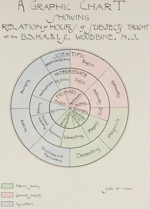
The image presents a hand-drawn graphic chart, titled "A Graphic Chart Showing Relation of Hours of Subject Taught at the B.D.H.A.S.L.S., Woodbine, N.J." The chart is divided into two concentric circles, with the inner circle labeled "Primary" and the outer circle labeled "Intermediate." Each section of the chart represents a different subject, such as English, Mathematics, Science, and Social Studies.
Key Features:
- Title: The title of the chart is written in black ink at the top of the page.
- Chart Structure: The chart consists of two concentric circles, with the inner circle labeled "Primary" and the outer circle labeled "Intermediate."
- Subject Sections: Each section of the chart represents a different subject, such as English, Mathematics, Science, and Social Studies.
- Color-Coded: The chart uses color-coding to differentiate between the primary and intermediate subjects.
- Scale: The chart includes a scale at the bottom, which indicates the number of hours spent on each subject.
- Legend: A legend is provided at the bottom of the chart, explaining the meaning of the colors used.
Purpose:
The purpose of this chart is to illustrate the relationship between the hours of subject taught at the B.D.H.A.S.L.S. in Woodbine, N.J. The chart provides a visual representation of the distribution of teaching hours across different subjects, allowing for easy comparison and analysis.
Conclusion:
In conclusion, the image presents a well-structured and informative graphic chart that effectively communicates the relationship between the hours of subject taught at the B.D.H.A.S.L.S. in Woodbine, N.J. The use of color-coding and a clear legend makes it easy to understand and interpret the data presented in the chart.
Created by us.meta.llama3-2-90b-instruct-v1:0 on 2025-05-24
The image depicts a hand-drawn chart titled "A Graphic Chart Showing Relation of Hours of Subject Taught at the B.D.H.A.S.L.C., Woodbine, N.J." The chart is divided into three concentric circles, with the innermost circle labeled "Primary," the middle circle labeled "Intermediate," and the outermost circle labeled "Scientific." Each section of the chart represents a different subject, such as English, Mathematics, and Science, and is colored differently to distinguish between them.
The chart appears to be a visual representation of the curriculum taught at the B.D.H.A.S.L.C. in Woodbine, New Jersey, with the size of each section corresponding to the number of hours spent on that subject. The chart also includes a key in the bottom-left corner that explains the color-coding system used to represent different subjects.
Overall, the chart provides a clear and concise overview of the curriculum taught at the B.D.H.A.S.L.C. and allows viewers to quickly compare the amount of time spent on different subjects.
Amazon Nova
Created by amazon.nova-pro-v1:0 on 2025-05-24
The image is a graphic chart showing the relationship between hours of subjects taught at the B.D.H.A.S.J., Woodbine, N.J. The chart is circular in shape and is divided into three concentric rings, each representing a different category of subjects. The outermost ring is labeled "Scientific," the middle ring is labeled "Intermediate," and the innermost ring is labeled "Primary." Each ring is further divided into segments representing different subjects within that category. The chart is color-coded to indicate the number of hours spent on each subject, with different colors representing different subjects. The chart is titled "A Graphic Chart Showing Relation of Hours of Subjects Taught at the B.D.H.A.S.J., Woodbine, N.J." and is dated 1904.
Created by amazon.nova-lite-v1:0 on 2025-05-24
The image is a graphic chart titled "A Graphic Chart Showing Relation of Hours of Subjects Taught at the B.D.H.A.S.J., Woodbine, N.J." The chart is divided into three color-coded sections representing different categories of subjects: Nature Study (green), General Subjects (pink), and Agriculture (blue). The chart uses a pie chart format to visually represent the distribution of teaching hours across these categories. The chart is accompanied by a legend that provides a key to the color-coding system and a scale indicating that one hour is represented by a specific unit of measurement.
Google Gemini
Created by gemini-2.0-flash on 2025-04-29
Here is a description of the image:
The image is a graphic chart on a cream-colored background. The chart is titled "A GRAPHIC CHART SHOWING RELATION OF HOURS OF SUBJECT TAUGHT at the B.De H.A..., WOODBINE, N.J.". The chart is in the form of concentric circles divided into segments, representing different subjects taught at the school.
The innermost circle is labelled "PRIMARY" and includes subjects like English, Arithmetic, History, Geography, Physiology, Botany and Entomology, Agronomy, and Chemistry. This section is colored green, indicating Nature Study. The next ring, labeled "INTERMEDIATE," includes English and Veterinary Science. The outer ring, labeled "SCIENTIFIC," also includes English and Veterinary Rience. The third ring features segments labelled Dairying, Horticulture, Animal Industry, Feeding, Pomology and Floriculture.
The right side of the wheel has several overlapping rings labeled Mathematics, Physics, and Chemistry. The Mathematics segment is colored pink, indicating General Subjects. Agriculture is colored blue. A legend at the bottom of the chart explains the color coding: Green for "Nature Study", Pink for "General Subjects", and Blue for "Agriculture".
At the bottom right of the chart, the scale is indicated as "Scale: 15°.1 hour."
Created by gemini-2.0-flash-lite on 2025-04-29
Here's a description of the image:
Overall: The image is a hand-drawn graphic chart, likely from the early 20th century. It visualizes the relationship between hours spent on different subjects taught at the B.D.H.A.S.I. (likely an agricultural or horticultural institution) in Woodbine, N.J.
Chart Design:
- The chart is circular, divided into segments like a pie chart or a sunburst diagram.
- Different subjects are listed in the segments, arranged in concentric rings, likely representing levels of education (Primary, Intermediate, Scientific).
- Color-coding is used, indicated by a small key at the bottom. Pink denotes General Subjects, green is Nature Study, and blue/grey indicates Agriculture.
- The handwritten text is clear and the illustration has a quaint, hand-crafted feel.
Subjects and Details:
- Subjects listed include English, Veterinary Science, Horticulture, Mathematics, Physics, Chemistry, Agronomy, Animal Industry, Feeding, Dairying, Pomology (fruit study), and others.
- The scale shows 15 hours in one hour.
Additional Notes:
- The chart likely served as a way to visualize the curriculum or time allocation for various subjects.
- The image is likely a scan of an original document.
- The overall aesthetic suggests it's a historical document.
Mistral Pixtral
Created by us.mistral.pixtral-large-2502-v1:0 on 2025-05-24
The image is a graphic chart that visually represents the relationship between the number of hours spent and the subjects taught at the B.D.H.A.S.L.S. in Woodbine, N.J. The chart is designed in a circular format with concentric rings, each representing different categories of subjects.
Key Components:
Title:
- The title at the top of the chart reads: "A Graphic Chart Showing Relation of Hours of Subject Taught at the B.D.H.A.S.L.S., Woodbine, N.J."
Circular Structure:
- The chart is divided into three main concentric circles labeled "Primary," "Intermediate," and "Scientific."
- Each circle is further divided into segments representing different subjects.
Subjects:
Primary Circle (Innermost):
- English
- Arithmetic
- History
- Geography
- Drawing
- Music
- Physical Training
Intermediate Circle (Middle):
- English
- History
- Geography
- Algebra
- Physiology
- Drawing
- Agriculture
- Nature Study
Scientific Circle (Outermost):
- Chemistry
- Physics
- Zoology
- Botany
- Mathematics
- Agriculture
- Nature Study
Color Coding:
- The chart uses color coding to differentiate between types of subjects:
- Green: Nature Study
- Pink: General Subjects
- Blue: Agriculture
- The chart uses color coding to differentiate between types of subjects:
Scale:
- There is a scale indicator at the bottom right of the chart that states "1 inch = 1 hour," which helps in understanding the proportion of hours dedicated to each subject.
Interpretation:
- The chart provides a visual representation of the curriculum, showing how much time is allocated to various subjects at different educational levels (Primary, Intermediate, and Scientific).
- The use of color coding helps to quickly identify the type of subjects being taught.
- The concentric circles allow for a clear comparison of the emphasis placed on different subjects at each educational level.
This chart is a useful tool for understanding the educational focus and distribution of teaching hours across various subjects at the B.D.H.A.S.L.S. in Woodbine, N.J.
Text analysis
Amazon