Machine Generated Data
Tags
Color Analysis
Feature analysis
Amazon
Clarifai
AWS Rekognition
| Rug | 76.8% | |
Categories
Imagga
created on 2019-06-05
| text visuals | 99.5% | |
Captions
Microsoft
created by unknown on 2019-06-05
| a close up of text on a white background | 73.2% | |
| a close up of text on a white surface | 68.6% | |
| a close up of text on a black background | 64.4% | |
Salesforce
Created by general-english-image-caption-blip on 2025-05-18
a photograph of a map of minnesota showing the location of the city of minneapolis
OpenAI GPT
Created by gpt-4o-2024-11-20 on 2025-06-13
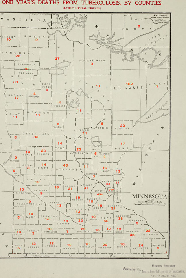
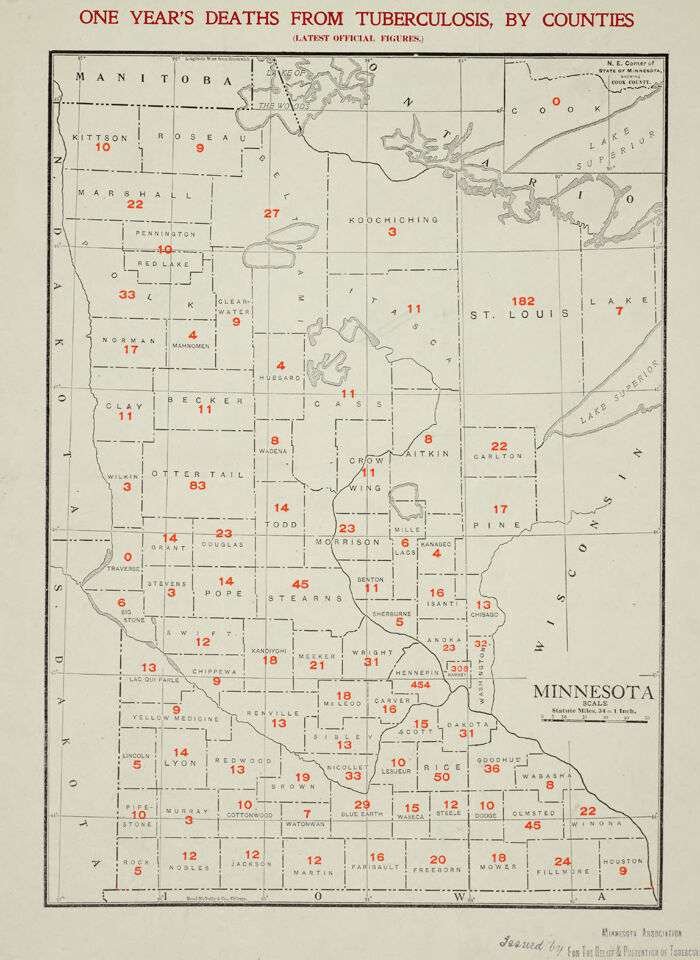
This image is a detailed map of Minnesota titled "One Year’s Deaths from Tuberculosis, by Counties" (latest official figures). Each county on the map is marked with a number indicating the recorded tuberculosis deaths within that year.
- The map is bordered and labeled, showing Minnesota's counties divided into grids, with death counts written in red numerals across the state.
- Large numerical variations are visible between counties, demonstrating stark differences in tuberculosis mortality rates. For example, Hennepin County shows the highest number with 454 deaths, followed by St. Louis County with 182 deaths.
- Counties such as Koochiching and Wilkin have much lower numbers, marked as 3 deaths each.
- This visualization serves as an epidemiological tool to track the prevalence of tuberculosis geographically within Minnesota. The map likely highlights areas for concern or targeted health interventions.
It was issued by the Minnesota Association for the Prevention and Treatment of Tuberculosis, based in St. Paul, Minnesota.
Created by gpt-4o-2024-08-06 on 2025-06-13
The image is a historical map of Minnesota showing the number of deaths from tuberculosis in each county for one year. The title at the top reads "One Year's Deaths from Tuberculosis, By Counties (Latest Official Figures)" and is printed in red. The map is divided into counties, each labeled with their respective name and a number in red indicating the number of tuberculosis deaths recorded.
Some notable numbers include:
- St. Louis County shows a particularly high number with 182 deaths.
- Hennepin County also reports a high number of 454 deaths.
- Ramsey County records 351 deaths.
- Other counties with notable figures include Otter Tail with 83 deaths and Stearns with 45 deaths.
The map is presented with a scale in the lower right, indicating that 18 statute miles equal 1 inch. The map appears to be issued by the Minnesota Association for the Prevention of Tuberculosis, based in St. Paul, MN, as indicated in the lower right corner.
Anthropic Claude
Created by anthropic.claude-3-haiku-20240307-v1:0 on 2025-06-17
This image appears to be a map of Minnesota, showing the number of deaths from tuberculosis in each county over the course of one year. The map is divided into counties, and the number of deaths in each county is indicated by a numerical value. The image is titled "One Year's Deaths from Tuberculosis, by Counties" and provides a detailed breakdown of the tuberculosis mortality rates across the state.
Created by us.anthropic.claude-3-5-sonnet-20241022-v2:0 on 2025-06-17
This is a historical map showing one year's deaths from tuberculosis by counties in Minnesota. The map appears to be from an older time period and shows the state divided into its counties, with red numbers indicating the death count in each county. The highest numbers appear to be concentrated around what is likely the Twin Cities metro area, with St. Louis County (in the northeast) also showing a notably high number of 182 deaths. The map includes parts of neighboring regions like Manitoba to the north and Lake Superior to the northeast. The numbers vary significantly across counties, from single digits in some rural areas to several hundred in more populated regions. The title is written in red text at the top of the map, and the map includes a simple border and basic geographical features like county lines and some water bodies.
Meta Llama
Created by us.meta.llama3-2-11b-instruct-v1:0 on 2025-06-11
The image presents a map of Minnesota, titled "ONE YEAR'S DEATHS FROM TUBERCULOSIS, BY COUNTIES," which displays the number of deaths from tuberculosis in each county over a one-year period. The map is divided into counties, with each county labeled and featuring a numerical value indicating the number of deaths from tuberculosis.
- Title and Legend
- The title "ONE YEAR'S DEATHS FROM TUBERCULOSIS, BY COUNTIES" is prominently displayed at the top of the image.
- A legend is not provided, but the numbers on the map are likely to represent the number of deaths from tuberculosis in each county.
- Map Features
- The map is divided into counties, with each county labeled.
- The numbers on the map range from 0 to 182, indicating the number of deaths from tuberculosis in each county.
- The map appears to be a hand-drawn or printed map, with a simple design and minimal embellishments.
- Color Scheme
- The map features a beige background with black lines and text.
- The numbers on the map are highlighted in red, making them stand out against the beige background.
- Statistics
- The map provides a visual representation of the number of deaths from tuberculosis in each county.
- The highest number of deaths is reported in St. Louis County, with 182 deaths.
- The lowest number of deaths is reported in Traverse County, with 0 deaths.
- Conclusion
- The map effectively communicates the distribution of tuberculosis deaths across Minnesota counties.
- The use of a simple design and clear labeling makes it easy to understand the data presented.
- The map provides valuable insights into the impact of tuberculosis on different regions of Minnesota during the specified time period.
Created by us.meta.llama3-2-90b-instruct-v1:0 on 2025-06-11
The image is a map of Minnesota, titled "One Year's Deaths from Tuberculosis, by Counties (Latest Official Figures)." The map displays the number of deaths from tuberculosis in each county over a one-year period. The numbers are represented in red text and vary significantly across different counties.
Key Features:
- Title: "One Year's Deaths from Tuberculosis, by Counties (Latest Official Figures)"
- Map: A map of Minnesota with county boundaries
- Data Representation: Red text indicating the number of deaths from tuberculosis in each county
- Variation in Data: Significant variation in the number of deaths across different counties
Conclusion:
The image provides a visual representation of the impact of tuberculosis on Minnesota's population during a specific time period. It highlights the disparities in mortality rates across different counties, which could be influenced by various factors such as access to healthcare, socioeconomic status, and environmental conditions.
Amazon Nova
Created by amazon.nova-lite-v1:0 on 2025-06-05
This image is a map titled "One Year's Deaths from Tuberculosis, by Counties." It shows the number of deaths from tuberculosis in each county of the United States. The map is divided into sections, with each section representing a different region of the country. The numbers on the map indicate the number of deaths from tuberculosis in each county during a one-year period. The map is likely from the early 20th century, as tuberculosis was a major public health concern during that time. The map is a visual representation of the spread of tuberculosis across the country and the impact it had on different regions.
Created by amazon.nova-pro-v1:0 on 2025-06-05
The image is a map of the state of Minnesota, labeled "ONE YEAR'S DEATHS FROM TUBERCULOSIS, BY COUNTIES (LATEST OFFICIAL FIGURES)." The map is divided into various counties, each marked with a number indicating the number of deaths from tuberculosis in that county. The map is in black and white, with the numbers in red for emphasis. The counties are labeled with their names, and the map includes a scale and a legend indicating the number of deaths per county. The map also includes a note at the bottom that reads "Issued by the Minnesota Association for the Relief and Prevention of Tuberculosis, St. Paul, Minn."
Google Gemini
Created by gemini-2.0-flash on 2025-06-02
Here's a description of the image:
The image is a map of Minnesota, USA, displaying "One Year's Deaths from Tuberculosis, by Counties". It is labeled with "(Latest Official Figures)". The map includes the counties of Minnesota and their names, with numbers in each county that indicate the number of deaths from tuberculosis in that county.
The map is bordered by the names of neighboring areas (Manitoba, Wisconsin, Iowa, and North/South Dakota). The map includes major lakes within and bordering Minnesota, such as Lake Superior and the Lake of the Woods. The map also shows a portion of Canada, above Minnesota.
Below the map, text states that it was “Issued by for The Relief & Prevention of Tuberculosis, ST. PAUL MINN."
Created by gemini-2.0-flash-lite on 2025-06-02
Here's a description of the image:
Overview:
The image is a historical map of Minnesota, showing the number of deaths from tuberculosis in each county for a single year. It's likely a public health document.
Key Features:
- Title: "ONE YEAR'S DEATHS FROM TUBERCULOSIS, BY COUNTIES"
- Data Representation: The map displays the number of deaths in each county as numerical figures, highlighted in red. The different counties are also labeled, which allows for easy comparison.
- Geographic Scope: The map covers the entire state of Minnesota, along with bordering Canadian provinces (Manitoba) and Lake Superior to the northeast.
- Details: The map includes county names, the number of deaths, and a scale. There is also a small inscription at the bottom, that states, "Issued by For The Relief & Prevention of Tuberculosis, ST. PAUL, MINN."
Visual Elements:
- Color Palette: Primarily black and white, with red used to highlight the numeric death tolls.
- Style: The map has a somewhat basic, functional design common to official documents of the era. The font is clean.
Overall Impression:
The image functions as a statistical overview of a public health issue in Minnesota at a particular time. It provides valuable insight into the geographic distribution of tuberculosis.
Mistral Pixtral
Created by us.mistral.pixtral-large-2502-v1:0 on 2025-06-05
The image is a map of Minnesota, showing the number of deaths from tuberculosis by county over the span of one year. The data is presented in red numbers, indicating the death toll in each county. The map is titled "One Year's Deaths from Tuberculosis, by Counties" and is labeled as containing the latest official figures.
Here are some key observations from the map:
Highest Death Counts:
- Hennepin County: 299 deaths
- Ramsey County: 104 deaths
- St. Louis County: 102 deaths
Moderate Death Counts:
- Several counties have death counts ranging from 20 to 45, including:
- Otter Tail County: 83 deaths
- Olmsted County: 45 deaths
- Morrison County: 45 deaths
- Blue Earth County: 33 deaths
- Winona County: 45 deaths
- Several counties have death counts ranging from 20 to 45, including:
Lower Death Counts:
- Many counties have death counts in the single digits or low teens, such as:
- Kittson County: 10 deaths
- Roseau County: 9 deaths
- Koochiching County: 3 deaths
- Cook County: 1 death
- Many counties have death counts in the single digits or low teens, such as:
Geographical Distribution:
- Higher death counts are concentrated in more populated areas, particularly in the central and southeastern parts of the state.
- Lower death counts are generally found in the more rural and less populated northern and western counties.
Map Details:
- The map includes a scale indicating that one inch equals 44 miles.
- It was issued by the Minnesota Federation and printed by the Pioneer Press in St. Paul, Minnesota.
This map provides a visual representation of the impact of tuberculosis across Minnesota, highlighting areas with higher and lower mortality rates due to the disease.
Qwen
Text analysis
Amazon