Machine Generated Data
Tags
Color Analysis
Feature analysis
Amazon

| Poster | 72.5% | |
Categories
Imagga
| text visuals | 97.6% | |
| food drinks | 1% | |
| streetview architecture | 0.7% | |
| paintings art | 0.5% | |
| events parties | 0.2% | |
| interior objects | 0.1% | |
Captions
Microsoft
created on 2018-03-16
| a close up of a sign | 95.4% | |
| close up of a sign | 94.1% | |
| a sign on a pole | 77.3% | |
OpenAI GPT
Created by gpt-4 on 2024-12-20
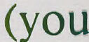
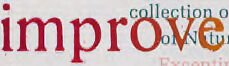
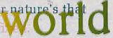
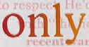
This is an image of a printed text artwork. The page looks like a page from a diary or a book, with the word "DIARY: how TO improve THE WORLD (you will only make matters WORSE)" printed in bold, large, and colorful letters that overlay the regular text below. Each of the main words in this phrase is in a different color and font size, and they are scattered across the page in a way that breaks the linear reading flow, creating a kind of visual poetry or art piece. Below the prominent text, there are paragraphs of smaller text in a regular font that are harder to read due to the overlay of the larger words. At the bottom right corner, there's a signature that says "John Cage" and a date "1968". This signature indicates that the artist of the piece is likely John Cage, an American composer, music theorist, artist, and philosopher. The location "Champaign, Ill." is also noted, possibly referring to where the piece was created or first displayed. John Cage was known for his experimental approach to art and music, often incorporating chance and non-standard use of instruments and media in his works. Please remember I can identify the character of the signature, but I cannot visually verify the authenticity of the artwork or the signature itself.
Created by gpt-4o-2024-05-13 on 2024-12-20
This image is the cover of "Diary: How to Improve the World (You Will Only Make Matters Worse) Continued 1968," created by John Cage. The text on the cover primarily uses a large, bold font in a spectrum of colors, transitioning from red to green. The title itself is creatively laid out across the cover with the words "TO" and "WORSE" emphasized in significantly larger font sizes against a background of smaller, lightly printed text. The overall design is visually striking, using changing font colors and sizes to draw attention to key words and phrases. The bottom right corner features John Cage's signature.
Anthropic Claude
Created by claude-3-haiku-20240307 on 2024-12-20
The image appears to be the cover of a book or publication titled "Diary: How to improve the world (you will only make matters worse) continued 1968" by Tom Sage. The text on the cover is visually striking, using different font sizes, colors, and shapes to emphasize various phrases and ideas. The overall message seems to be about how individual actions, while well-intentioned, can sometimes have unintended negative consequences when trying to improve the world. The design and layout of the text creates a thought-provoking visual representation of this theme.
Created by claude-3-5-sonnet-20241022 on 2024-12-20
This appears to be an artistic book or publication cover from 1968 titled "DIARY: HOW TO improve the world (you will only make matters WORSE)" from Champaign, Illinois. The design features text in a gradient of colors from red to orange to green, with some underlying text visible in the background. The title and text are arranged in an artistic, typographic manner. The words "WORSE" and "continued" appear prominently, along with the date 1968. There appears to be a signature at the bottom right of the image. The design has a modernist feel typical of the late 1960s, with its bold typography and color choices. The provocative title suggests this may be a work of social commentary or experimental literature from that period.
Meta Llama
Created by us.meta.llama3-2-11b-instruct-v1:0 on 2024-12-20
The image is a book cover for "Diary: How to Improve the World (You Will Only Make Matters Worse) Continued 1968" by Tomi Ungerer. The cover features a white background with large, multicolored letters spelling out the title in a playful, overlapping style. The text is arranged in a way that creates a sense of movement and energy, with some letters overlapping or blending into each other. The title itself is the main focus of the cover, with the words "DIARY: HOW" in red and yellow at the top, followed by "TO IMPROVE THE WORLD (YOU WILL ONLY MAKE MATTERS WORSE)" in a mix of colors, including green, blue, and orange. The word "CONTINUED" is written in yellow at the bottom right corner, with the year "1968" in green to the right of it. The background of the cover is white, which provides a clean and simple contrast to the colorful text. Overall, the design of the cover is eye-catching and engaging, suggesting that the book is a thought-provoking and humorous exploration of the human condition.
Created by us.meta.llama3-2-90b-instruct-v1:0 on 2024-12-20
The image depicts a white poster with the words "DIARY: HOW TO improve the world (you will only make matters WORSE) continued 1968" in large, multicolored letters. The text is overlaid on a background of smaller, illegible text. **Key Features:** * **Title:** "DIARY: HOW TO improve the world (you will only make matters WORSE) continued 1968" * **Color Scheme:** Multicolored letters in red, orange, yellow, green, and blue * **Background:** Smaller, illegible text in various colors * **Signature:** A signature in the bottom-right corner, likely belonging to the artist or creator of the poster * **Location:** The location "Champaign, Ill." is written in small red text at the bottom-left corner of the poster **Overall Impression:** The poster appears to be a thought-provoking piece that challenges the viewer to consider the impact of their actions on the world. The use of multicolored letters and a busy background creates a visually striking image that grabs the viewer's attention. The signature and location suggest that the poster may be a unique piece created by an individual artist or designer.
Amazon Nova
Created by amazon.nova-pro-v1:0 on 2025-02-27
The image is a page from a book titled "Diary: How," featuring a unique typographic design. The page is predominantly white, with various words and phrases in different colors and sizes, creating a visually striking layout. The word "WORSE" is prominently displayed in large, bold letters at the bottom of the page, with the letters in different colors: red, orange, and green. Above "WORSE," the phrase "continued 1968" is written in a mix of red, orange, and green, with "continued" in red and "1968" in green. The word "10" is positioned at the top center of the page, with the "1" in red and the "0" in green. The text surrounding these words is in smaller, less prominent fonts, with various colors and arrangements, suggesting a theme of chaos or disorder. The overall design appears to be a commentary on the state of the world or a personal reflection, with the bold, colorful words drawing attention to specific phrases or concepts.
Created by amazon.nova-lite-v1:0 on 2025-02-27
The image is a collage of text and images, with a white background and bold, colorful typography. The text is arranged in a grid-like pattern, with some words and phrases overlapping and blending together. The words "Diary: How to Improve the World" are prominently displayed in the top left corner, while the words "Worse Continued" are displayed in the bottom right corner. The text is accompanied by various images, including a green circle with the number "10" in the center, a red letter "O" with the word "worse" in the center, and a red letter "W" with the word "continued" in the center.
Text analysis
Amazon