Machine Generated Data
Tags
Color Analysis
Categories
Imagga
| text visuals | 100% | |
Captions
Microsoft
created on 2022-01-23
| chart | 76.6% | |
OpenAI GPT
Created by gpt-4 on 2024-12-21
This image appears to be a conceptual artwork featuring a graph-like layout with various lines plotted across it, each line representing different objects or elements labeled with text. The image is composed on a plain white background and includes the following labeled elements: - Wall - Ceiling - Mountain (depicted with a red to orange gradient line with peaks and valleys) - Hand (several dotted lines across the bottom) - Bread - Plate (a dotted line along the bottom) - Shadow (another dotted line along the bottom, perhaps representing the outline of a shadow) - Window (several windows are represented across the middle) - Sky (depicted with a light blue line above the mountain line) - Tree (depicted with a purple line) - Door (labeled at the very bottom) - Cup (labeled next to a hand and plate on the bottom right side) - Table (represented by a dotted orange line) Each element is clearly labeled, suggesting that it is likely a visualization of a scene or set of objects against the layout of a room. The artwork seems to have a signature at the bottom right, suggesting it may be the work of a particular artist. The exact interpretation of the artwork would likely depend on the artist's intent and the context in which it was created. It seems to combine elements of both indoor and outdoor space, possibly playing with the concept of perspective or the relationship between different objects in a space.
Created by gpt-4o-2024-05-13 on 2024-12-21
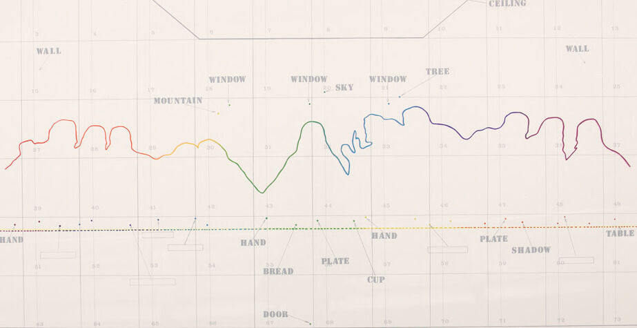
This image appears to be a detailed and structured drawing or diagram. It is laid out on a grid with several labels and a wavy, colorful line running through the middle horizontally from left to right. Here's a description of the elements in the image: - **Labels and Grid:** - The grid is marked with horizontal and vertical lines segmenting the area into smaller boxes, each with numerical notations. - There are various labels in different sections of the grid such as "WALL," "CEILING," "WINDOW," "MOUNTAIN," "SKY," "TREE," "HAND," "BREAD," "PLATE," "CUP," "SHADOW," "TABLE," and "DOOR." - The labels are distributed in both the upper and lower sections of the diagram. - **Colorful Wavy Line:** - A single wavy line runs horizontally across the image through the middle section, changing colors as it progresses. It appears to start in red, transitions to orange, yellow, green, blue, and finally purple. - The line seems to represent some conceptual or physical connection between the labeled items. - **Horizontal Dotted Lines:** - There are also several horizontal dotted lines in different colors (red, orange, yellow, green, blue) that run parallel with the colorful wavy line. - **Annotations and Signatures:** - There are a couple of signatures or annotations at the lower right part of the image. One seems to be a date "27.9.79," and another looks like a signature, potentially of the artist or creator. The overall style and layout of the image suggest it may be an abstract representation or conceptual diagram, possibly related to art, design, or a technical illustration.
Anthropic Claude
Created by claude-3-haiku-20240307 on 2024-12-21
This image appears to be a detailed illustration or diagram depicting various elements and their relative positions or relationships. The main components shown include a wall, window, mountain, sky, tree, hand, plate, bread, cup, door, and table shadow. The lines and shapes forming these elements seem to create a visual representation or analysis of some kind, though the specific meaning or purpose is not immediately clear from the image alone. The overall layout and use of different colors suggests this may be some form of technical or conceptual diagram, though without more context the exact nature of what is being depicted is difficult to determine.
Created by claude-3-5-sonnet-20241022 on 2024-12-21
This appears to be a schematic or diagram showing the profile or silhouette of a scene, labeled with various elements. At the top of the image, there's a line labeled "CEILING," and along the sides are "WALL" markers. The middle section shows three "WINDOW" spaces and includes labels for "MOUNTAIN," "SKY," and "TREE." The silhouette itself is drawn in different colors that form a continuous wavy line across the image, changing from red to orange, yellow, green, blue, purple, and pink. Below this main line, there are several labels for items like "HAND," "BREAD," "PLATE," "CUP," "DOOR," and "TABLE." The entire diagram is laid out on a grid pattern with numbers along the edges, suggesting this might be some kind of technical or artistic planning document. The drawing appears to be quite minimal and precise in its presentation, with the colored line being the main visual element against the otherwise plain background. It looks like this could be a study of sight lines or a planned composition for an art piece or architectural element, showing how different elements relate to each other in space.
Meta Llama
Created by us.meta.llama3-2-11b-instruct-v1:0 on 2024-12-21
The image presents a graph with a grid pattern, featuring various words and phrases in a seemingly random arrangement. The graph is divided into squares, each containing a number, and includes labels such as "WALL," "MOUNTAIN," "WINDOW," "SKY," "TREE," "HAND," "BREAD," "DOOR," "CUP," "PLATE," "SHADOW," and "TABLE." The graph also features a series of lines in different colors, which appear to be hand-drawn and irregularly shaped. The graph's background is white, with a subtle grid pattern that provides a sense of structure and organization. The overall effect is one of visual complexity, with many elements competing for attention. **Key Features:** * **Grid Pattern:** The graph features a grid pattern, with each square containing a number. * **Labels:** The graph includes labels such as "WALL," "MOUNTAIN," "WINDOW," "SKY," "TREE," "HAND," "BREAD," "DOOR," "CUP," "PLATE," "SHADOW," and "TABLE." * **Lines:** The graph features a series of lines in different colors, which appear to be hand-drawn and irregularly shaped. * **Background:** The graph's background is white, with a subtle grid pattern that provides a sense of structure and organization. **Visual Complexity:** * **Many Elements:** The graph features many elements, including labels, lines, and numbers, which can make it difficult to focus on a single aspect. * **Irregular Shapes:** The lines on the graph are irregularly shaped, which can add to the visual complexity. * **Competing Attention:** The many elements on the graph can compete for attention, making it challenging to understand the overall message or pattern. **Possible Interpretations:** * **Data Visualization:** The graph could be used to visualize data, with the lines representing different variables or trends. * **Artistic Expression:** The graph could be seen as a form of artistic expression, with the irregular shapes and colors creating a unique visual experience. * **Abstract Representation:** The graph could be interpreted as an abstract representation of a concept or idea, with the labels and lines serving as a metaphor for the underlying meaning.
Created by us.meta.llama3-2-90b-instruct-v1:0 on 2024-12-21
The image presents a graph with a white background and a grid pattern, featuring various lines in different colors that represent different objects. The x-axis is labeled with words such as "hand," "bread," "door," "plate," "cup," "shadow," "table," "wall," "ceiling," "tree," "window," "sky," and "mountain." The y-axis is not explicitly labeled but appears to represent some form of measurement or value. The graph includes several lines, each corresponding to a specific object or concept. For example, there is a red line for "hand," a yellow line for "bread," a green line for "door," and so on. Each line has its own unique shape and pattern, suggesting that it represents a distinct set of data or values. In the bottom-right corner of the image, there is a signature or notation that reads "Robert Motherwell 1974." This suggests that the graph was created by the artist Robert Motherwell in 1974. Overall, the image appears to be a visual representation of data or concepts related to everyday objects and experiences. The use of different colors and line styles adds a creative and artistic touch to the graph, making it more engaging and visually appealing.
Amazon Nova
Created by amazon.nova-lite-v1:0 on 2025-02-28
The image is a diagram consisting of various geometric shapes and lines. The diagram is divided into multiple sections, each with a different color. The top section has a red line, while the second section has a yellow line. The third section has a green line, and the fourth section has a blue line. The fifth section has a purple line. The sixth section has a pink line. The seventh section has a white line. The eighth section has a black line. The ninth section has a gray line. The tenth section has a brown line. The eleventh section has a white line. The twelfth section has a white line. The diagram also includes labels for each section, such as "WALL," "WINDOW," "TREE," "SKY," "MOUNTAIN," "HAND," "PLATE," "SHADOW," "BREAD," "PLATE," "CUP," "DOOR," "CEILING," and "WALL."
Created by amazon.nova-pro-v1:0 on 2025-02-28
The image is a drawing of a graph with a grid-like structure. The graph is divided into several sections, each with a different color. The top section of the graph is labeled "Ceiling," and the bottom section is labeled "Wall." The middle section is labeled "Window," and the bottom-right section is labeled "Tree." The graph also includes a series of lines that represent different objects, such as a hand, a plate, and a table.
Text analysis
Amazon