Machine Generated Data
Tags
Color Analysis
Feature analysis
Amazon
Clarifai
AWS Rekognition
| Poster | 99.2% | |

Categories
Imagga
created on 2022-01-23
| text visuals | 98.5% | |
| paintings art | 1.1% | |
Captions
Microsoft
created by unknown on 2022-01-23
| calendar | 48.9% | |
Clarifai
Created by general-english-image-caption-clip on 2025-07-11
a city is a city.
Salesforce
Created by general-english-image-caption-blip on 2025-05-17
a photograph of a poster of a train station with a train on the tracks
OpenAI GPT
Created by gpt-4 on 2024-12-21
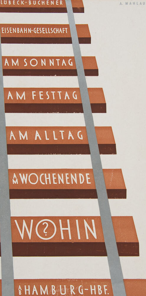
This image is a vintage poster featuring a graphic design that resembles a railway track. The track is diagonally oriented, going up from the bottom right to the top left of the poster. Along the track, there are what look like railway sleepers or ties, consisting of brown rectangles with white text inside.
The text on the poster is in German and it reads as follows, from top to bottom along the sleepers:
- LÜBECK-BÜCHENER EISENBAHN-GESELLSCHAFT
- AM SONNTAG
- AM FESTTAG
- AM ALLTAG
- AM WOCHENENDE
- WOHIN
- HAMBURG-HBF.
This text is suggesting a rail service provided by the Lübeck-Büchener Railway Company (Lübeck-Büchener Eisenbahn-Gesellschaft), mentioning days of the week and words, such as "Sunday" (SONNTAG), "holiday" (FESTTAG), "weekday" (ALLTAG), and "weekend" (WOCHENENDE), implying the different times when one can travel. "WOHIN" is a question that means "Where to?" in German. The final line, HAMBURG-HBF, indicates Hamburg Hauptbahnhof, the main railway station in Hamburg, Germany.
The art is rendered in a minimalist style, using flat colors and simple shapes to convey the idea of train travel. At the top right of the poster, there are initials "A. Mahlau," likely the artist's signature or the designer of the poster.
Created by gpt-4o-2024-05-13 on 2024-12-21
The image features an illustration resembling train tracks with brown wooden ties and gray rails. Each tie displays white text written in German, creating a vertical sequence up the image. The text on the ties reads from top to bottom:
- LÜBECK-BÜCHENER
- EISENBAHN-GESELLSCHAFT
- AM SONNTAG (on Sunday)
- AM FESTTAG (on holiday)
- AM ALLTAG (on weekday)
- AM WOCHENENDE (on weekend)
- WOHIN? (where to?)
- AB HAMBURG-HBF (from Hamburg main station)
The name "A. Mahlau" is situated at the top right corner in small print, suggesting the artist or designer's signature. The overall design has a vintage/industrial style and seems likely to be an advertisement for train travel from the Lübeck-Büchener Railway Company, emphasizing various occasions for traveling.
Anthropic Claude
Created by us.anthropic.claude-3-5-sonnet-20241022-v2:0 on 2025-06-27
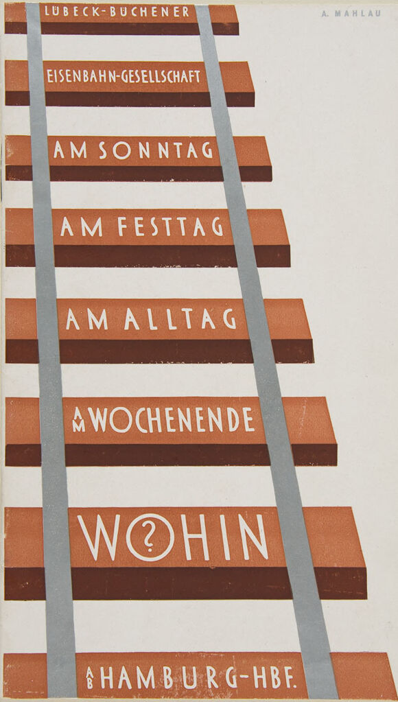
This appears to be a vintage German railway timetable or schedule poster for the Lübeck-Büchener Railway Company (Eisenbahn-Gesellschaft). The design is minimalist and modernist, with text arranged in a descending ladder-like format. The text is in white against reddish-brown bars, with gray vertical lines suggesting railway tracks.
The schedule shows different time periods:
- AM SONNTAG (On Sunday)
- AM FESTTAG (On Holidays)
- AM ALLTAG (On Weekdays)
- WOCHENENDE (Weekend)
At the bottom it shows "WOHIN?" (Where to?) with a question mark in a circle, and "HAMBURG-HBF" (Hamburg Central Station) as the destination.
The design is credited to "A. MAHLAU" at the top of the image. This appears to be from the early-to-mid 20th century and exemplifies the clean, functional graphic design style that was popular in Germany during that period.
Created by claude-3-haiku-20240307 on 2024-12-21
The image appears to be a schedule or timetable for a railway company or transportation service. It displays various time periods, such as "AM Sonntag" (Sunday morning), "AM Festtag" (Holiday morning), "AM Alltag" (Weekday), and "Wochende" (Weekend). The text also includes the name "Lubeck-Buchener Eisenbahn-Gesellschaft", which suggests this is a schedule for a railway company or service in the Lubeck-Buchener region. The image has a distinctive orange and gray color scheme with horizontal lines dividing the different time periods.
Created by claude-3-5-sonnet-20241022 on 2024-12-21
This is a vintage German railway advertisement or timetable poster, designed with a minimalist and geometric style typical of early-to-mid 20th century graphic design. The text is arranged in a ladder-like format with parallel gray rails running vertically through the design.
The title at the top reads "LUBECK-BUCHENER EISENBAHN-GESELLSCHAFT" (Lübeck-Büchen Railway Company), and the text descends through different time periods:
- AM SONNTAG (On Sunday)
- AM FESTTAG (On Holidays)
- AM ALLTAG (On Weekdays)
- AM WOCHENENDE (On Weekend)
At the bottom, there's "WOHIN" (Where to?) with a question mark in a circle, and finally "HAMBURG-HBF" (Hamburg Central Station) at the base.
The color scheme is primarily terracotta or rust-colored text blocks against a white background with gray railway track lines. The design is credited to "A. MAHLAU" and represents a classic example of modernist transportation graphics.
Meta Llama
Created by us.meta.llama3-2-11b-instruct-v1:0 on 2024-12-21
The image depicts a vintage-style poster featuring a ladder with nine rungs, each bearing a word or phrase in white text on an orange background. The ladder is set against a beige background.
Here is a detailed description of the image:
- Ladder
- The ladder is the central element of the poster.
- It has nine rungs, each with a word or phrase written in white text on an orange background.
- The ladder is positioned at an angle, with the top rung on the left side of the image and the bottom rung on the right side.
- Words and Phrases
- The words and phrases on the ladder are written in white text on an orange background.
- They appear to be in German, with some words being more prominent than others.
- The words and phrases are arranged in a way that creates a sense of movement and progression up the ladder.
- Background
- The background of the poster is beige.
- It provides a neutral and subtle contrast to the orange and white colors used in the ladder and words.
- Overall Design
- The overall design of the poster is simple yet effective.
- The use of a ladder as a metaphor for progress and achievement adds depth and meaning to the image.
- The vintage-style aesthetic gives the poster a sense of nostalgia and timelessness.
In summary, the image is a thought-provoking poster that uses a ladder as a metaphor for progress and achievement. The use of a vintage-style aesthetic and the arrangement of the words and phrases on the ladder create a sense of movement and progression. The overall design is simple yet effective, making the poster a compelling and memorable piece of art.
Created by us.meta.llama3-2-90b-instruct-v1:0 on 2024-12-21
The image is a vintage-style poster with a beige background and a prominent graphic of a ladder. The ladder features rungs with German text, including "LUBECK-BUCHENER," "EISENBAHN-GESELLSCHAFT," "AM SONNTAG," "AM FESTTAG," "AM ALLTAG," "AWOCHENENDE," "WOHIN," and "HAMBURG-HBF." The text is presented in white on orange or brown rungs, with gray lines separating the rungs. In the top-right corner, the name "A. MAHLAU" is displayed in small gray letters.
The overall design suggests that this poster may be an advertisement for a train route or service, possibly from Lubeck to Hamburg, given the mention of "HAMBURG-HBF" at the bottom. The use of German text and the vintage aesthetic imply that the poster is likely from the early 20th century.
Amazon Nova
Created by amazon.nova-lite-v1:0 on 2025-02-25
The image is a vintage travel poster from the early 20th century. It features a vertical composition with a central image of a train on a track. The train is depicted in a stylized, almost abstract manner, with the train car and wheels forming a geometric shape. The background is a plain, light-colored surface, likely representing the sky or a landscape.
The poster includes text in German, which translates to:
"Lübeck-Buchener Eisenbahn-Gesellschaft" (Lübeck-Buchen Railway Company)
"A. Mahlau" (likely the artist or designer)
"Am Sonntag" (On Sunday)
"Am Festtag" (On a holiday)
"Am Alltag" (On a weekday)
"Am Wochenende" (On the weekend)
"Wohin?" (Where to?)
"Hamburg-Hbf" (Hamburg Central Station)
The text is arranged in a grid-like pattern, with each line of text occupying a separate row. The words are written in a bold, sans-serif font, with the larger words "Wohin?" and "Hamburg-Hbf" standing out prominently.
The overall design of the poster is minimalist and geometric, with a focus on the central image of the train and the vertical arrangement of the text. The use of bold, contrasting colors and the simple, clean typography contribute to the poster's visual impact and effectiveness as a travel advertisement.
Created by amazon.nova-pro-v1:0 on 2025-02-25
The image shows a poster with a staircase-like design. The staircase has brown steps, and the sides are painted gray. The staircase is positioned on a white background. The words "AM SONNTAG," "AM FESTTAG," "AM ALLTAG," and "AM WOCHENENDE" are written in white on the brown steps. The word "WOHIN" is written in white with a question mark on the last step. The words "LUBECK-BUCHENER," "EISENBAH-GESELLSCHAFT," and "HAMBURG-HBF" are written in white on the gray sides.
Google Gemini
Created by gemini-2.0-flash-lite on 2025-05-18
Here's a description of the image:
This appears to be a vintage travel poster or advertisement, likely from Germany. It uses a simplified, geometric design with a clear message.
Key elements:
- Structure: The layout strongly resembles a ladder or a set of railway tracks. The 'rungs' of the ladder are horizontal rectangles in a reddish-brown color, representing railway ties or steps. Two vertical, light gray lines run along the sides, mimicking the rails.
- Text: The poster contains several lines of text, all in a bold, sans-serif font. The text appears to be German. The meaning is as follows:
- "LUBECK-BUCHENER" (likely a location or departure point)
- "EISENBAHN-GESELLSCHAFT" (This means "Railway Company")
- "AM SONNTAG" ("On Sunday")
- "AM FESTTAG" ("On a Holiday/Feast Day")
- "AM ALLTAG" ("On a Weekday")
- "AM WOCHENENDE" ("On the Weekend")
- "WOHIN" ("Where to?") – this is the central question with a question mark incorporated into the "O".
- "HAMBURG-HBF" (likely a destination or train station, "Hamburg Hauptbahnhof," meaning "Hamburg Main Station")
- Color Palette: The poster uses a limited color palette, primarily consisting of reddish-brown, light gray, and white/off-white. This minimalist color scheme enhances the clarity of the message.
- Overall impression: The poster's design suggests the concept of taking the train, especially with the depiction of a ladder. The question "WOHIN?" ("Where to?") implies inviting travelers to consider different options and destinations, with a specific focus on transport with the railway company. The design gives a minimalist and vintage feel. The image is likely a printed piece of ephemera from the early to mid-20th century.
Created by gemini-2.0-flash on 2025-05-18
The image is a vintage poster or advertisement, likely for a transportation service, specifically a railway. It features a stylized design representing railway tracks with a ladder-like structure formed by horizontal bars between the tracks.
The background is a light, off-white color. The horizontal bars are a gradient of brown, creating a 3D shadow effect as if the bars are sticking out, and each bar contains text in white. The text on each bar reads:
- "LUBECK-BUCHENER"
- "EISENBAHN-GESELLSCHAFT"
- "AM SONNTAG" (On Sunday)
- "AM FESTTAG" (On Holiday)
- "AM ALLTAG" (On All Days)
- "AWOCHENENDE" (On Weekends)
- "WOHIN" (Where to?) and the "O" is replaced by a question mark
- "HAMBURG-HBF." (Hamburg Central Station)
The "tracks" of the railway are depicted as light gray, diagonal stripes that run from the top left to the bottom right of the image.
In the top right corner, there's the text "A. MAHLAU," which is likely the artist's or designer's name.
Mistral Pixtral
Created by us.mistral.pixtral-large-2502-v1:0 on 2025-05-31
This image is a vintage poster designed in a minimalist style, featuring railway tracks as the central visual element. The text is integrated into the design of the railway tracks, creating a unique and visually appealing composition. The poster is predominantly in shades of brown and white, with the tracks and text in contrasting colors to enhance readability.
The text on the poster reads:
- LÜBECK-BUCHENER
- EISENBAHN-GESELLSCHAFT
- AM SONNTAG
- AM FESTTAG
- AM ALLTAG
- AM WOCHENENDE
- WOHIN
- HAMBURG-HBF
The words are arranged in such a way that they follow the alignment of the railway sleepers (ties), with the text "WOHIN" (which means "where to" in German) being the most prominent and placed centrally. The name "A. MAHLAU" appears in the top right corner, likely indicating the designer or artist of the poster.
Overall, the poster is an artistic representation promoting railway travel, emphasizing the various occasions one might use the railway service, such as on Sundays, holidays, weekdays, and weekends, and highlighting the destination Hamburg Hauptbahnhof (Hamburg Central Station).
Qwen
Created by Qwen/Qwen2.5-VL-7B-Instruct on 2025-06-30
This image is a vintage German advertisement for the Lübeck-Büchener Eisenbahn-Gesellschaft (Lübeck-Büchener Railway Company). It features a stylized illustration of a railway track with the words "LÜBECK-BÜCHENER" prominently displayed at the top in a red and white striped background. The text "A.MAHLAU" is also visible in the top right corner, likely indicating the artist's signature.
The rest of the advertisement lists various travel times to Hamburg Hauptbahnhof (Hamburg Hauptbahnhof) for different days and situations:
- "AM SONNTAG" (On Sunday)
- "AM FESTTAG" (On a holiday)
- "AM ALLTAG" (On a regular day)
- "AM WOCHENENDE" (On the weekend)
- "WOHIN?" (Where to? or Where?)
The design uses a clean and modernist style, with bold typography and a striking color scheme of red, white, and gray. The illustration of the railway track emphasizes the company's connection to travel, while the varied times highlight the convenience of the railway service regardless of the day.
Created by Qwen/Qwen2.5-VL-72B-Instruct on 2025-06-30
This image is a vintage German railway advertisement for the "Lübeck-Büchener Eisenbahn-Gesellschaft," which translates to "Lübeck-Büchen Railway Company." The design is minimalist and geometric, featuring a set of railway tracks that converge in the center, creating a strong perspective effect. The tracks are depicted with two parallel gray lines representing the rails and a series of reddish-brown rectangular shapes that resemble the ties or sleepers.
The text on the image is in German and is written in a bold, sans-serif font. The text reads as follows:
- "LÜBECK-BÜCHENER EISENBAHN-GESELLSCHAFT" at the top, indicating the name of the railway company.
- "AM SONNTAG AM FESTTAG AM ALLTAG AM WOCHENENDE" which translates to "On Sunday, On Holiday, On weekdays, On weekends," suggesting the availability of train services during different times.
- "WOHIN" which translates to "Where to," prompting the viewer to consider their travel destination.
- "HAMBURG-HBF" at the bottom, indicating the main station in Hamburg.
The overall design is clean and modern, likely from the mid-20th century, and effectively uses typography and simple geometric shapes to convey its message. The artist's name, "A. Mahlau," is also present in the top right corner.
Text analysis
Amazon