Machine Generated Data
Tags
Color Analysis
Feature analysis
Amazon
Clarifai
AWS Rekognition
| Poster | 68.6% | |

Categories
Imagga
created on 2022-01-23
| text visuals | 99.6% | |
Captions
Microsoft
created by unknown on 2022-01-23
| a close up of a sign | 89.8% | |
| close up of a sign | 86.5% | |
| a sign on a wall | 75.2% | |
Clarifai
Created by general-english-image-caption-clip on 2025-07-14
the logo is a nod to the traditional symbols.
Salesforce
Created by general-english-image-caption-blip on 2025-05-22
a photograph of a poster of a staircase case with a picture of a staircase case
OpenAI GPT
Created by gpt-4 on 2024-12-21
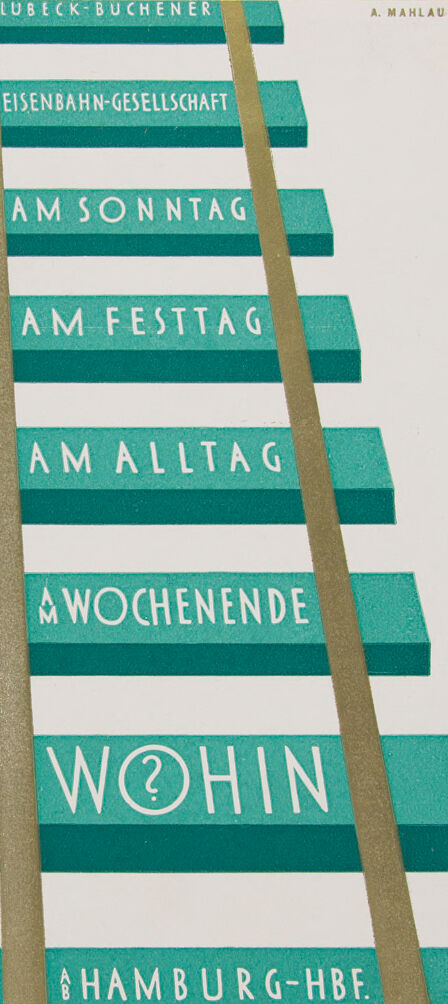
The image presents an artistic representation that appears to be a vintage poster or advertisement, which could be related to a railroad or train service. It has a stylized design that resembles a railway track. Two brown lines, which simulate the rails, diagonally divide the composition, creating sections with green backgrounds and white font. The white text is in German and each section seems to indicate different times or occasions for traveling. The text includes "AM SONNTAG" (On Sunday), "AM FESTTAG" (On the holiday), "AM ALLTAG" (On weekdays), and "AM WOCHENENDE" (On the weekend), with each phrase placed on a green horizontal bar. A larger text saying "WÖHIN" (Where to?) is located towards the bottom of the image, making it a focal point. Below that, another phrase reads "HAMBURG-HBF," suggesting a destination or a significant location related to Hamburg's main train station. Additionally, at the top, there's text reading "LÜBECK-BUCHENER EISENBAHN-GESELLSCHAFT," possibly indicating the name of the railway company or network. The initials "A. Mahlau" in the top right corner suggest the name of the artist or designer. The style hints at mid-20th-century design, with a minimalistic and typographic approach that was popular in German design at that time.
Created by gpt-4o-2024-05-13 on 2024-12-21
The image is a stylized graphic design resembling a section of railway tracks. The tracks are presented in a three-dimensional perspective, with horizontal ties spanning across the two vertical rails. Each tie contains German text in white, contrasting against a teal background.
From top to bottom, the text on the ties reads:
- LÜBECK-BÜCHENER
- EISENBAHN-GESELLSCHAFT
- AM SONNTAG (On Sunday)
- AM FESTTAG (On Holiday)
- AM ALLTAG (On Weekday)
- AM WOCHENENDE (On Weekend)
- WOHIN? (Where To?)
- AB (From) HAMBURG-HBF (Hamburg Central Station)
The name "A. MAHLAU" appears near the top right corner, likely indicating the artist or designer responsible for the image. The overall design likely serves as an advertisement or promotional piece for the Lübeck-Büchener Eisenbahn, emphasizing the various travel options available on different days from Hamburg's central station.
Anthropic Claude
Created by us.anthropic.claude-3-5-sonnet-20241022-v2:0 on 2025-06-24
This appears to be a vintage German railway or transportation schedule design. The image shows a series of turquoise or teal-colored horizontal bars with white text, arranged vertically like steps or a ladder. The text includes "LÜBECK-BÜCHENER" at the top, "EISENBAHN-GESELLSCHAFT" (Railway Company), and different time designations like "AM SONNTAG" (On Sunday), "AM FESTTAG" (On Holiday), "AM ALLTAG" (On Weekday), and "AM WOCHENENDE" (On Weekend). At the bottom it shows "HAMBURG-HBF." The design includes two vertical gold or tan-colored stripes running diagonally through the bars. The design is credited to "A. MAHLAU" and appears to be a modernist or Bauhaus-influenced transportation timetable design.
Created by claude-3-haiku-20240307 on 2024-12-21
The image appears to be a schedule or timetable for trains or other transportation services. It is labeled "Lubeck-Buchener Eisenbahn-Gesellschaft", which suggests it is related to a railway or train company. The schedule lists different time periods, such as "Am Sonntag" (on Sunday), "Am Festtag" (on a holiday), "Am Alltag" (on a weekday), and "Am Wochenende" (on the weekend). The last item on the schedule is "Hamburg-Hbf", which likely refers to Hamburg Central Station. The schedule seems to be providing information about train services and their operating times.
Created by claude-3-5-sonnet-20241022 on 2024-12-21
This appears to be a vintage German railway timetable or schedule design. The image shows a stylized railroad track with teal/turquoise colored sleepers (railroad ties) and two brown rails. Text is written in white on each sleeper, reading from top to bottom:
LÜBECK-BUCHENER
EISENBAHN-GESELLSCHAFT
AM SONNTAG
AM FESTTAG
AM ALLTAG
WOCHENENDE
WOHIN (with a question mark in a circle)
HAMBURG-HBF
The design is credited to "A. MAHLAU" at the top right. It's a clever graphic design that uses the visual metaphor of railway tracks to present schedule information for different days (Sunday, Holiday, Weekday, Weekend) for the Lübeck-Buchener Railway Company, with Hamburg Central Station (HBF) as a destination. The "WOHIN" (meaning "Where to?" in German) with the question mark adds an interesting interactive element to the design.
Meta Llama
Created by us.meta.llama3-2-11b-instruct-v1:0 on 2024-12-21
The image presents a visually striking composition of teal-colored rectangles, each featuring white text in German. The rectangles are arranged in a staggered formation, with some partially overlapping others, creating a sense of depth and layering.
Key Features:
- Teal Rectangles: The dominant feature of the image, these rectangles vary in size and are stacked in a staggered manner.
- White Text: Each rectangle contains white text in German, adding a touch of elegance and sophistication to the design.
- Background: A light gray background provides a subtle contrast to the teal rectangles, allowing the viewer's focus to remain on the central elements.
- Gold Lines: Two gold lines, resembling a ladder or stairs, run vertically through the center of the image, adding a sense of movement and progression to the composition.
- Author's Name: In the top-right corner, the author's name "A. MAHLAU" is displayed in small, gold letters, providing a subtle nod to the creator of the artwork.
Overall Impression:
The image exudes a sense of modernity and sophistication, with the teal rectangles and white text creating a striking visual contrast against the light gray background. The gold lines add a touch of luxury and elegance, while the author's name in the top-right corner provides a sense of authenticity and provenance.
Created by us.meta.llama3-2-90b-instruct-v1:0 on 2024-12-21
The image depicts a book cover featuring a stylized illustration of a ladder with rungs, each bearing German text. The title "WOHIN" is prominently displayed on the bottom rung, accompanied by the author's name "A. MAHLAU" in the top-right corner. The background of the cover is white, providing a clean and simple backdrop for the ladder design.
The overall aesthetic of the cover suggests that it may be a vintage or classic book, possibly from the early 20th century. The use of a ladder as a central motif adds a sense of depth and dimensionality to the design, while the German text provides a touch of cultural authenticity. Overall, the image presents a visually appealing and thought-provoking book cover that invites the viewer to explore its contents.
Amazon Nova
Created by amazon.nova-lite-v1:0 on 2025-02-25
The image is a vintage advertisement poster for the Lubeck-Buchener Eisenbahn-Gesellschaft, a railway company. The poster features a simple yet eye-catching design with a green and white color scheme. The main focus of the poster is a stylized image of a train track, represented by a series of green rectangular blocks with white text. The text reads "Wohin?" which means "Where to?" in German, suggesting that the poster is advertising train travel to various destinations. The train track is depicted as ascending, symbolizing progress and movement. The poster also includes the names of the railway company and the artist, A. Mahlau, at the top and bottom, respectively. Overall, the poster effectively combines visual and textual elements to promote train travel as a convenient and efficient mode of transportation.
Created by amazon.nova-pro-v1:0 on 2025-02-25
The image appears to be a poster or advertisement for a company or event. The poster features a green and white color scheme with a staircase-like structure in the center. The staircase is made up of a series of steps, each with a different word or phrase written on it. The words are in German and include "Am Sonntag," "Am Festtag," "Am Alltäg," and "Wochenende." The poster also features the word "Wohin" in a larger font at the bottom, along with the phrase "A Hamburg-HBF." The overall design of the poster is simple and straightforward, with a focus on the staircase and the words written on it. The use of green and white colors creates a clean and modern look, while the staircase structure adds a sense of movement and progression. The poster likely serves as an advertisement for a company or event related to travel or transportation, with the staircase representing the journey or path to the destination. The words written on the steps may be intended to evoke different emotions or experiences associated with travel, such as excitement, relaxation, or adventure. Overall, the poster is visually appealing and effective in conveying its message through the use of simple design elements and clear typography.
Google Gemini
Created by gemini-2.0-flash-lite on 2025-05-18
The image is a vintage advertisement or poster, likely for a train or travel service. It has a minimalist and geometric design.
Here's a breakdown of the elements:
Color Scheme: The poster primarily uses a combination of teal (or a similar shade of blue-green), white, and a gold or tan color. The background is a light, off-white.
Composition: The design is arranged to look like train tracks. The "tracks" are represented by two parallel gold-colored vertical bands. The horizontal teal rectangles serve as the "sleepers" or ties.
Text:
- The poster includes German words on each of the teal rectangles.
- The wording includes:
- "LUBECK-BUCHENER" (This might be the origin or destination)
- "EISENBAHN-GESELLSCHAFT" (This likely means "railroad company")
- "AM SONNTAG" ("On Sunday")
- "AM FESTTAG" ("On a Holiday")
- "AM ALLTAG" ("On a Weekday")
- "A WOCHENENDE" ("At the weekend")
- "WOHIN?" ("Where to?", implying a question of destination)
- "HAMBURG-HBF." (Probably the abbreviation for the main train station in Hamburg)
- "A. MAHLAU" at the top right, which could be the artist's signature.
Overall Impression: The poster conveys information in a simple, straightforward style. The question "WOHIN?" suggests an invitation to travel or explore, and the other phrases help to set the time-related context for travel.
Created by gemini-2.0-flash on 2025-05-18
Here's a description of the image:
This appears to be a vintage poster or advertisement, possibly related to train travel or transportation. It features a stylized depiction of what looks like a staircase or perhaps railway ties. The background is a light color, likely off-white or cream.
Each step or tie is a rectangular shape, colored in a teal or turquoise green. On each of these shapes, text is displayed in a clean, sans-serif font. The text is in German and includes:
- LUBECK-BUCHENER
- EISENBAHN-GESELLSCHAFT (Railway Company)
- AM SONNTAG (On Sunday)
- AM FESTTAG (On Holiday)
- AM ALLTAG (On Everyday)
- AM WOCHENENDE (On Weekend)
- WOHIN (Where to?) with a question mark replacing the 'o'
- HAMBURG-HBF. (Hamburg Main Station)
Two parallel gold-colored lines run diagonally across the image, resembling railway tracks. The name "A. MAHLAU" is located to the right of "LUBECK-BUCHENER".
The overall design is clean, with a strong focus on typography and a limited color palette, characteristic of early 20th-century advertising.
Mistral Pixtral
Created by us.mistral.pixtral-large-2502-v1:0 on 2025-05-31
The image is a vintage advertisement for the Lübeck-Büchener Eisenbahn-Gesellschaft, a railway company. The design features a stylized depiction of train tracks, with the rails in gold and the sleepers in a teal color. The text is integrated into the sleepers, with each sleeper containing a different phrase.
The phrases on the sleepers are:
- "AM SONNTAG" (On Sunday)
- "AM FESTTAG" (On Holiday)
- "AM ALLTAG" (On Everyday)
- "AM WOCHENENDE" (On the Weekend)
- "WOHIN" (Where to?)
At the bottom, it mentions "HAMBURG-HBF," indicating a connection to Hamburg's main train station (Hauptbahnhof). The artist's name, "A. MAHLAU," is noted in the top right corner. The overall design is minimalist and modernist, characteristic of early to mid-20th century graphic design.
Qwen
Created by Qwen/Qwen2.5-VL-7B-Instruct on 2025-06-30
The image appears to be a vintage poster designed in a clean, geometric, and minimalist style, reminiscent of mid-20th-century graphic design. The poster is predominantly white with alternating green and white horizontal stripes. The text is laid out in a structured manner on the green stripes, with each line of text representing different days of the week and a question mark at the bottom.
Here's a breakdown of the text:
- Top Left Corner: The text "LÜBECK-BUCHENER" is at the top left.
- First Line: "AM SONNTAG" (On Sunday).
- Second Line: "AM FESTTAG" (On a holiday).
- Third Line: "AM ALLTAG" (On a regular day).
- Fourth Line: "AM WOCHENENDE" (On the weekend).
- Fifth Line: "WO?" (Where?).
- Bottom Right Corner: "HAMBURG-HBF" (Hamburg Hauptbahnhof, which is Hamburg's main train station).
The gold-colored vertical lines on either side of the green stripes add a sense of symmetry and guiding direction, as if they represent train tracks, suggesting a theme related to travel or transportation. The overall design is simple yet impactful, likely intended to convey information about train schedules or travel options.
Created by Qwen/Qwen2.5-VL-72B-Instruct on 2025-06-30
This image is a vintage poster advertisement for the "Lübeck-Buchener Eisenbahn-Gesellschaft," a railway company. The design is minimalist and geometric, featuring railway tracks that lead the eye down the poster. The tracks are represented by two parallel lines that converge as they move towards the bottom.
The poster is divided into horizontal stripes, each containing German text. The text reads from top to bottom: "LÜBECK-BUCHENER EISENBAHN-GESELLSCHAFT" (Lübeck-Buchener Railway Company), "AM SONNTAG" (on Sunday), "AM FESTTAG" (on holidays), "AM ALLTAG" (on weekdays), "AM WOCHENENDE" (on weekends), "WOHIN?" (where to?), and "HAMBURG-HBF" (Hamburg Central Station).
The color scheme is primarily teal and white, with the teal stripes containing the text and the white stripes in between. The overall design is clean and modern, typical of early 20th-century graphic design. The poster effectively uses the imagery of railway tracks to convey the idea of travel and destinations. The text "A. MAHLAU" appears in the top right corner, possibly indicating the artist or designer of the poster.
Text analysis
Amazon