Machine Generated Data
Tags
Color Analysis
Feature analysis
Amazon
| Poster | 77% | |

Categories
Imagga
| paintings art | 94.1% | |
| text visuals | 5.9% | |
Captions
Microsoft
created on 2018-05-08
| a graffiti covered wall | 53.7% | |
| a graffiti covered building | 40.2% | |
| graffiti on a wall | 40.1% | |
OpenAI GPT
Created by gpt-4o-2024-05-13 on 2024-12-30
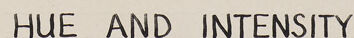
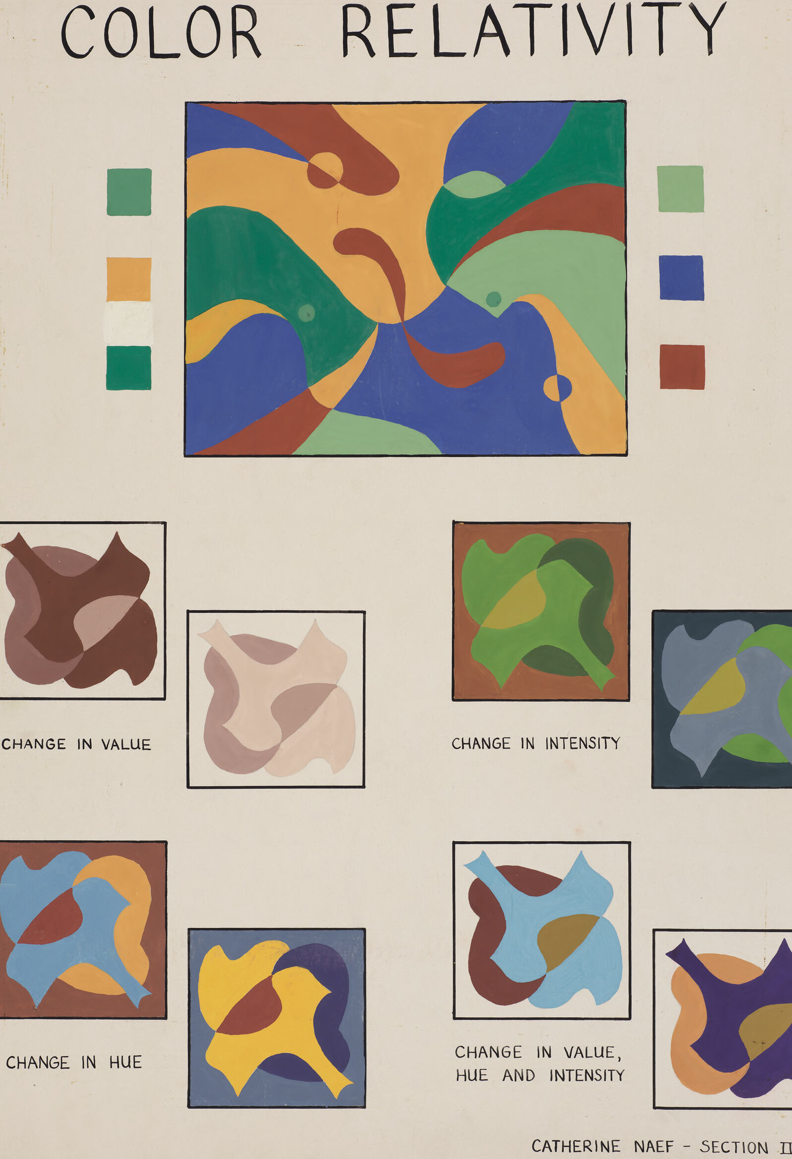
The image is a visual diagram titled "Color Relativity." It is divided into sections and incorporates various colors and their relationships through changes in value, intensity, and hue. - At the top center of the image, the title "COLOR RELATIVITY" is written in large, bold letters. - Below the title, there is a large central abstract composition featuring various organic shapes in red, green, blue, yellow, and white. - To the left of the central composition, there is a vertical set of three small color swatches in green, orange, and white, and another set on the right side with blue, green, and red swatches. - Below the central composition, there are six smaller sections, each containing a unique abstract shape combination. The six smaller sections are labeled as follows: 1. "CHANGE IN VALUE" – Features a composition shifting between darker and lighter values. 2. "CHANGE IN INTENSITY" – Shows variations in the strength of the colors. 3. "CHANGE IN HUE" – Depicts how hues (color tones) shift. 4. "CHANGE IN HUE" – Another example of hue changes, highlighting the variation. 5. "CHANGE IN VALUE, HUE AND INTENSITY" – Illustrates changes in value, hue, and intensity combined. 6. "CHANGE IN VALUE, HUE AND INTENSITY" – Another depiction integrating changes in all three elements. At the bottom right corner, there is the name "CATHERINE NAEF" followed by "SECTION II," attributing the work to an individual identified as Catherine Naef.
Created by gpt-4 on 2024-11-17
The image you've provided is an educational or informative illustration titled "COLOR RELATIVITY." It appears to be a visual representation of color theory principles or a study on how colors can be perceived differently depending on various factors. At the top of the image, there is a large title "COLOR RELATIVITY" in bold, capitalized letters. Just below the title, there are two sets of color squares — two columns on the left and two columns on the right. Each column appears to have three squares of the same color in varying shades or intensities, likely meant to demonstrate the principle of color relativity on adjacent colors. In the center, there is a large abstract painting with swirling shapes and different colors, representing the interplay and relativity of colors within a single artwork. Beneath the central piece of artwork, there are six smaller framed images organized in two rows of three. Each has a descriptive label below: 1. "CHANGE IN VALUE" – Shows three organic shapes in varying shades of brown, suggesting a visual change in lightness or darkness. 2. "CHANGE IN INTENSITY" – Three similar shapes with different levels of color saturation or brightness. 3. "CHANGE IN HUE" – Depicts the same shapes but in different colors. 4. "CHANGE IN VALUE, HUE AND INTENSITY" – The same shapes as the first, but each is affected by combined variations in value, hue, and intensity. The bottom of the image has the text "CATHERINE NAEF - SECTION II," indicating the creator or contributor of the work and possibly a section from a larger series of studies. Overall, the image serves as an educational tool to demonstrate how colors can be manipulated and how those changes affect visual perception.
Anthropic Claude
Created by claude-3-5-sonnet-20241022 on 2024-12-27
This is an educational art piece titled "COLOR RELATIVITY" that demonstrates different aspects of color theory. The image consists of a main colored abstract composition at the top, with four small colored squares on either side of it showing the basic colors used in the composition. Below the main image are several smaller variations of a similar abstract pattern, each demonstrating different color relationships: - "CHANGE IN VALUE" shows the pattern in different shades of brown - "CHANGE IN INTENSITY" shows variations in the vibrancy of greens - "CHANGE IN HUE" demonstrates the pattern using different colors while maintaining similar values - "CHANGE IN VALUE, HUE AND INTENSITY" shows multiple color variations combined This appears to be Section II of a larger work, labeled as being by Catherine Naef. The piece effectively illustrates how colors can appear different depending on their surrounding colors and how various aspects of color (value, intensity, and hue) can be manipulated in composition.
Created by claude-3-haiku-20240307 on 2024-11-17
The image appears to be an educational poster about color relativity. It features a large central abstract design with various shapes and colors, surrounded by smaller illustrations demonstrating different concepts related to color, such as change in value, change in intensity, change in hue, and change in value, hue, and intensity. The overall impression is one of exploring the relative and subjective nature of color perception and the ways in which colors can be manipulated and understood.
Meta Llama
Created by us.meta.llama3-2-90b-instruct-v1:0 on 2024-12-24
The image is a color theory chart titled "COLOR RELATIVITY" that illustrates how colors interact with each other. The chart features a central square with a multicolored abstract design, surrounded by six smaller squares that demonstrate different color relationships. **Central Square:** The central square showcases a vibrant abstract design comprising various shapes and colors, including green, blue, yellow, brown, and red. This design serves as the foundation for exploring color relationships. **Smaller Squares:** The six smaller squares surrounding the central square are labeled with different color relationships: * **Change in Value:** This square features a brown shape with varying shades of brown, demonstrating how changing the value (lightness or darkness) of a color affects its appearance. * **Change in Intensity:** This square displays a green shape with different intensities of green, illustrating how changing the intensity (saturation) of a color impacts its visual effect. * **Change in Hue:** This square presents a blue shape with different hues of blue, showing how changing the hue (color) of a shape alters its appearance. * **Change in Value, Hue, and Intensity:** This square combines changes in value, hue, and intensity, demonstrating how these factors interact to create complex color relationships. **Color Palette:** A small color palette is located to the left of the central square, featuring five colors: green, yellow, brown, blue, and red. These colors are used throughout the chart to illustrate the different color relationships. **Background:** The background of the chart is a light beige color, providing a neutral backdrop for the colorful designs and labels. **Overall:** This color theory chart effectively demonstrates how colors interact with each other, highlighting the importance of considering value, intensity, and hue when working with colors. By examining the different color relationships presented in the chart, artists and designers can gain a deeper understanding of how to use color effectively in their work.
Created by us.meta.llama3-2-11b-instruct-v1:0 on 2024-11-29
The image presents a comprehensive visual representation of color relativity, showcasing various aspects of color theory and its application in design. The title "COLOR RELATIVITY" is prominently displayed at the top, setting the tone for the content that follows. **Color Palette:** * A square color palette is situated to the left of the main image, featuring a selection of colors that are also used in the design. * The colors include green, yellow, blue, brown, and red, which are arranged in a harmonious and balanced manner. **Main Image:** * The main image is a large square that dominates the center of the page, showcasing a dynamic and abstract design. * The design features a mix of curved and straight lines, as well as various shapes and forms, all rendered in different colors. * The colors used in the design are reminiscent of the colors in the palette, but with some variations and nuances. **Color Swatches:** * Below the main image, there are several small color swatches arranged in a grid-like pattern. * Each swatch represents a different color or combination of colors, and they are labeled with descriptive text such as "CHANGE IN VALUE," "CHANGE IN INTENSITY," "CHANGE IN HUE," and "CHANGE IN VALUE, HUE AND INTENSITY." * These swatches provide a closer look at the colors used in the design and how they relate to each other. **Overall Design:** * The overall design of the image is clean and modern, with a focus on simplicity and clarity. * The use of negative space and the arrangement of the elements create a sense of balance and harmony. * The image effectively communicates the concept of color relativity and its application in design, making it a valuable resource for designers, artists, and anyone interested in color theory. In summary, the image is a visually appealing and informative representation of color relativity, showcasing a range of colors and design elements that work together to create a cohesive and engaging visual experience.
Amazon Nova
Created by amazon.nova-pro-v1:0 on 2025-01-11
The image is a poster or educational material that explains the concept of color relativity. It is titled "COLOR RELATIVITY." The poster has a white background with various sections that demonstrate how colors can change in appearance based on their surroundings. At the top, there is a large abstract painting with a mix of colors, including blue, green, yellow, and red. To the left and right of this painting, there are small squares of individual colors, likely to show the pure colors before they are influenced by their surroundings. Below the main painting, there are several smaller paintings that illustrate different aspects of color relativity. These include "CHANGE IN VALUE," "CHANGE IN INTENSITY," "CHANGE IN HUE," and "CHANGE IN VALUE, HUE, AND INTENSITY." Each of these sections shows how the perception of a color can change when placed next to different colors or when its value, intensity, or hue is altered. The poster is credited to Catherine Naef, Section II, A.
Created by amazon.nova-lite-v1:0 on 2025-01-11
The image shows a color chart titled "Color Relativity" by Catherine Naef, which is Section II of her work. The chart consists of several colored shapes, each with a label indicating the type of color change it represents. The chart is divided into three sections, with the first section showing a change in value, the second section showing a change in intensity, and the third section showing a change in hue. The chart also includes a large, abstract painting in the center, which is surrounded by smaller shapes that demonstrate the effects of color changes on the overall composition.
Text analysis
Amazon