Machine Generated Data
Tags
Color Analysis
Feature analysis
Amazon
Clarifai

AWS Rekognition
| Bird | 88.8% | |


Categories
Imagga
created on 2018-07-20
| text visuals | 97.9% | |
| paintings art | 1.4% | |
| interior objects | 0.7% | |
Captions
Microsoft
created by unknown on 2018-07-20
| a number of animals in a room | 45.4% | |
Clarifai
No captions written
Salesforce
Created by general-english-image-caption-blip on 2025-05-06
a photograph of a poster of a poster of a picture of a picture of a picture of a
Created by general-english-image-caption-blip-2 on 2025-06-29
pigment tone control by jean-luc nollet
OpenAI GPT
Created by gpt-4o-2024-05-13 on 2024-12-31
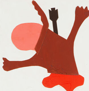
The image is of a colorful and abstract art piece titled "Pigment Tone Control." The title is prominently displayed at the top. Below the title, there are twenty small square sections arranged in a grid, each containing unique abstract shapes and designs.
The squares showcase various combinations of three main colors: Vermilion, Turquoise Blue, and Yellow Ochre, as indicated by color blocks and text at the bottom of the image. These colors are creatively combined with other hues to produce diverse patterns and compositions.
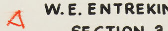
Each design within the squares features different combinations of abstract shapes, lines, and forms, creating a visually engaging and vibrant presentation. The artwork also includes some artist details at the bottom right corner: "W.E. Entrekin Jr. Section 3."
Overall, the artwork appears to be an exploration of color theory and abstract design principles.
Created by gpt-4 on 2024-11-17
This image appears to be a chart labeled "PIGMENT TONE CONTROL," possibly created for educational or demonstrative purposes related to art and color theory. The chart is organized into a grid of 20 squares, each containing an abstract or simplified graphical representation that contrasts shapes and colors. The artwork uses a colorful palette and a mix of rounded and angular forms.
There are four rows with five squares each. The squares have various background colors and within each square are abstract shapes and forms in different colors and configurations, seemingly designed to explore the relationships between the shapes and the background tones.
The bottom of the chart has a key indicating three colors used in the artwork: VERMILION, TURQUOISE BLUE, and YELLOW OCHRE, with corresponding color blocks beneath each label. In the bottom right corner, there is text that reads "W.E. ENTREKIN JR. SECTION 3," which may refer to the person who created the chart or the section of a course or book it belongs to.
The abstract nature of the graphics and the structured presentation suggests it might stem from a mid-20th-century design or color theory source, reflecting the modernist tendencies of that era in graphic design and educational materials.
Anthropic Claude
Created by us.anthropic.claude-3-5-sonnet-20241022-v2:0 on 2025-06-25
This is an artistic color study titled "PIGMENT TONE CONTROL" by W.E. Entrekin Jr. (Section 3). The image consists of a grid of 24 abstract compositions, each contained within its own square. The artwork demonstrates the use of three primary colors as noted at the bottom: Vermilion (red), Turquoise Blue, and Yellow Ochre.
Each square contains modernist, geometric abstract designs using these colors in various combinations and tones. The compositions feature simplified shapes that suggest various objects, animals, and abstract forms. Some squares appear to show birds, keys, architectural elements, and other geometric patterns.
The overall style is reminiscent of mid-century modern design and color theory exercises, with clean lines and bold color blocking. The compositions make effective use of positive and negative space, with each square working both as an individual piece and as part of the larger grid arrangement.
The artwork appears to be a teaching or demonstration piece showing how different combinations and applications of these three basic pigments can create varied and dynamic compositions. It's likely this was created as part of a design or art education context, given its instructional title and systematic approach to color exploration.
Created by claude-3-5-sonnet-20241022 on 2024-12-27
This is a color study or exercise titled "PIGMENT TONE CONTROL" by W.E. Entrekin Jr. (Section 3). The image consists of a grid of 24 abstract compositions using three main colors as indicated at the bottom: Vermilion (red), Turquoise Blue, and Yellow Ochre.
Each square contains geometric and organic shapes arranged in various abstract compositions. The designs appear to be modernist in style, using simplified forms and bold colors. Some squares feature recognizable motifs like birds, keys, and architectural elements, while others are purely abstract arrangements of shapes.
The compositions demonstrate different ways of using and combining these three primary colors, showing how they interact with each other and create different visual effects. Some squares use black or white backgrounds to create additional contrast. The overall effect is reminiscent of modernist design exercises, possibly from a design school or educational context.
The layout is clean and systematic, with each composition contained within its own square, creating a cohesive grid pattern. This appears to be an educational or experimental piece exploring color relationships and compositional techniques.
Created by claude-3-haiku-20240307 on 2024-11-17
The image appears to be a collection of abstract geometric shapes and forms in various colors, arranged in a grid format. The title "PIGMENT TONE CONTROL" suggests that this image is likely a color palette or color theory guide, with the different shapes and forms representing different color tones and combinations.
The colors featured in the palette include vermilion, turquoise blue, and yellow ochre, as indicated at the bottom of the image. The shapes and forms themselves are stylized and abstract, ranging from simple geometric shapes to more organic, biomorphic forms.
The overall impression is one of a visually striking, modernist aesthetic, with the use of bold, contrasting colors and dynamic, playful compositions. This image seems to be a visual exploration of color relationships and the expressive potential of abstract forms.
Meta Llama
Created by us.meta.llama3-2-90b-instruct-v1:0 on 2024-12-24
The image is a vibrant and eclectic composition of 25 abstract art pieces, each showcasing a unique blend of colors and shapes. The title "PIGMENT TONE CONTROL" is prominently displayed at the top in black text, setting the tone for the artistic exploration that follows.
Color Palette:
The color palette is diverse and playful, featuring a range of hues including red, blue, yellow, orange, green, brown, gray, and white. Each piece is carefully crafted to balance and contrast these colors, creating a visually appealing effect.
Shapes and Forms:
The shapes and forms used in the artwork are equally varied, ranging from geometric figures like triangles, circles, and squares to more organic shapes reminiscent of leaves, flowers, and abstracted animal forms. Some pieces feature bold, solid colors, while others incorporate subtle gradients and textures.
Arrangement:
The 25 art pieces are arranged in a grid pattern, with five rows and five columns. This structured layout provides a sense of order and cohesion, allowing the viewer to easily compare and contrast the different pieces.
Artist's Signature:
In the bottom-right corner of the image, the artist's signature is visible, accompanied by the text "W.E. ENTREKIN JR." and "SECTION 3." This adds a personal touch to the artwork, providing context and attribution.
Overall Impression:
The image exudes a sense of creativity and experimentation, as if the artist is exploring the possibilities of color and form. The use of bold colors and geometric shapes creates a dynamic and engaging visual experience, inviting the viewer to explore and interpret the artwork in their own way.
Created by us.meta.llama3-2-11b-instruct-v1:0 on 2024-11-29
The image is a poster titled "PIGMENT TONE CONTROL" and features a grid of 25 abstract shapes in various colors, with a color key at the bottom.
Title and Color Key
- The title "PIGMENT TONE CONTROL" is written in black text at the top of the image.
- Below the title, there are five small squares representing different colors: vermilion, turquoise blue, yellow ochre, and two shades of gray.
Grid of Shapes
- The grid consists of 25 small squares, each containing an abstract shape made up of geometric forms in various colors.
- The shapes are arranged in a 5x5 grid, with some rows and columns having more shapes than others.
- The shapes are diverse, ranging from simple lines and curves to more complex compositions.
Background and Author
- The background of the poster is a light beige color.
- In the bottom-right corner, there is a signature that reads "W.E. ENTREKIN JR. SECTION 3".
Overall
- The poster appears to be a design exercise or a study of color and composition.
- The use of abstract shapes and a limited color palette creates a sense of cohesion and visual interest.
- The poster may be intended to showcase the artist's skills in creating visually appealing compositions using geometric forms and color.
Amazon Nova
Created by amazon.nova-lite-v1:0 on 2025-01-13
This image features a collection of abstract paintings arranged in a grid format. Each painting is in a square shape and showcases various geometric shapes and lines in different colors. The title "Pigment Tone Control" is prominently displayed at the top of the image, indicating the focus on color and tone. Below the title, there are three color swatches representing vermilion, turquoise blue, and yellow ochre. The image is attributed to W.E. Entrekin Jr., Section 3, suggesting it is part of a larger series or collection. The paintings exhibit a range of vibrant and contrasting colors, creating a visually engaging and dynamic composition.
Created by amazon.nova-pro-v1:0 on 2025-01-13
The image is a poster titled "Pigment Tone Control," designed by W.E. Entrekin Jr. The poster features a grid of 30 abstract compositions, each using a distinct combination of colors and shapes. The compositions are arranged in a 5x6 grid, with each square containing a unique abstract design. The designs vary in complexity and style, featuring geometric shapes, lines, and organic forms. The colors used in the compositions include vermilion, turquoise blue, and yellow ochre, as indicated at the bottom of the poster. The poster appears to be a study or demonstration of color and tone control in abstract art.
Google Gemini
Created by gemini-2.0-flash on 2025-05-07
Here's a description of the image based on the provided information:
The image is a visual guide titled "Pigment Tone Control," likely used for art or design education. It features a grid of 21 abstract designs, each contained within a square. The designs are made of various shapes and colors, seemingly exploring combinations of different pigments.
The text at the bottom of the poster indicates three key colors: Vermilion, Turquoise Blue, and Yellow Ochre. These colors are likely the primary pigments used in the designs.
The bottom right corner credits "W. E. Entrekin Jr." and "Section 3," suggesting this might be part of a larger series or course.
The overall style is reminiscent of mid-century modern design. The composition suggests a study of color relationships and abstract form.
Created by gemini-2.0-flash-lite on 2025-05-07
Certainly! Here's a description of the image:
Overall Impression:
The image is a colorful, graphic composition, likely a design study or a teaching aid related to color theory. It features a grid of small, square illustrations arranged in a matrix.
Details:
- Title: The title "PIGMENT TONE CONTROL" is prominently displayed at the top, suggesting the image's purpose is to explore color relationships.
- Grid of Squares: The core of the image is a 5x4 grid of square images, each containing an abstract composition.
- Abstract Compositions: Each square features an abstract design, created through the layering of simple, geometric shapes (e.g., triangles, curves, rectangles). The shapes are in various colors and the backgrounds are a few consistent colors.
- Color Palette:
- At the bottom are three small color swatches labeled "VERMILION," "TURQUOISE BLUE," and "YELLOW OCHRE". The other colors in the squares have their origins from these colors.
- Author/Section: The bottom right corner shows the name "W. E. ENTREKIN JR." and "SECTION 3" indicating this might be from a larger series or a study.
Style/Purpose:
The style is reminiscent of modernist art or design, with a focus on form, color, and the interplay of shapes. It is most likely used to teach principles of color and design.
Mistral Pixtral
Created by us.mistral.pixtral-large-2502-v1:0 on 2025-06-02
The image is titled "Pigment Tone Control" and features a grid of 24 abstract, colorful designs arranged in a 4x6 layout. Each design consists of various geometric shapes and forms, utilizing a range of colors and contrasts. The designs are vibrant and employ a mix of primary and secondary colors, including red, blue, yellow, green, and others.
At the bottom left of the image, three color swatches are labeled:
- Vermilion (a bright red)
- Turquoise Blue (a blue-green color)
- Yellow Ochre (a warm yellow)
The bottom right corner credits "W.E. Entrekin Jr." and notes "Section 3."
The designs vary in style and complexity, showcasing different artistic techniques and color combinations. Some designs are more abstract, while others hint at recognizable forms like keys, animals, and structures. The overall effect is a visually stimulating exploration of color and form.
Qwen
Created by Qwen/Qwen2.5-VL-7B-Instruct on 2025-07-12
This image is a piece of artwork titled "Pigment Tone Control," created by W.E. Entrekin Jr. It is divided into a grid of 24 squares, each containing a unique abstract composition of shapes and forms. The artwork uses a limited color palette, with the bottom left corner indicating the colors used: vermilion, turquoise blue, and yellow ochre.
Each square features geometric and organic shapes in varying sizes and orientations, some overlapping, creating a collage-like effect. The shapes are cut out from different colors, often placed against contrasting backgrounds, and arranged in a way that suggests a sense of movement or interaction. The overall composition is visually dynamic, with a mix of sharp lines and softer curves, and the use of color contrasts adds depth and interest to each individual square. The piece appears to explore the interplay between color, shape, and space in abstract art.
Created by Qwen/Qwen2.5-VL-72B-Instruct on 2025-07-12
This image is a visual demonstration titled "PIGMENT TONE CONTROL," created by W.E. Entrekin Jr., Section 3. It features a grid of 20 squares arranged in five rows and four columns. Each square contains abstract shapes in various colors, demonstrating the use of color mixing and tone control.
At the bottom of the image, there are three color swatches labeled with their names: Vermilion, Turquoise Blue, and Yellow Ochre. These colors are likely the primary colors used in the color mixing examples shown in the grid.
The abstract shapes in each square are designed to show how different pigments can be mixed to create various tones and shades. The background colors of the squares vary, and the shapes within them are in contrasting colors, further emphasizing the effect of pigment tone control. The overall design is both informative and visually engaging, providing a practical example of color theory in action.
Text analysis
Amazon