Machine Generated Data
Tags
Color Analysis
Feature analysis
Amazon
Clarifai

AWS Rekognition
| Poster | 72.2% | |

Categories
Imagga
created on 2019-03-22
| paintings art | 95.6% | |
| text visuals | 4.4% | |
Captions
Microsoft
created by unknown on 2019-03-22
| a screenshot of a cell phone screen with text | 44.9% | |
| a close up of text on a white background | 44.8% | |
| a close up of text on a white surface | 44.7% | |
Clarifai
Created by general-english-image-caption-clip on 2025-07-13
painting artist, a painter of color.
Salesforce
Created by general-english-image-caption-blip on 2025-05-20
a photograph of a poster of a colorful abstract painting of a bird
OpenAI GPT
Created by gpt-4 on 2025-03-05
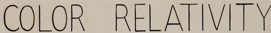
This image showcases a chart titled "COLOR RELATIVITY" by J. Edwards, Section I. It appears instructional, possibly for an educational or artistic context, and contains nine squares divided into three rows and three columns, each representing different aspects of color theory.
In the first row under the label "VALUE," there are three squares with abstract shapes within them, each composed of various colors. The theme seems to be to demonstrate how the same shapes can appear different depending on the value (lightness or darkness) of the colors used.
The second row labeled "HUE" shows the shapes in varying colors to demonstrate their appearance with different hues. The hues are vibrant and distinctly different from one another.
The third row contains three labels and squares corresponding to "INTENSITY," "VALUE HUE,"
and "INTENSITY" again. These squares likely illustrate variations in color saturation or purity (intensity), a combination of values and hues, and intensity comparisons, respectively. Each square features a different color scheme and intensity level, making the shapes within appear differently due to these changes.
Additionally, to the left of the large central square, there is a column of color swatches seemingly corresponding to the examples presented in the squares for comparison.
The image helps demonstrate how color properties such as value, hue, and intensity can affect visual perception of the same object. The graphic design is clean and modernist, suggesting it might be from a mid-20th-century educational book or poster on color theory.
Created by gpt-4o-2024-05-13 on 2025-03-05
The image is an educational visual on "Color Relativity," created by J. Edwards. It is divided into sections that explore how different color properties—Value, Hue, and Intensity—affect perception.
At the top, there are four small squares labeled "Value." These squares show how different shades of a color can vary in lightness and darkness.
Next to these, there are four more squares labeled "Hue," displaying the impact of different base colors on a similar pattern.
The center features a larger black square containing a more complex and colorful abstract design. This design showcases a variety of hues, values, and intensities to demonstrate the concept of color relativity within a single image.
Adjacent to this central image, there are smaller squares demonstrating various colors presumably used within the image, possibly to highlight specific hues and their relationships.
Below the central image, there are four more squares. The first two are labeled "Intensity," showing how different levels of saturation can change the appearance of a pattern. The third square is labeled "Value Hue," combining the properties of value and hue, while the fourth square shows an example combining all three properties: "Value, Hue, Intensity."
The artist's name, J. Edwards, along with a section identifier "SEC.I" is noted in the bottom corner, indicating perhaps a classroom or project designation. Overall, the poster serves as a guide to understanding how changing value, hue, and intensity can alter the perception of color in artworks and designs.
Anthropic Claude
Created by us.anthropic.claude-3-5-sonnet-20241022-v2:0 on 2025-06-26
This is an educational art piece titled "COLOR RELATIVITY" that demonstrates different aspects of color theory. The composition consists of eight smaller squares arranged around a larger central black rectangle, with small color swatches on the sides.
The top row shows four variations labeled "VALUE" and "HUE," each containing similar abstract geometric shapes in different color combinations. The bottom row shows four more variations labeled "INTENSITY," "VALUE HUE," and "INTENSITY."
The central black rectangle contains a larger abstract composition with various geometric shapes in different colors including yellow, blue, green, red, and brown, creating a dynamic arrangement against the dark background.
The piece appears to be a teaching tool or study of how colors relate to each other and how they change in appearance based on their value (lightness/darkness), hue (actual color), and intensity (brightness/dullness). It's signed "J. EDWARDS SEC. I" at the bottom right corner.
The overall design is clean and methodical, typical of color theory educational materials, with each section clearly demonstrating different aspects of how colors interact with each other.
Created by claude-3-haiku-20240307 on 2025-01-21
The image appears to be an educational illustration about color theory, specifically exploring the concepts of color relativity. It is divided into several sections that demonstrate different color relationships, such as value, hue, and intensity.
The top section shows four abstract square compositions that illustrate different aspects of color relativity. The bottom section includes a larger abstract composition featuring overlapping geometric shapes and forms in various colors.
The overall visual style of the image is modernist, with bold, simplified shapes and a limited color palette. It seems to be using these abstract color studies to teach principles of color theory and perception.
Created by claude-3-5-sonnet-20241022 on 2025-01-21
This is a color theory educational illustration titled "COLOR RELATIVITY." The image demonstrates different aspects of color relationships through abstract geometric compositions. At the center is a larger black-background composition featuring various colored angular shapes arranged in an artistic pattern.
Surrounding this central piece are eight smaller square compositions showing the same basic geometric arrangement but with different color variations to demonstrate various color principles:
- The top row shows examples of "VALUE" and "HUE" variations
- The bottom row illustrates "INTENSITY" and "VALUE HUE INTENSITY"
On the sides of the central composition are small color swatches that appear to show the palette used in the artwork.
The entire piece is arranged on a light background and appears to be an instructional design piece, signed "J. EDWARDS SEC. I" at the bottom right. The style is characteristic of mid-20th century modernist design and color theory education materials.
The compositions use angular, abstract shapes that interlock and overlap, with each variation demonstrating how different color properties (value, hue, and intensity) affect the viewer's perception of the relationships between colors.
Created by claude-3-opus-20240229 on 2025-01-21
The image depicts color relativity concepts using geometric shapes in different color combinations. At the top, it shows how the perceived color (hue) of a simple 3D geometric shape can vary based on the color (value) of the background square behind it. In the center is a more complex composition of overlapping angular shapes in multiple colors on a black background. Below that, it presents a grid showing how both the value and intensity of colors impact their appearance, with brighter, more saturated colors on the right side of the grid. The text labels the concepts being demonstrated as "COLOR RELATIVITY", "VALUE", "HUE", and "INTENSITY". The image appears to be an educational illustration, likely from the mid-20th century based on the style.
Meta Llama
Created by us.meta.llama3-2-90b-instruct-v1:0 on 2025-01-21
The image is a color chart titled "COLOR RELATIVITY" in black text at the top. The chart features nine squares, each containing a unique geometric design composed of various shapes and colors. The squares are arranged in three rows of three, with the top row labeled "VALUE," the middle row labeled "HUE," and the bottom row labeled "INTENSITY."
Each square has a corresponding color palette to its left, showcasing the individual colors used in the design. The background of the chart is a light beige color, providing a neutral backdrop for the vibrant designs. The overall effect is one of visual interest and complexity, as the viewer's eye is drawn to the intricate patterns and colors within each square.
Created by us.meta.llama3-2-11b-instruct-v1:0 on 2025-01-21
The image presents a color palette poster titled "COLOR RELATIVITY" in black text at the top. The poster features a beige background with a central square containing abstract shapes in various colors, including brown, yellow, blue, green, and red. This central square is surrounded by smaller squares, each displaying a different color combination of the same abstract shapes.
The poster is divided into four sections, each labeled with a different color term: VALUE, HUE, INTENSITY, and VALUE HUE INTENSITY. Each section contains three small squares, showcasing different color combinations of the abstract shapes. The VALUE section features squares with a range of colors, from light to dark. The HUE section displays squares with different hues, such as red, blue, and yellow. The INTENSITY section shows squares with varying levels of intensity, from bright to muted. The VALUE HUE INTENSITY section combines all three elements, creating a complex color palette.
Overall, the poster provides a comprehensive exploration of color relativity, demonstrating how different colors can be combined to create unique and interesting effects.
Amazon Nova
Created by amazon.nova-lite-v1:0 on 2025-01-12
The image is a color relativity poster, featuring a colorful and abstract design. The poster has a white background with a grid-like structure, and it is divided into several sections. The main section in the center is a large, colorful abstract design with various shapes and colors. The text "COLOR RELATIIVITY" is prominently displayed at the top of the poster in bold letters. Below the main section, there are smaller sections with the words "VALUE," "HUE," and "INTENSITY." Each section contains different colored shapes and patterns, illustrating the concepts of color value, hue, and intensity. The poster also includes a signature "J.EDWARDS SEC.I" at the bottom right corner.
Created by amazon.nova-pro-v1:0 on 2025-01-12
The image is a color relativity chart with a white background. It has a title at the top, "COLOR RELATIVITY," in black font. The chart is divided into four main sections, each labeled with a different color property: "VALUE," "HUE," and "INTENSITY." Each section contains several small squares with different color combinations. The bottom of the chart is labeled with the artist's name, "J. EDWARDS SEC. I," in black font.
Created by amazon.nova-pro-v1:0 on 2025-01-21
The image is a rectangular diagram that appears to be a visual representation of color theory. At the top, the words "COLOR RELATIVITY" are written in bold, capital letters. Below this, there are three rows of smaller images, each containing different combinations of colors and shapes. The first row has four images that represent "VALUE", "HUE", "INTENSITY", and "VALUE HUE INTENSITY". The second row has one large image that represents the combination of all three elements. The third row has four images that represent the different combinations of "VALUE", "HUE", and "INTENSITY". The image is likely used to explain the concept of color relativity and how different combinations of colors can create different effects.
Created by amazon.nova-lite-v1:0 on 2025-01-21
The image is a visual representation of color relativity, showcasing various color combinations and their effects on perception. The title "Color Relativity" is prominently displayed at the top of the image. Below the title, there are several colorful geometric shapes, each labeled with a specific color term. These shapes are arranged in a grid-like pattern, with each row representing a different color combination. The image also includes a central abstract design with multiple colors, emphasizing the concept of color relativity.
Google Gemini
Created by gemini-2.0-flash-lite on 2025-04-29
The image is a poster or educational diagram about color relativity. It has a light beige background with the title "COLOR RELATIVITY" at the top. Below this, there are several sections displaying how colors can be perceived differently based on their context.
The main section of the poster focuses on a large, complex shape composed of various abstract geometric forms, with black as a background. Around this main area, there are smaller square boxes.
There are two main axes of color relativity:
- VALUE: the box shows how the shapes are perceived depending on the darkness of their background.
- HUE: the box shows how the shapes are perceived depending on their color.
- INTENSITY: the box shows how the shapes are perceived depending on their saturation.
- VALUE, HUE: displays the shape with different colors and values.
- INTENSITY: displays the shape with different intensity of colors.
In each square, there is a similar abstract shape composed of geometric forms, but the color combinations and backgrounds change to demonstrate the different color principles.
There are small squares with different color samples beside the main shape. At the bottom right, there is text that says "J. EDWARDS SEC. I." which likely indicates the creator and section number.
Created by gemini-2.0-flash on 2025-04-29
The image is a piece of art called "Color Relativity," and it appears to be an instructional illustration or diagram. Here's a breakdown of the elements:
Title: The words "COLOR RELATIVITY" are printed at the top.
Central Image: In the middle, there's a black square. Within the square are geometric, angular shapes in a variety of colors, including blue, yellow, brown, green, red, and tan.
Surrounding Squares: Encircling the central black square are additional squares, each featuring similar geometric shapes to those inside the central square but with altered color palettes. These squares are grouped and labeled with terms associated with color theory: "VALUE", "HUE", and "INTENSITY".
Color Samples: Next to each grouping of squares, there are color swatches.
Signature: At the bottom right corner, the name "J. EDWARDS" is written, followed by "SEC. I"
The overall purpose seems to be demonstrating how colors appear differently based on their surroundings and variations in color properties like value, hue, and intensity.
Mistral Pixtral
Created by us.mistral.pixtral-large-2502-v1:0 on 2025-05-26
This image is an educational poster titled "Color Relativity" created by J. Edwards. It explores the concepts of value, hue, and intensity in color theory through a series of abstract geometric shapes.
Here is a detailed breakdown of the poster:
Title:
- "Color Relativity" is written at the top center of the poster.
Sections:
- The poster is divided into several sections, each labeled to represent different aspects of color:
- Value:
- The top left section shows a set of shapes against a blue background. The shapes vary in brightness and darkness, illustrating the concept of value (lightness or darkness of a color).
- Hue:
- The top right section features shapes against a red background. The shapes display different hues (the pure color types, such as red, blue, yellow, etc.).
- Intensity:
- The bottom left section presents shapes against a dark background. The shapes vary in intensity (the brightness or dullness of a color).
- Combined Concepts:
- The bottom right section combines the concepts of value, hue, and intensity with shapes against a pink background.
- Value:
- The poster is divided into several sections, each labeled to represent different aspects of color:
Central Image:
- In the middle of the poster, there is a larger, more complex arrangement of shapes against a black background. This central image likely serves as a focal point to demonstrate the interaction of value, hue, and intensity together.
Color Swatches:
- Surrounding the central image and the labeled sections are small color swatches. These swatches correspond to the colors used in the shapes, providing a quick reference for the hues, values, and intensities depicted.
Artist/Creator:
- The name "J. Edwards" is noted at the bottom right, indicating the creator of the poster.
Overall, the poster is a visual representation of how different attributes of color (value, hue, and intensity) interact and relate to each other, providing a comprehensive overview of color relativity.
Qwen
No captions written
Text analysis
Amazon