Machine Generated Data
Tags
Color Analysis
Feature analysis
Amazon
| Bird | 66.9% | |


Categories
Imagga
| paintings art | 99.7% | |
| interior objects | 0.2% | |
Captions
OpenAI GPT
Created by gpt-4o-2024-05-13 on 2024-12-30
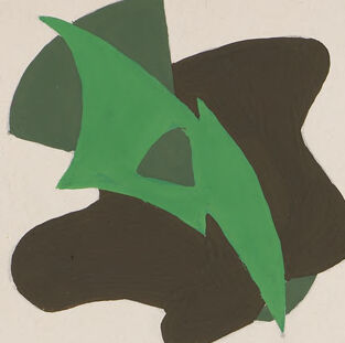
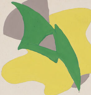
This image is titled "Color Relativity" and explores the concept through multiple visual examples. It consists of a central abstract composition of various overlapping shapes in different colors and shades, surrounded by several smaller sections that demonstrate how value, hue, and intensity influence the perception of color. 1. **Top Section**: - There are two side-by-side comparisons under the label "value". Each pair features a green abstract shape set against different background colors, showing how the perception of the green changes with varied background values. - Two more pairs are labeled "hue". These pairs show abstract colored shapes changing in hue while paired with different hues in the backgrounds, demonstrating how surrounding colors influence the perceived hue. 2. **Middle Section**: - The central portion of the image contains a larger abstract painting. This composite image incorporates light and dark values, warm and cool hues, and different saturations/intensities of colors. To the right and left of this painting are small color swatches showcasing various shades and tones used within the artwork. 3. **Bottom Section**: - The first example under the label "intensity" demonstrates how a green shape on different intensities of yellow backgrounds affects how the green is perceived. - The second set shows a change in background hue from brown to pink, with a green abstract shape in the foreground. - The last section labeled "value - hue - intensity" displays how all three factors interact. It contains different abstract shapes set against backgrounds which vary in value, hue, and intensity. The image is signed "B. Jones – II" in the bottom right corner.
Created by gpt-4 on 2024-11-19
This image appears to be an educational poster or chart demonstrating the concept of "COLOR RELATIVITY," as indicated by the large text at the top. The poster is organized into different sections, each illustrating a different aspect of how colors interact and how our perception of them can change depending on certain variables. In the upper half, there are three labeled sections aligned horizontally: - The first section on the left is labeled "value" and presents three abstract images with different shades of green in varying degrees of lightness or darkness against different backgrounds. - The center section is labeled "hue" and shows a trio of images in different color schemes (yellow and green, blue and purple, pink and red), each with the same abstract design. - On the right, there's no label, but it follows the same format as the others with abstract designs featuring the same shapes in various hues. Below these sections, there are two columns of color swatches on the left side illustrating different values and intensities of color. The center of the poster features a larger abstract design incorporating a variety of colors and shapes, possibly to demonstrate how different colors and values can be used in a single composition. Below the central image, there are smaller sections aligned horizontally: - The first one on the left is labeled "intensity," displaying abstract images with bright and muted versions of the same colors. - The section in the middle shows a single composition across two panels labeled "value – hue – intensity," suggesting that this piece incorporates considerations of lightness/darkness (value), the actual color (hue), and the vividness or dullness (intensity). - The third one isn't labeled. In the bottom right corner, there's the name "B. Jones - II," likely indicating the creator of the poster or this specific presentation. The overall design of the poster is educational, providing a visual reference to concepts of color theory which are valuable to artists, designers, and anyone studying color dynamics.
Anthropic Claude
Created by claude-3-5-sonnet-20241022 on 2024-12-27
This is an educational illustration about color relativity demonstrating different aspects of color theory. The image is divided into several sections: At the top, there are four squares showing the same abstract shape in different color combinations, labeled "value" and "hue." In the center, there's a larger rectangular composition featuring an abstract pattern with various overlapping shapes in muted tones of brown, grey, yellow, green, and pink. On either side of this central composition are small color swatches showing the palette used. At the bottom, there are four more squares showing similar abstract shapes demonstrating "intensity" and "value-hue-intensity" relationships. The shapes are rendered in different color combinations to show how these color properties interact. The title "COLOR RELATIVITY" is displayed at the top of the composition, and it appears to be signed "B. Jones - II" at the bottom right corner. The overall piece appears to be a teaching tool or study of color theory principles.
Created by claude-3-haiku-20240307 on 2024-11-19
The image shows a visual representation of color relativity, which explores the concepts of value, hue, and intensity in color theory. The top portion of the image contains four squares demonstrating different color values and hues, while the bottom portion features various color combinations illustrating the relationships between value, hue, and intensity. The abstract shapes and patterns in the central image appear to be an artistic application of these color theory principles, showcasing how different combinations and arrangements of colors can create varying visual effects. This image serves as an educational tool to help understand the fundamental aspects of color and how they interact with one another, which is an important consideration in fields such as art, design, and visual communication.
Meta Llama
Created by us.meta.llama3-2-90b-instruct-v1:0 on 2024-12-24
The image is a poster titled "COLOR RELATIVITY" that showcases the different aspects of color. The poster is divided into sections, each highlighting a specific aspect of color. **Value**: This section features three abstract shapes in various shades of green, yellow, and brown, demonstrating how value affects the perception of color. **Hue**: This section displays three abstract shapes in different hues, including blue, purple, and pink, illustrating how hue contributes to the overall appearance of color. **Intensity**: This section presents three abstract shapes in varying intensities of yellow, green, and brown, demonstrating how intensity impacts the visual effect of color. **Value-Hue-Intensity**: This section combines all three aspects of color, featuring an abstract shape with multiple colors and shades, showcasing how value, hue, and intensity interact to create a complex visual effect. Overall, the poster provides a comprehensive overview of the different aspects of color and how they work together to create a wide range of visual effects.
Created by us.meta.llama3-2-11b-instruct-v1:0 on 2024-11-29
The image presents a comprehensive color theory chart, titled "COLOR RELATIVITY," which explores the relationships between different colors and their intensities. The chart is divided into several sections, each focusing on a specific aspect of color theory. * **Value** * The value section features three abstract shapes in various colors, with each shape representing a different value (lightness or darkness). * The colors used are green, yellow, brown, and gray. * The shapes are arranged in a way that creates a sense of depth and dimensionality. * **Hue** * The hue section displays three abstract shapes in different hues (colors). * The colors used are blue, purple, and red. * The shapes are arranged in a way that creates a sense of movement and energy. * **Intensity** * The intensity section features three abstract shapes in different intensities (brightness or saturation). * The colors used are yellow, green, and brown. * The shapes are arranged in a way that creates a sense of contrast and visual interest. * **Value - Hue - Intensity** * The value - hue - intensity section combines all three aspects of color theory, featuring three abstract shapes that demonstrate the relationships between value, hue, and intensity. * The colors used are a mix of the previous sections, with additional colors added to create a more complex and nuanced palette. * The shapes are arranged in a way that creates a sense of harmony and balance. Overall, the chart provides a clear and concise visual representation of the relationships between different colors and their intensities, making it a useful tool for artists, designers, and anyone interested in color theory.
Amazon Nova
Created by amazon.nova-pro-v1:0 on 2025-01-12
The image is a visual representation of the concept of color relativity. It features a series of color swatches and abstract shapes arranged in a structured layout on a white background. The title "COLOR RELATIVITY" is prominently displayed at the top center of the image in bold, uppercase letters. Below the title, there are four rows of color swatches, each labeled with a different color property: "value," "hue," "intensity," and "value - hue - intensity." Each row contains four small, square color swatches, each accompanied by a corresponding abstract shape that demonstrates the color property. The shapes are painted in various colors and shades, showcasing the relativity of color perception based on the surrounding colors and context. The image effectively illustrates how the perception of color can change depending on the context and the other colors present.
Created by amazon.nova-lite-v1:0 on 2025-01-12
The image features a white background with a title "COLOR RELATIVE" at the top. Below the title, there are several sections of illustrations and text. The first section has four illustrations of a green leaf-like shape, each in a different color, with the text "value" underneath. The second section has four illustrations of a leaf-like shape in different colors, with the text "hue" underneath. The third section has a large illustration of a colorful, abstract pattern with the text "value-hue-intensity" underneath. The fourth section has four illustrations of a leaf-like shape in different colors, with the text "intensity" underneath. The image appears to be a visual representation of color theory and the relationships between color values, hues, and intensities.
Text analysis
Amazon