Machine Generated Data
Tags
Color Analysis
Feature analysis
Amazon
Clarifai
AWS Rekognition
| Bird | 80.9% | |


Categories
Imagga
created on 2018-08-22
| paintings art | 100% | |
Captions
Microsoft
created by unknown on 2018-08-22
| a graffiti covered wall | 62.2% | |
| a bunch of graffiti on a wall | 51.7% | |
| a lot of graffiti on a wall | 51.6% | |
Clarifai
No captions written
Salesforce
Created by general-english-image-caption-blip on 2025-05-14
a photograph of a picture of a picture of a painting of a woman's face
Created by general-english-image-caption-blip-2 on 2025-06-30
a painting with different colors and shapes
OpenAI GPT
Created by gpt-4o-2024-05-13 on 2024-12-30
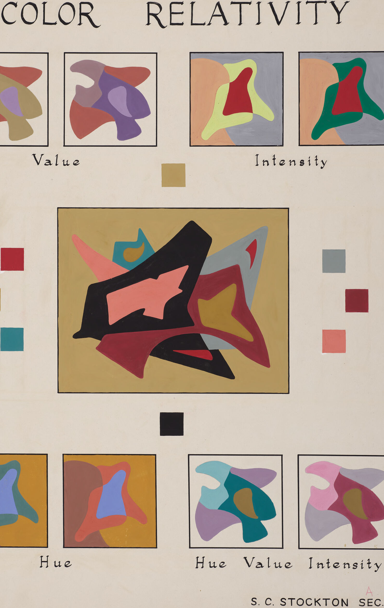
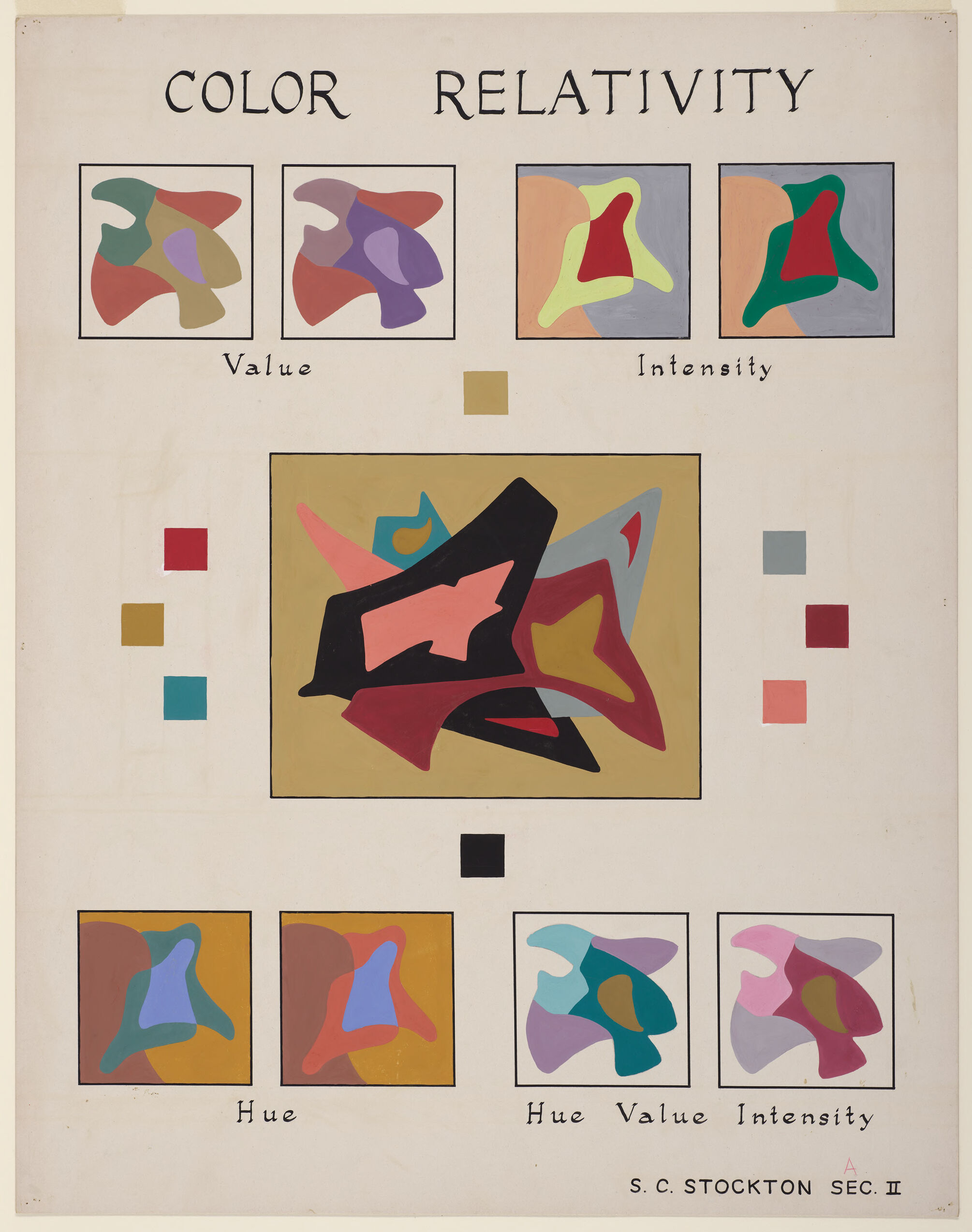
The image is a visual composition illustrating the concept of "Color Relativity." It is divided into multiple sections, each demonstrating different aspects or properties of color: value, intensity, and hue.
At the top of the image, the title "COLOR RELATIVITY" is prominently displayed. Below the title, there are four smaller sections arranged in a grid. Each of these sections contains abstract, multi-colored shapes demonstrating different color interactions:
- The top left corner is labeled "Value" and includes two abstract shapes with varying shades.
- The top right corner is labeled "Intensity" and shows shapes with different saturation levels.
- The bottom left corner is labeled "Hue" and includes shapes demonstrating varying hues.
- The bottom right corner combines all three properties: "Hue Value Intensity."
In the center of the image, there’s a larger section with an abstract, multi-colored artwork, likely meant to bring together the principles of value, intensity, and hue. Surrounding this central artwork, there are also small color swatches of different hues.
Lastly, the bottom right corner of the image includes the signature of the artist or creator, "S.C. Stockton," along with "Sec. II," indicating perhaps a section or version of the work. The overall composition uses abstract, non-representational forms to explore and communicate the relationships and interactions among different colors.
Created by gpt-4 on 2024-11-19
The image shows a visual study of color titled "COLOR RELATIVITY." It appears to be an educational or explanatory poster, possibly for artistic or design instruction.
The center of the poster features a large, colorful abstract composition with a variety of irregular shapes overlapping one another in different colors. The style is similar to abstract art, with forms that do not represent any particular objects.
Around this central composition are six smaller framed images, three above and three below. Each smaller frame is labeled with a term related to color theory:
- The top left frame is labeled "Value" and contains an abstract composition with muted, earthy tones.
- The top center frame is labeled "Intensity" and has two images of vibrantly colored abstract shapes, each set against a differently colored background.
- The top right frame is not distinctly labeled but based on its position and relationship to the others, it also presents an aspect of color relationships.
- The bottom left frame is labeled "Hue" and displays a colorful abstract with primary colors.
- The bottom center frame is labeled "Hue Value Intensity" and features a composition with various hues, showing shifts in intensity and value.
- The bottom right frame again isn't distinctly labeled but ties in with the other color studies.
Small color squares flank the central image, potentially serving as reference points or examples of the hues and tones discussed.
At the bottom of the image, the letters "A" and "S.C. STOCKTON SEC. II" suggest that the poster is part of a series or educational section, possibly created by or for someone named S.C. Stockton, in a section numbered II.
Overall, the poster seems to be an educational tool designed to illustrate the principles of color theory, specifically how colors interact with and are perceived relative to one another in terms of value, intensity, and hue.
Anthropic Claude
Created by claude-3-5-sonnet-20241022 on 2024-12-27
This is an educational artwork titled "COLOR RELATIVITY" that demonstrates different aspects of color theory. The image is composed of several abstract geometric compositions arranged around a central, larger piece. At the top, there are four squares labeled "Value" and "Intensity" showing how the same basic shapes can appear different when their color properties are altered. Small color squares are arranged on either side of the central composition, which features black, red, and pink abstract shapes on a golden background. The bottom row shows more variations labeled "Hue" and "Hue Value Intensity," demonstrating how changing these color properties affects the visual perception of similar forms. The artwork appears to be signed "S. C. STOCKTON SEC. II" and serves as a teaching tool for understanding color relationships and their effects in art and design.
Created by claude-3-haiku-20240307 on 2024-11-19
This image appears to be an instructional poster or diagram about the concept of color relativity. It presents various examples of abstract, geometric shapes and patterns that illustrate the principles of value, intensity, hue, hue value, and hue intensity in relation to color. The poster is titled "Color Relativity" and provides visual demonstrations of how color perception can change based on these different color properties and their interplay. The overall focus seems to be on exploring the relative nature of color through these abstract artistic compositions.
Created by us.anthropic.claude-3-5-sonnet-20241022-v2:0 on 2025-06-26
This is an educational art diagram titled "COLOR RELATIVITY" that demonstrates different aspects of color theory. The image is composed of several squares containing abstract shapes, each illustrating different color properties:
At the top, there are four squares labeled "Value" and "Intensity" showing how the same abstract shape appears when rendered with different color values and intensities.
In the center, there's a larger rectangular composition on a gold background featuring abstract shapes in black, red, pink, and other colors.
Around this central image are small color squares on either side showing different color swatches.
At the bottom, there are four more squares labeled "Hue" and "Hue Value Intensity" demonstrating how the same abstract shape appears when different color properties are adjusted.
The overall composition appears to be an instructional piece, likely used for teaching color theory principles. The work is credited to "S. C. STOCKTON SEC. II" at the bottom of the image.
The style is modernist and appears to be from a mid-20th century art education context, using clean lines and flat colors to demonstrate color relationships and properties.
Meta Llama
Created by us.meta.llama3-2-90b-instruct-v1:0 on 2024-12-24
The image is a color chart titled "COLOR RELATIVITY" that illustrates the concepts of value, intensity, and hue in color theory. The chart features a series of abstract shapes in various colors, each representing different aspects of color relativity.
Value: The top row of the chart shows three squares with abstract shapes in different colors, labeled as "Value". These shapes demonstrate how the same color can have different values (lightness or darkness) depending on its surroundings.
Intensity: The second row of the chart shows three squares with abstract shapes in different colors, labeled as "Intensity". These shapes illustrate how the same color can have different intensities (saturation or brightness) depending on its surroundings.
Hue: The third row of the chart shows three squares with abstract shapes in different colors, labeled as "Hue". These shapes demonstrate how the same color can have different hues (color appearance) depending on its surroundings.
Color Chart: The center of the chart features a large square with an abstract shape in various colors, surrounded by smaller squares with different colors. This chart illustrates how the same color can appear differently depending on its surroundings, demonstrating the concept of color relativity.
Overall, the image provides a visual representation of the complex relationships between color, value, intensity, and hue, highlighting the importance of considering the context in which colors are used.
Created by us.meta.llama3-2-11b-instruct-v1:0 on 2024-11-29
The image presents a comprehensive analysis of color relativity, featuring a title at the top that reads "COLOR RELATIVITY" in black text. Below the title, three columns of images are arranged, each containing a series of abstract shapes in various colors. The left column is labeled "Value," the middle column is labeled "Intensity," and the right column is labeled "Hue."
Value Column:
- The first image in this column displays a range of colors, including red, green, blue, and yellow.
- The second image shows a more muted palette, with shades of brown, beige, and gray.
- The third image features a bold and vibrant color scheme, with bright reds, blues, and yellows.
Intensity Column:
- The first image in this column presents a subtle gradient of colors, with soft pastels and muted tones.
- The second image showcases a more dramatic contrast between light and dark, with bold blacks and whites.
- The third image features a dynamic and energetic color scheme, with bright whites and deep blacks.
Hue Column:
- The first image in this column displays a range of warm colors, including oranges, yellows, and reds.
- The second image features a cool color scheme, with blues, greens, and purples.
- The third image presents a neutral color palette, with shades of gray, beige, and taupe.
Central Image:
- A large, abstract shape dominates the center of the image, featuring a mix of colors from all three columns.
- The shape is surrounded by smaller, colorful squares that represent the different hues and intensities.
Background:
- The background of the image is a light beige color, providing a clean and neutral backdrop for the colorful shapes and text.
Text:
- The title "COLOR RELATIVITY" is written in black text at the top of the image.
- The labels for each column are also written in black text, with the words "Value," "Intensity," and "Hue" appearing below each column.
- The artist's name, "S.C. STOCKTON SEC. II," is written in small text at the bottom right corner of the image.
Overall, the image provides a visually striking representation of color relativity, showcasing the complex relationships between different hues, intensities, and values.
Amazon Nova
Created by amazon.nova-lite-v1:0 on 2025-02-28
The image shows a page from a book or a document titled "Color Relativity." The page contains a series of abstract paintings and illustrations arranged in a grid-like pattern. The paintings are in various colors, shapes, and sizes, and they seem to be related to the concept of color relativity.
At the top of the page, there are two rows of smaller paintings, each labeled with the words "Value" and "Intensity." Below these rows, there is a larger central painting labeled "Hue." The paintings are arranged in a way that suggests they are related to each other and to the concepts of value, intensity, and hue.
The page also includes a few other elements, such as a small square labeled "A" and a name "S.C. Stockton Sec. II" at the bottom. The overall design and layout of the page suggest that it is part of a larger work or publication that explores the topic of color relativity.
Created by amazon.nova-pro-v1:0 on 2025-02-28
The image is a color study of an artwork. The artwork is titled "COLOR RELATIVITY" and is divided into two sections. The upper section has four color studies, each with a different color combination. The first two are labeled "Value," and the last two are labeled "Intensity." The lower section has four more color studies, each with a different color combination. The first two are labeled "Hue," and the last two are labeled "Hue Value Intensity." The artwork is a study of color relationships and how they can be manipulated to create different effects.
Google Gemini
Created by gemini-2.0-flash on 2025-06-04
The image is an abstract painting or illustration focused on the concept of "Color Relativity." The composition includes several sections:
Title: At the top, the words "COLOR RELATIVITY" are written in black letters.
Abstract Shapes: Throughout the image, there are abstract shapes within squares, arranged in various configurations. The central and the smaller rectangles have the same kind of shapes inside it, with varying colors.
Color Squares: Next to the central abstract painting, there are small squares that presumably represent the colors present in the central abstract.
Labels: Beneath certain sections of abstract shapes, there are words like "Value," "Intensity," and "Hue." These labels seem to categorize the abstract shapes based on these color properties.
Artist's Mark: At the bottom of the image, there's a name or a signature that reads "S. C. STOCKTON SEC. II".
Overall, the artwork appears to be an illustrative explanation of color relativity, using abstract shapes and contrasting colors to demonstrate how different elements can affect how colors are perceived.
Created by gemini-2.0-flash-lite on 2025-06-04
This image is a color theory chart. It is titled "Color Relativity".
The chart is divided into sections that appear to demonstrate the different aspects of color, including value, intensity, and hue. There are squares filled with different colors to illustrate the concepts, as well as abstract shapes. The central image is a large abstract painting with several interlocking shapes in various colors. There are also squares of various colors near the center. The artist's name and the "SEC II" are displayed in the lower right corner.
Mistral Pixtral
Created by us.mistral.pixtral-large-2502-v1:0 on 2025-06-03
The image is an educational illustration titled "Color Relativity," which appears to be a study on the relativity of color perception. It is divided into several sections, each demonstrating different aspects of color:
Top Row (Left to Right):
- Value: Two squares show abstract shapes in varying shades, focusing on the lightness or darkness of colors.
- Intensity: Two squares display abstract shapes with different levels of color saturation or brightness.
Middle Section:
- A central abstract composition with various shapes in different colors and shades. This section seems to combine multiple color attributes.
- Surrounding the central composition are small color swatches, likely representing the colors used in the central piece.
Bottom Row (Left to Right):
- Hue: Two squares show abstract shapes focusing on different hues (the color itself, like red, blue, green, etc.).
- Hue Value Intensity: Two squares combine all three attributes—hue, value, and intensity—in abstract shapes, demonstrating how these elements interact together.
The image is credited to "S.C. Stockton Sec II," which might indicate the creator or the source of this educational material. The overall purpose of the image is to illustrate how color perception can change based on the context provided by surrounding colors, highlighting the concepts of hue, value, and intensity.
Qwen
Created by Qwen/Qwen2.5-VL-7B-Instruct on 2025-07-12
The image is an educational diagram titled "COLOR RELATIVITY," created by S.C. Stockton. It appears to be a study or exploration of color theory, focusing on the concepts of hue, value, intensity, and their interrelations.
Top Section:
- There are four squares labeled "Value" and "Intensity." Each square contains abstract shapes in various hues and values, demonstrating how color appears with different levels of lightness and darkness. The shapes are colored in red, green, yellow, and other colors, set against a gray background, which helps to emphasize the changes in value and intensity.
Middle Section:
- The central large square contains a complex abstract design with overlapping shapes in different colors, including red, black, and blue. This design is surrounded by smaller colored squares that likely represent different hues. The arrangement suggests a study of color harmony or contrast.
Bottom Section:
- There are four additional squares labeled "Hue," "Hue Value," and "Hue Value Intensity." These squares contain abstract shapes with different hues, values, and intensities, further illustrating the interactions and relationships between these attributes.
The overall layout and design of the image are structured to demonstrate how color perception and relationships can be manipulated and analyzed. The use of abstract shapes and neutral backgrounds helps to focus attention on the colors and their transformations.
Created by Qwen/Qwen2.5-VL-72B-Instruct on 2025-07-12
This image is an educational illustration titled "COLOR RELATIVITY," designed to demonstrate the concepts of value, intensity, hue, and their combined effects on color perception. The artwork is structured into various sections, each with a distinct purpose:
Title: At the top, the title "COLOR RELATIVITY" is prominently displayed in bold, black letters.
Value and Intensity Sections:
- There are four squares at the top, two labeled "Value" and two labeled "Intensity."
- The "Value" squares show abstract shapes in different colors, illustrating how the lightness or darkness of a color can change its appearance.
- The "Intensity" squares demonstrate how the brightness or dullness of a color affects its perception.
Central Section:
- A large square in the center contains a complex abstract design with various colors and shapes. This design is set against a beige background and includes a mix of black, red, yellow, and other colors, showcasing the interplay of different color elements.
Hue and Hue Value Intensity Sections:
- At the bottom, there are four more squares, two labeled "Hue" and two labeled "Hue Value Intensity."
- The "Hue" squares show abstract shapes in different colors, illustrating the pure color without considering value or intensity.
- The "Hue Value Intensity" squares combine all three elements, demonstrating how hue, value, and intensity work together to create a specific color perception.
Additional Elements:
- There are small color squares scattered around the central design, possibly representing the individual colors used in the illustration.
- The bottom right corner includes the text "S. C. STOCKTON SEC. II," likely indicating the creator and section number of the artwork.
Overall, this image serves as a visual guide to understanding how different aspects of color interact and influence each other, making it a valuable tool for artists and designers.
Text analysis
Amazon