Machine Generated Data
Tags
Color Analysis
Feature analysis
Amazon
Clarifai

AWS Rekognition
| Poster | 78.4% | |
Categories
Imagga
created on 2018-02-10
| streetview architecture | 81.6% | |
| text visuals | 13.6% | |
| paintings art | 2.7% | |
| interior objects | 1.5% | |
| nature landscape | 0.2% | |
| beaches seaside | 0.1% | |
| pets animals | 0.1% | |
| cars vehicles | 0.1% | |
| food drinks | 0.1% | |
Captions
Microsoft
created by unknown on 2018-02-10
| a close up of a building | 79.4% | |
| a clock on the side of a building | 22.4% | |
| a clock on a building | 17.8% | |
Clarifai
No captions written
Salesforce
Created by general-english-image-caption-blip on 2025-05-03
a photograph of a stamp stamp with a picture of a building
Created by general-english-image-caption-blip-2 on 2025-07-01
a poster for the first meeting of the ausstellungstelle
OpenAI GPT
Created by gpt-4o-2024-05-13 on 2024-12-30
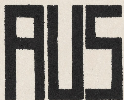
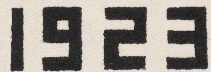
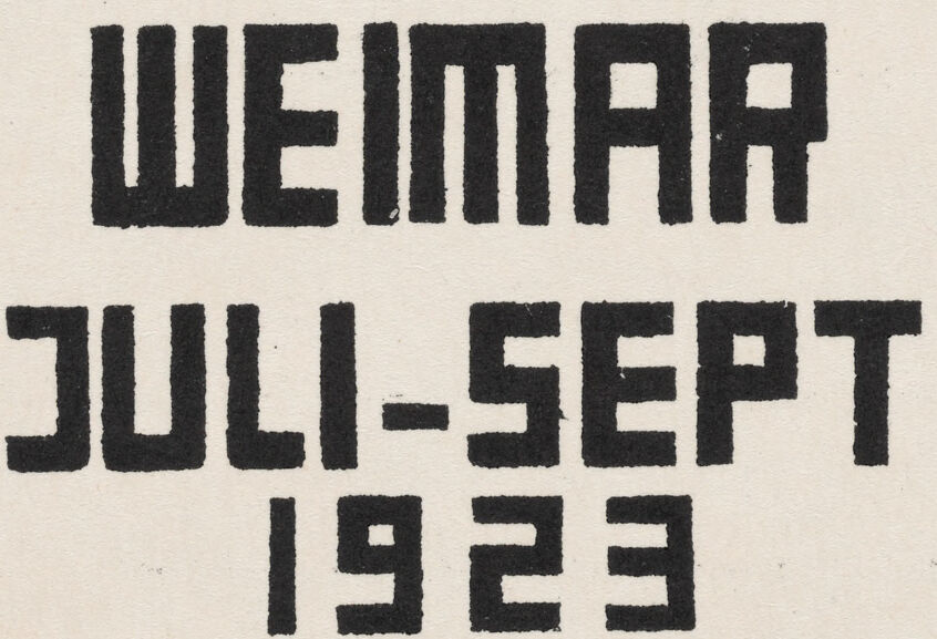
This image is a poster promoting the first Bauhaus exhibition. The poster features a simplified, abstract illustration of a building in orange and black. The text on the poster reads: "1. BAU AUS STELLUNG" which translates to "1st Bauhaus Exhibition". Below this, it provides the location and dates for the event: "WEIMAR JULI-SEPT 1923". The design uses a modernist, geometric style typical of the Bauhaus movement, characterized by bold, clean lines and a minimalist aesthetic.
Created by gpt-4 on 2024-11-28
The image depicts a vintage printed poster or card with a graphic design featuring a stylized architectural drawing of a modernist building in orange and black. The building has a flat roof, an emphasis on horizontal lines, and multiple rectangular windows.
Below the graphic, there is text in a bold, sans-serif typeface that reads:
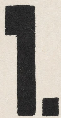
1.
BAUHAUS
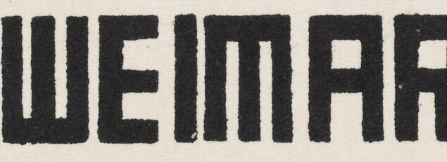
WEIMAR
JULI-SEPT
1923
AUS
STELLUNG
The design hints at the Bauhaus style, which is known for its simplicity, geometric shapes, and lack of ornamentation. "Bauhaus" refers to the influential German school of art, design, and architecture from the early 20th century. The text indicates that the image is likely related to a Bauhaus exhibition in Weimar between July and September of 1923. This work could be considered a piece of Bauhaus-related graphic design or a promotional material for the exhibition mentioned.
Anthropic Claude
Created by us.anthropic.claude-3-5-sonnet-20241022-v2:0 on 2025-06-28
This appears to be a promotional or exhibition poster from 1923 for the Bauhaus art school in Weimar, Germany. The image shows a modernist architectural drawing of what appears to be the Bauhaus building, rendered in an orange/salmon color with black details. The building features clean, geometric lines and a distinctive modernist style typical of Bauhaus architecture. The text on the poster reads "WEIMAR JULI-SEPT 1923" and "AUS STELLUNG" (which means "exhibition" in German). The typography is characteristically Bauhaus in style, using bold, geometric letterforms. The number "1." appears in the top left corner. This poster exemplifies the Bauhaus design principles of simplicity, functionality, and geometric forms.
Created by claude-3-5-sonnet-20241022 on 2024-12-26
This is a modernist architectural promotional image from 1923 advertising an exhibition at the Bauhaus in Weimar, Germany. The image shows a geometric, orange-colored building design in a distinctly Bauhaus style, with clean lines, flat roofs, and rectangular windows. The text reads "WEIMAR JULI-SEPT 1923" and "AUS STELLUNG" (which means "exhibition" in German). The building illustration demonstrates the characteristic Bauhaus architectural principles of functionality and minimalism. The number "1." appears in the top left corner, suggesting this might be part of a series or catalog. The overall design reflects the avant-garde aesthetic that the Bauhaus school was known for during this period.
Created by claude-3-haiku-20240307 on 2024-11-27
The image appears to be a poster or advertisement for an exhibition or event called "Weimar Juli-Sept 1923". The poster features an architectural illustration of a building or structure, likely a modernist or industrial design, in shades of orange and black. The text below the illustration lists the dates "Juli-Sept 1923" and the phrase "Aus Stelling", which seems to be the title or name of the exhibition or event being promoted.
Meta Llama
Created by us.meta.llama3-2-90b-instruct-v1:0 on 2024-12-24
The image is a vintage poster for the first Bauhaus exhibition, held in Weimar from July to September 1923. The poster features a stylized illustration of a building, likely the Bauhaus school itself, in a bold and geometric style characteristic of the Bauhaus movement. The building is depicted in a warm orange color with black accents, set against a cream-colored background.
Below the building, the text "WEIMAR JULI-SEPT 1923" is written in a modernist font, providing the location and dates of the exhibition. To the right of the building, the text "AUS STELLUNG" is displayed, which translates to "exhibition" or "show" in English. The overall design of the poster reflects the Bauhaus emphasis on clean lines, simple shapes, and functional design.
The poster's use of bold typography and geometric forms creates a sense of dynamism and energy, drawing the viewer's attention to the exhibition. The warm orange color of the building adds a touch of warmth and humanity to the otherwise austere design, suggesting that the exhibition will be a vibrant and engaging experience.
Overall, the poster effectively conveys the spirit of the Bauhaus movement and invites viewers to attend the exhibition, which promises to showcase the latest innovations in art, design, and architecture.
Created by us.meta.llama3-2-11b-instruct-v1:0 on 2024-11-25
The image is a vintage-style poster for an art exhibition titled "Weimar Ausstellung" (Weimar Exhibition), which took place in July-September 1923. The poster features a simple yet striking design, with a prominent illustration of a building at the top and bold text below.
- Building Illustration:
- The building is depicted in a minimalist style, with clean lines and geometric shapes.
- It appears to be a modernist structure, possibly a museum or gallery, given the context of the exhibition.
- The building is rendered in a warm, earthy color, which contrasts with the cool tones of the background.
- Text:
- Below the building illustration, the text "WEIMAR JULI-SEPT 1923" is written in large, bold letters.
- The text is arranged in a staggered format, with each line slightly offset from the one above it.
- The font used is a stylized, art deco-inspired typeface, which adds to the overall aesthetic of the poster.
- Background:
- The background of the poster is a light beige color, which provides a neutral backdrop for the building illustration and text.
- The background is slightly textured, giving the poster a tactile quality.
Overall, the image is a visually striking representation of the Weimar Exhibition, with its bold typography and simple yet effective illustration. The use of earthy tones and geometric shapes creates a sense of modernity and sophistication, while the stylized font adds a touch of elegance.
Amazon Nova
Created by amazon.nova-lite-v1:0 on 2025-02-26
The image is a poster that appears to be an advertisement for an architectural exhibition. The poster features a drawing of a building in the center, which is colored orange and has a modern architectural style. The drawing includes several windows and doors, and the building has a flat roof. The poster also includes text in black font, which reads "1. Bau Weimar Juli-Sept 1923" on the left side and "AUS STELLUNG" on the right side.
Created by amazon.nova-pro-v1:0 on 2025-02-26
The image is a poster with a simple design. It features a drawing of a building in the top half, with a flat roof and rectangular windows, and a door in the center. The building is depicted in orange, with black outlines for the windows and door. Below the drawing, there are two sets of text. The left side reads "1. WEIMAR JULI-SEPT 1923," and the right side reads "AUS STELLUNG." The text is in bold, black font, with "AUS" and "STELLUNG" appearing larger than the rest of the text. The poster has a clean and straightforward design, with a focus on the building and the text.
Google Gemini
Created by gemini-2.0-flash on 2025-04-27
The image is a vintage poster or advertisement with a minimalist design.
At the top left, there is a large, bold number "1."
Below this, the word "BAU" is written using the form of the building in the upper middle section.
In the middle of the poster, there is an architectural illustration of a building. The building is depicted with clean, geometric lines, typical of the Bauhaus style. The building's exterior is rendered in a light orange color, contrasting with the black lines that define its structure.
Beneath the illustration, there is text arranged in two columns. On the left, "WEIMAR" is written in a bold, sans-serif font, followed by "JULI-SEPT" and "1923" below it. On the right, "AUS" is written in a similar bold font, followed by "STELLUNG" below it.
Created by gemini-2.0-flash-lite on 2025-04-27
Here's a description of the image:
Overall Impression:
The image is a vintage poster or announcement with a distinctly modernist and architectural aesthetic. It appears to advertise an exhibition related to building/construction, likely from the early 20th century, given the style and date.
Visual Elements:
- Architectural Rendering: The central focus is a simplified, stylized illustration of a building. It is likely an abstract depiction. The building is rendered in shades of orange/brown with thick, black outlines and is a series of rectangular volumes.
- Typography: The typography is a prominent feature. The text is composed of bold, blocky, sans-serif letters, a style often associated with Bauhaus design. The text is arranged vertically.
- Layout: The poster is well-organized, with the building image positioned at the top and the text below. The use of the numeral "1." likely indicates this is the first in a series of announcements or a primary focus of the exhibition.
- Color Palette: The limited color scheme is characteristic of the modernist period. The primary colors are orange/brown, black, and the off-white background of the paper.
Text Details:
- "1." is placed at the top-left.
- "BAU" is written with block letters above the depicted architecture.
- "WEIMAR" is centered and placed beneath the building.
- "JULI-SEPT" is positioned below "WEIMAR".
- "1923" is at the bottom-left.
- "AUS" is at the top-right.
- "STELLUNG" is underneath "AUS".
Context and Possible Interpretation:
- Based on the words and date, this poster advertised the "Bauhaus Ausstelling" (Bauhaus Exhibition) in Weimar, Germany, held in the summer of 1923. The Bauhaus was a highly influential art and design school, and the exhibition would have showcased its principles of modern architecture, design, and art.
- The building depicted in the poster may represent a structure built or planned by the Bauhaus or presented in the exhibit. The style of the illustration suggests a focus on functionalism and clean lines, typical of modernist design.
Mistral Pixtral
Created by us.mistral.pixtral-large-2502-v1:0 on 2025-04-27
The image is a promotional card for an exhibition held in Weimar, Germany, from July to September 1923. The card features a stylized illustration of a building, which is likely the Bauhaus building in Weimar, rendered in an orange hue with black lines and shading. The text on the card reads:
- "1. BAU" (presumably "1. Bauhaus")
- "AUSSTELLUNG" (meaning "exhibition")
- "WEIMAR"
- "JULI-SEPT 1923" (indicating the duration of the exhibition)
The design and typography reflect the modernist aesthetic associated with the Bauhaus movement, characterized by simplicity, geometric shapes, and a focus on functionality and minimalism. The Bauhaus was a highly influential art school that operated from 1919 to 1933, known for combining crafts and fine arts, and its impact on modern art, architecture, and design.
Qwen
Created by Qwen/Qwen2.5-VL-7B-Instruct on 2025-07-11
The image is a poster for the "1. Bauhaus Ausstellung" (1st Bauhaus Exhibition), held in Weimar from July to September 1923. The poster features a stylized orange and black illustration of a building, which is characteristic of the Bauhaus style. The text is prominently displayed in black, with the title "AUSSTELLUNG" (exhibition) on the right and "WEIMAR JULI-SEPT 1923" (Weimar, July-September 1923) on the left. The design is clean and geometric, reflecting the principles of the Bauhaus movement, which aimed to integrate art, design, and craft in a functional and aesthetic manner.
Created by Qwen/Qwen2.5-VL-72B-Instruct on 2025-07-11
The image is a vintage poster featuring a prominent graphic of a modernist building in a striking orange color with black outlines, likely representing the Bauhaus architectural style. The building design is geometric and abstract, with large rectangular windows and a flat roof.
The text on the poster is bold and in black, utilizing a sans-serif font. The text reads "1. BAUHAUS AUSSTELLUNG WEIMAR JULI-SEPT 1923," which translates to "1st Bauhaus Exhibition in Weimar, July-September 1923." The layout is clean and minimalistic, with a focus on the building and the text, characteristic of the Bauhaus design principles. The overall aesthetic is modern and functional, reflecting the Bauhaus movement's emphasis on simplicity and practicality.


