Machine Generated Data
Tags
Color Analysis
Feature analysis
Amazon
Clarifai
AWS Rekognition
| Poster | 65.1% | |


Categories
Imagga
created on 2021-12-15
| paintings art | 99.9% | |
Captions
Microsoft
created by unknown on 2021-12-15
| a close up of a sign | 81.9% | |
| a sign on a wall | 68.1% | |
| a sign for a photo | 62.3% | |
Clarifai
Created by general-english-image-caption-clip on 2025-07-14
the book of the year.
Salesforce
Created by general-english-image-caption-blip on 2025-05-05
a photograph of a black and white book with a black and white image of a building
OpenAI GPT
Created by gpt-4o-2024-11-20 on 2025-06-11
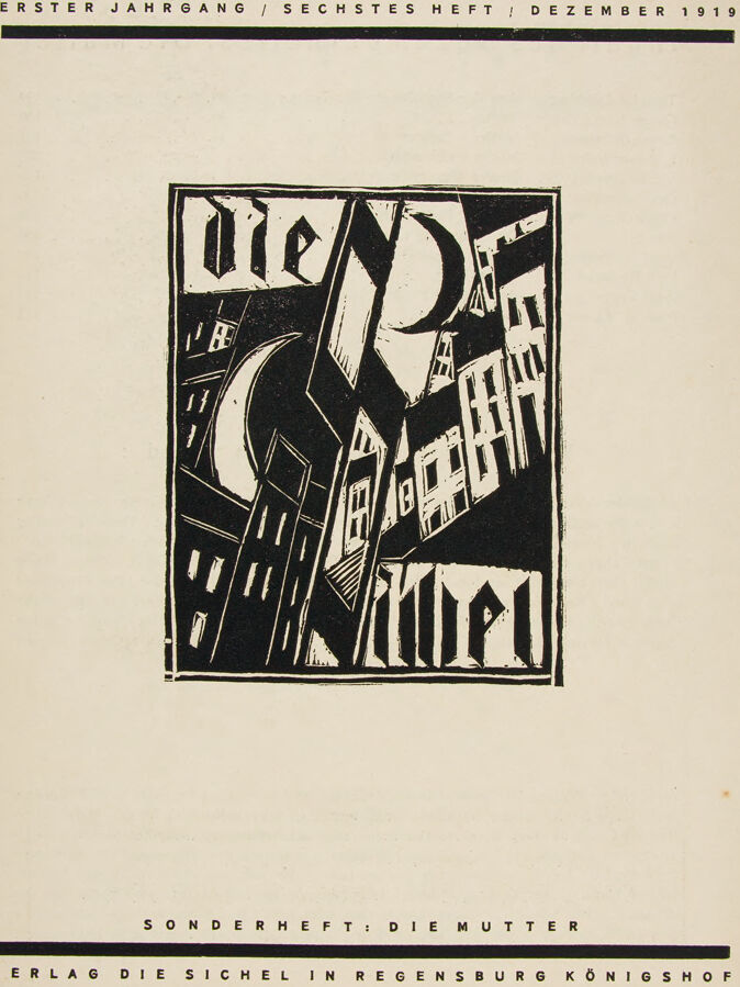
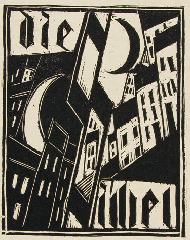
This image displays the cover of "Der Kunde," a German publication from December 1919. The artwork is done in an expressive, woodcut-style reminiscent of early 20th-century German Expressionism. The cover features angular, abstracted buildings in a nighttime urban scene, with a crescent moon visible above. The design is stark and monochromatic, emphasizing sharp contrasts between black and white. The title "Der Kunde" is integrated into the artwork at the top of the illustration.
The text at the top of the cover reads, “Erster Jahrgang / Sechstes Heft / Dezember 1919” (First Year / Sixth Issue / December 1919). Below the illustration, additional text reads “Sonderheft: Die Mutter,” meaning "Special Issue: The Mother," and at the bottom is the publisher's information, "Verlag Die Sichel in Regensburg Königshof."
Created by gpt-4o-2024-08-06 on 2025-06-11
The image is a cover page of a publication from December 1919. It has a distinct early 20th-century design style with a focus on black-and-white contrast. At the top, it reads "ERSTER JAHRGANG / SECHSTES HEFT / DEZEMBER 1919," indicating that this is the first year, sixth issue, from that month and year.
Below this heading, there is a central black square artwork with a highly stylized, abstract design. The artwork contains angular shapes that resemble buildings and a crescent moon, depicted in a cubist style. The words "Die Hilfe" are integrated into the design, written in a stylized, Gothic-like font that complements the angular nature of the illustration.
At the bottom of the page, it reads "SONDERHEFT: DIE MUTTER," and below this, "VERLAG DIE SICHEL IN REGENSBURG KÖNIGSHOF." This text suggests the publication might be a special issue ("SONDERHEFT") focused on a theme related to "DIE MUTTER" (The Mother), and that it is from a publisher called "DIE SICHEL" located in Regensburg at "KÖNIGSHOF." The design uses a clean layout with horizontal lines that separate the sections, giving the cover a structured and organized appearance.
Anthropic Claude
Created by anthropic.claude-3-haiku-20240307-v1:0 on 2025-06-17
The image appears to be the cover of a magazine or publication from December 1919. It features a striking black and white graphic design with bold geometric shapes and angular buildings or structures. The text at the top and bottom provides information about the publication, including the title "Die Mutter" and the publisher "Verlag Die Sichel in Regensburg Konigshof". The overall style and composition of the image suggest it is an example of early 20th century German Expressionist art or design.
Created by us.anthropic.claude-3-5-sonnet-20241022-v2:0 on 2025-06-17
This appears to be a magazine or publication cover from December 1919 ("ERSTER JAHRGANG / SECHSTES HEFT / DEZEMBER 1919"). It features a striking black and white woodcut or linocut print showing an expressionist urban scene with angular buildings and a crescent moon. The image has a strong contrast between black and white areas, creating a dramatic, modernist composition. The buildings appear to be leaning and distorted, typical of German Expressionist art of this period. At the bottom of the page, it indicates this is a special issue ("SONDERHEFT: DIE MUTTER") published by "VERLAG DIE SICHEL IN REGENSBURG KÖNIGSHOF". The overall design reflects the avant-garde artistic movements of early 20th century Germany.
Meta Llama
Created by us.meta.llama3-2-11b-instruct-v1:0 on 2025-06-02
The image is a cover page for an art magazine, featuring a striking black-and-white design. At the top, the title "ERSTER JAHRGANG / SECHSTES HEFT / DEZEMBER 1919" is displayed in a simple yet elegant font, indicating the first year and sixth issue of the magazine, published in December 1919.
In the center of the page, a large, abstract design dominates the space. This design consists of various geometric shapes, including rectangles, triangles, and circles, arranged in a seemingly random yet harmonious pattern. The shapes are rendered in a bold, black line style, with some areas filled in with white to create a sense of depth and dimensionality.
At the bottom of the page, the text "SONDERHEFT: DIE MUTTER" is written in smaller letters, suggesting that this issue is a special edition focusing on the theme of "The Mother." Below this, the phrase "VERLAG DIE SICHEL IN REGENSBURG KÖNIGSHOF" provides information about the publisher, located in Regensburg, Königshof.
Overall, the image presents a visually appealing and thought-provoking design that reflects the artistic style of the time period. The use of geometric shapes and bold lines creates a sense of modernity and innovation, while the abstract nature of the design invites the viewer to interpret its meaning in their own way.
Created by us.meta.llama3-2-90b-instruct-v1:0 on 2025-06-02
The image is a vintage poster or cover page for a publication, featuring a striking black-and-white design. The title, "ERSTER JAHRGANG / SECHSTES HEFT / DEZEMBER 1919," is written in small text at the top of the page, indicating that it is the first year and sixth issue of the publication, dated December 1919.
In the center of the page, a stylized illustration depicts a cityscape with buildings and streets, rendered in bold black lines and geometric shapes. The illustration is surrounded by a thin black border, which adds to the overall sense of simplicity and elegance.
At the bottom of the page, two lines of text are written in smaller letters. The first line reads "SONDERHEFT: DIE MUTTER," while the second line states "VERLAG DIE SICHEL IN REGENSBURG KÖNIGSHOF." These lines likely provide information about the publication's contents and publisher.
Overall, the image exudes a sense of modernity and sophistication, reflecting the artistic and cultural trends of the early 20th century. The use of bold lines, geometric shapes, and simple typography creates a visually striking design that is both aesthetically pleasing and thought-provoking.
Amazon Nova
Created by amazon.nova-lite-v1:0 on 2025-06-01
The image is a black-and-white illustration of a cityscape with buildings and a crescent moon. The illustration is titled "Die Mutter" and is part of a magazine cover. The magazine is titled "Erster Jahrgang / Sechstes Heft / Dezember 1919" and is published by Verlag Die Sichel in Regensburg Konigshof. The illustration is a woodcut, a type of printmaking technique that involves carving an image into a block of wood and then printing it onto paper. The image is surrounded by a black border and has a simple, minimalist design.
Created by amazon.nova-pro-v1:0 on 2025-06-01
The image depicts a black-and-white illustration of a building. The illustration is printed on a white background, and it is framed by a black border. The building is depicted in a distorted perspective, with the windows and doors appearing to be elongated and slanted. The illustration is accompanied by some text in German, which reads "Erster Jahrgang / Sechstes Heft / Dezember 1919". This text likely indicates the publication date and volume number of a magazine or journal. The overall style of the illustration is reminiscent of the Expressionist movement in art, which was popular in Germany during the early 20th century.
Google Gemini
Created by gemini-2.0-flash-lite on 2025-05-05
Here's a description of the image:
Overall Impression:
The image is a vintage magazine cover, likely from the early 20th century. It has a strong graphic style, characterized by bold lines and a limited color palette (black and white). The design is clearly influenced by Expressionism or a similar modernist art movement.
Elements:
- Text: There is a lot of text. The following lines are at the top and bottom of the page.
- "ERSTER JAHRGANG / SECHSTES HEFT / DEZEMBER 1919"
- "SONDERHEFT: DIE MUTTER"
- "VERLAG DIE SICHEL IN REGENSBURG KÖNIGSHOF"
- Central Graphic: The focal point is a black and white geometric design. It appears to be an abstract cityscape, possibly representing a night scene with buildings, moon, and other geometric shapes. The word "Die" is at the top of the central graphic. It has a gothic font, which would have been common at the time.
- Color Scheme: The use of only black and white creates a striking contrast, lending a sense of drama and boldness to the design.
- Composition: The design is well-balanced. The text is arranged to frame the central graphic, which anchors the composition. The layout is clean and uncluttered.
Style:
The image reflects a modernist aesthetic, particularly evident in the use of geometric shapes, bold contrasts, and simplified forms. It is likely a woodcut or linocut print technique, given the graphic quality of the image.
Overall Effect:
The overall impression is one of sophistication, possibly a hint of melancholy, and a clear commitment to a modern artistic vision. It's a strong visual statement typical of the art produced in the early part of the 20th century.
Created by gemini-2.0-flash on 2025-05-05
Here's a description of the image:
The image is a magazine or book cover featuring a black and white woodcut print. At the top, in sans-serif font, it reads "ERSTER JAHRGANG / SECHSTES HEFT / DEZEMBER 1919". Below this, taking up a large central portion of the cover, is the woodcut.
The woodcut is an expressionist piece, depicting a stylized cityscape under a night sky. There are several buildings arranged at various angles, creating a dynamic and somewhat chaotic composition. Two crescent moons are visible, adding to the nocturnal feel. The buildings have simple, angular shapes with stylized windows. The German word "Die" (meaning "The") appears at the top left of the print, written in a gothic-style font. The word "Vindel" also appears at the bottom right of the print.
Below the woodcut, the cover continues with text, again in sans-serif font. It states "SONDERHEFT: DIE MUTTER" (Special Edition: The Mother) and "VERLAG DIE SICHEL IN REGENSBURG KÖNIGSHOF" (Publisher Die Sichel in Regensburg Königshof). The cover has a slightly aged, off-white or cream-colored background.
Mistral Pixtral
Created by us.mistral.pixtral-large-2502-v1:0 on 2025-06-01
The image is a cover of a publication titled "Sechstes Heft" (Sixth Issue) from December 1919. It is the first year of publication, as indicated by "Erster Jahrgang" at the top. The cover features a black and white woodcut illustration of a stylized urban scene with buildings and a moon. The text at the bottom of the cover reads "Sonderheft: Die Mutter," indicating that this is a special issue focused on "The Mother." The publisher is listed as "Verlag Die Sichel in Regensburg Königshof." The overall design has a modernist, expressionist style characteristic of the early 20th century.
Qwen
Created by Qwen/Qwen2.5-VL-7B-Instruct on 2025-07-10
This image appears to be the cover of a publication from December 1919. The text at the top indicates it is the "Erster Jahrgang / Sechstes Heft / Dezember 1919," meaning it is the first year, sixth issue, from December 1919. The cover features a stylized black and white illustration. The text "Dienst" and "Metal" is prominently displayed in large, fragmented, and angular letters, integrated into the design of the illustration. The illustration itself seems to depict a night scene with buildings silhouetted against a crescent moon and a starry sky.
At the bottom, the text "Sonderheft: Die Mutter" suggests that this issue is a special edition, possibly focusing on the theme of "The Mother." The publisher's name, "Verlag Die Sichel in Regensburg Königshof," is also mentioned at the bottom, indicating the publisher's location in Regensburg, Königshof. The overall design and typography suggest an artistic or literary publication from the early 20th century.
Created by Qwen/Qwen2.5-VL-72B-Instruct on 2025-07-10
This image is a vintage magazine or book cover, dated December 1919, as indicated by the text at the top. The design has a stark, minimalist aesthetic, characteristic of early 20th-century graphic design.
Title and Text: The title "DIE ROTE NEMPEL" is prominently displayed in bold, stylized lettering that integrates into a geometric, abstract design. The text at the top reads "ERSTER JAHRGANG / SECHSTES HEFT / DEZEMBER 1919," indicating it is the first year, sixth issue, and the date. At the bottom, it notes "SONDERHEFT: DIE MUTTER," suggesting a special issue focused on the theme of motherhood, published by "VERLAG DIE SICHEL IN REGENSBURG KÖNIGSHOF."
Illustration: The central illustration features a cityscape with buildings and a crescent moon in the background. The buildings are depicted in a fragmented, geometric style with sharp angles and strong contrasts, giving a dynamic and somewhat chaotic feel. The design is monochromatic, using black and white to create a striking visual impact.
Overall Style: The overall style is reminiscent of German Expressionism and early modernist design, with its emphasis on bold lines, geometric shapes, and a limited color palette. The layout is simple yet impactful, with the text and illustration arranged in a balanced, symmetrical manner.
Text analysis
Amazon