Machine Generated Data
Tags
Color Analysis
Categories
Imagga
| paintings art | 100% | |
Captions
Microsoft
created by unknown on 2021-12-15
| a close up of a box | 59.8% | |
| close up of a box | 52% | |
| a envelope on the wall | 29.6% | |
Clarifai
created by general-english-image-caption-blip on 2025-05-18
| a photograph of a book with a picture of a man holding a sword | -100% | |
Google Gemini
Created by gemini-2.0-flash-lite on 2025-05-16
Here is a description of the image:
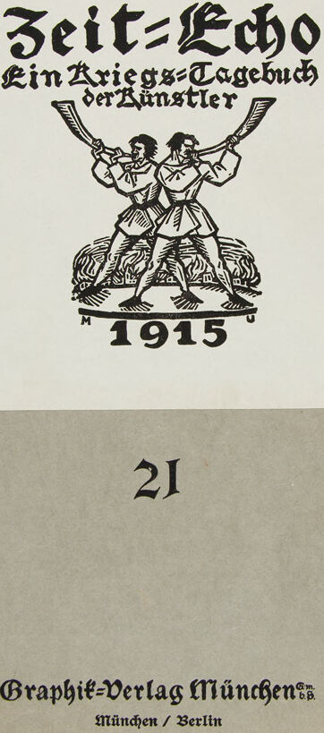
The image is a cover for a publication titled "Zeit-Echo. Ein Kriegs-Tagebuch der Künstler" (Time Echo. A War Diary of the Artists). The cover is printed in black ink on a plain, light gray background.
Central Design:
- At the top is a large, centered white rectangle. This contains the title and imagery:
- Title: "Zeit-Echo" is written in a bold, stylized black font.
- Subtitle: "Ein Kriegs-Tagebuch der Künstler" is written in a similar, slightly smaller font.
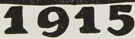
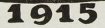
- Illustration: Below the text is a drawing of two men, dressed in what appears to be historical clothing, standing on a mound or base. They are blowing into curved horns. Below the figures, the year "1915" is printed.
- Number: Below the white rectangle, in the center, is the number "21" printed in a stylized font.
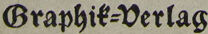
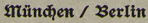
- Publisher Information: At the bottom of the image, the publisher's name, "Graphik-Verlag München" is printed in a stylized font, followed by the city names "München / Berlin" in a smaller font.
Overall Impression:
The design is simple and somewhat stark, reflecting the historical period. The typography and imagery contribute to a unique visual identity. The color palette of black and gray emphasizes the serious and perhaps somber subject matter.
Created by gemini-2.0-flash on 2025-05-16
Here is a description of the image:
The image is a vintage cover for a publication titled "Zeit-Echo: Ein Kriegs-Tagebuch der Künstler" (roughly translated as "Time Echo: A War Diary of Artists"). The cover has a distinct aesthetic, likely from the early 20th century.
Here's a breakdown of the details:
Layout: The cover is divided into a top white rectangle area and a lower gray area. The black elements are the title and illustration within the top rectangular area. The other elements are present in the bottom gray area.
Text: The title is presented in a classic, slightly Gothic font, commonly used in German publications of that era. Underneath the title is the subtitle "Ein Kriegs-Tagebuch der Künstler," which suggests the publication is a diary or journal documenting the experiences of artists during wartime. At the bottom of the cover, in a similar classic typeface, the text reads "Graphik-Verlag München," indicating the publishing house, and below that is "München / Berlin," suggesting the publisher's presence in both cities. A numeral "21" is centered in between the illustration and the publisher.
Illustration: Above the "1915" at the top portion is a black and white graphic. It features two figures standing on a pile of what appears to be rubble or earth. Each figure is raising a horn to their mouth, seemingly blowing it. This imagery evokes a sense of announcement, alarm, or perhaps a call to action, fitting with the war theme.
Date: The year "1915" is prominently displayed below the illustration, likely indicating the year of publication or the period covered by the diary.
Color and Texture: The overall color scheme is simple: black text and illustration against a white rectangle and a gray cover. The texture of the cover seems somewhat aged or rough, which adds to the vintage feel.
Overall, the cover design is reminiscent of German Expressionism and other early 20th-century art movements that were popular during World War I. The combination of text, illustration, and typography effectively conveys the publication's subject matter and historical context.
Text analysis
Amazon