Machine Generated Data
Tags
Color Analysis
Feature analysis
Amazon
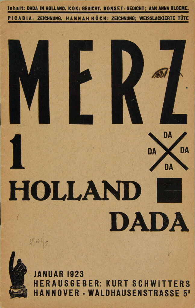
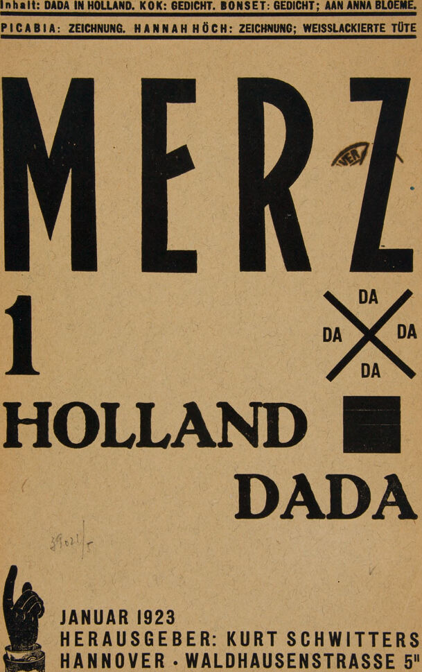
| Poster | 96.8% | |
Categories
Imagga
| text visuals | 78.7% | |
| paintings art | 19.7% | |
Captions
Microsoft
created on 2021-12-15
| a close up of a sign | 97.3% | |
| a sign over a book | 80.8% | |
| a sign on the side | 80.7% | |
Text analysis
Amazon