Machine Generated Data
Tags
Color Analysis
Feature analysis
Amazon
Clarifai

AWS Rekognition
| Menu | 70.4% | |

Categories
Imagga
created on 2022-05-05
| text visuals | 93% | |
| paintings art | 5.4% | |
| streetview architecture | 1.5% | |
Captions
Microsoft
created by unknown on 2022-05-05
| a close up of a newspaper | 86.2% | |
| a close up of text on a newspaper | 85% | |
| a close up of a newspaper article | 84.9% | |
Clarifai
No captions written
Salesforce
Created by general-english-image-caption-blip on 2025-05-16
a photograph of a poster advertising a german language language
Created by general-english-image-caption-blip-2 on 2025-07-04
a poster advertising the electric car
OpenAI GPT
Created by gpt-4 on 2025-02-15
This is an image of a poster showcasing typography and design, predominantly featuring black text on a beige background. The text is mostly in German and arranged in a stark, bold manner typical of the modernist design style.
The largest text on the poster reads "FIGURINEN" and "SIEG ÜBER DIE SONNE," which translates to "Figurines" and "Victory Over the Sun," respectively. The latter is a reference to a Russian Futurist opera.
Underneath "SIEG ÜBER DIE SONNE," there is a subtitle that reads "ALS OPER GEDICHTET VON A. KRUTSCHONJCH MOSKAU 1913," indicating the opera was written by A. Kruchenykh in Moscow in 1913.
On the right-hand side, the name "EL LISSITZKY" stands out, indicating the poster may have been designed by El Lissitzky, a famous Russian artist and designer, known for his avant-garde graphic works and contribution to the Constructivist movement.
Down the left-hand side from numbers 1 to 10 are what appear to be categories or roles such as "TEIL DER SCHAUMASCHINERIE," "ANSAGER," "POSTEN," and others.
At the bottom corner is the word "VERLAG," suggesting a publisher or publication, and beside it is a black circle containing a black square, a motif related to suprematist art.
Furthermore, there is text suggesting that the poster is part of a limited edition print run of 75 numbered and signed copies.
The image of El Lissitzky's design itself is a great example of modernist graphic design, which emphasizes geometric shapes, asymmetrical layouts, and sans-serif typefaces, reflecting the artistic movements of the early 20th century, particularly Constructivism and Suprematism.
Created by gpt-4o-2024-05-13 on 2025-02-15
The image is a poster designed by El Lissitzky, a prominent artist of the Russian Avant-Garde movement. The text is primarily in German and features a highly stylized and bold typography typical of Constructivist design.
Content Details:
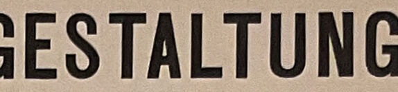
- The main title at the top reads "DIE PLASTISCHE GESTALTUNG DER ELEKTRO-MECHANISCHEN" which translates to "The Plastic Construction of Electro-Mechanical."
- Beneath this, the word "SCHAU" is prominently displayed in a large, thick font, meaning "Show".
- The name "EL LISSITZKY" is aligned vertically to the right of "SCHAU" indicating the designer.
- Below this, in slightly smaller text, it reads "SIEG ÜBER DIE SONNE" meaning "Victory over the Sun" followed by "ALS OPER GEDICHTET VON A. KRUTSCHONJCH MOSKAU 1913" which translates to "As opera poems by A. Kruchyonykh Moscow 1913".
- The word "FIGUREN" (Figures) is written vertically on the left side of the poster in a bold font.
- There is a list numbered 1 to 10 with different roles or titles such as "TEIL DER SCHAUMASCHINERIE ALS TITELBLATT" (Part of the foam machinery as title page), "ANSAGER" (Announcer), and "TOTENGRÄBER" (Gravedigger).
- On the lower right side is a block of smaller text with a central black square labeled “VERLAG” (Publisher).
- The poster certifies that the edition is limited to 75, with the number of each copy hand-written. In this case, it reads "No 24".
- The artist’s signature and the year 1923 can be seen at the bottom right, indicating the time when this particular piece was created and printed.
The design elements and the structured layout reflect the influence of the Constructivist movement, emphasizing geometric shapes, functional design, and clear communication.
Anthropic Claude
Created by us.anthropic.claude-3-5-sonnet-20241022-v2:0 on 2025-06-27
This is a German typography poster from 1923, appearing to be a program or advertisement for an electro-mechanical performance or opera titled "Victory Over the Sun" (Sieg über die Sonne). The design shows strong influences of the Constructivist and Bauhaus movements with its bold, geometric typography and hierarchical layout.
The text is arranged in a striking modernist style, with "FIGUREN" displayed vertically along the left side. The poster lists 10 numbered items or characters, including:
- Schaumaschinerie (Foam Machinery)
- Ansager (Announcer)
- Posten (Posts)
- Angstliche (Fearful Ones)
- Globetrotter (In Time)
- Sportsmänner (Sportsmen)
- Zankstifter (Troublemakers)
- Alter (Elder)
- Totengräber (Gravedigger)
- Neuer (New One)
The poster indicates it was published by Rob. Leunig & Chapman G.M.B.H. in Hannover and is numbered as part of a limited edition. The original opera was written by A. Krutschonich in Moscow in 1913. This is a fantastic example of early 20th-century avant-garde graphic design and typography.
Created by claude-3-haiku-20240307 on 2025-02-15
The image appears to be a historical advertisement or announcement for an exhibition titled "The Plastic Design of the Electromechanical" by Schau. It lists various elements or categories of the exhibition, including "Ansager" (Announcer), "Posten" (Posts), "Angstliche" (Fearful), "Globetrotter" (Globetrotter), "Sportsmaner" (Sportsmen), "Zankstifter" (Instigator), "Alter" (Old), and "Totengräber" (Gravedigger). The text also mentions that this is the 75th numbered and signed edition of the work. The overall design and layout of the advertisement is in a bold, modern graphic style typical of the early 20th century.
Created by claude-3-opus-20240229 on 2025-02-15
The image depicts the plastic structure of an electro-mechanical chess game titled "Victory over the Sun", which appears to be an opera composed by A. Krutschonjch Moskau in 1913. The structure is divided into 10 numbered sections representing different roles or components, such as "Schaumaschinerie als Titelblatt" (foam machinery as title page), "Ansager" (announcer), "Posten" (posts), "Angstliche" (anxious ones), "Globetrotter (in der Zeit)" (globetrotters in time), and more.
The right side of the image contains explanatory text describing the opera and its themes. It mentions that the ballet piece premiered in St. Petersburg in 1913 and was composed in a single common futuristic style by three artists. The text goes on to discuss the artistic and philosophical concepts explored in the avant-garde work.
At the bottom, there are notes about an enclosed exemplary sheet along with numbering that appears to be "No. 24".
Created by claude-3-5-sonnet-20241022 on 2025-02-15
This is a German typography poster from 1923 advertising "Die Plastische Gestaltung der Elektro-Mechanischen Schau" (The Plastic Design of the Electro-Mechanical Show). It appears to be promoting an opera called "Sieg über die Sonne" (Victory Over the Sun), composed in Moscow in 1913 by A. Krutschonich.
The design features bold, modernist typography characteristic of the avant-garde movements of the early 20th century. The layout includes a numbered list from 1 to 10 with terms like "Figuren" (Figures), "Ansager" (Announcer), "Posten" (Posts), and "Globetrotter." The poster indicates this is a limited edition of 75 numbered copies, printed by Rob. Leunig & Chapman G.m.b.H. in Hannover, and this specific copy is numbered 24.
The design demonstrates the influence of constructivist and bauhaus principles with its strong geometric layout, sans-serif typography, and use of bold black text against a light background. It's a significant example of early modernist graphic design and typography.
Meta Llama
Created by us.meta.llama3-2-11b-instruct-v1:0 on 2025-03-13
The image presents a vintage poster in German, featuring a bold and striking design. The title, "DIE PLASTISCHE GESTALTUNG DER ELEKTRO-MECHANISCHEN SCHAULISSITZKY," is prominently displayed at the top in large black letters, with the words "SCHAULISSITZKY" standing out in white.
Below the title, a list of ten items is presented in a column on the left side of the poster, each item numbered and accompanied by a brief description in German. The numbers are displayed in large black font, while the descriptions are written in smaller text.
On the right side of the poster, a large rectangle contains a block of text that appears to be a continuation of the list or a separate section. This text is also written in German and is presented in a smaller font size compared to the title and list.
In the bottom-right corner of the poster, a red stamp bears the number "24," which may indicate the poster's edition or serial number. A small section of illegible text is visible below the stamp.
The background of the poster is a light beige color, providing a clean and neutral backdrop for the bold typography and graphics. Overall, the design of the poster is eye-catching and effectively communicates the message or information it intends to convey.
Created by us.meta.llama3-2-90b-instruct-v1:0 on 2025-03-13
The image depicts a vintage German poster from 1913, featuring the title "DIE PLASTISCHE GESTALTUNG DER ELEKTRO-MECHANISCHEN SCHAULISSETZKY" in bold black letters at the top. The poster is divided into two sections: the left side contains a list of numbers with corresponding words, while the right side features a large block of text in German.
Key Features:
- Title: The title is prominently displayed at the top of the poster, written in bold black letters.
- Left Section: This section lists numbers from 1 to 10, each accompanied by a word or phrase in German.
- Right Section: This section features a large block of text in German, which appears to be an article or passage related to the topic of the poster.
- Design Elements: The poster includes various design elements, such as lines, shapes, and typography, which add visual interest and help to organize the content.
- Color Scheme: The dominant color of the poster is beige, with black text and accents used throughout.
- Language: The language used in the poster is German, indicating that it was likely created for a German-speaking audience.
- Date: The date "1913" is mentioned at the bottom of the poster, suggesting that it was created during this time period.
Overall Impression:
The poster appears to be a vintage advertisement or informational piece related to the topic of electro-mechanical devices. The use of bold typography and design elements suggests that the poster was intended to grab the attention of viewers and convey important information in a clear and concise manner. The inclusion of a large block of text on the right side of the poster indicates that the content is likely to be informative and educational in nature.
Amazon Nova
Created by amazon.nova-lite-v1:0 on 2025-02-15
The image is a vintage poster featuring a grid-like layout with various text and numbers. The title at the top is "Die plastische Gestaltung der elektro-mechanischen Schau" in bold, sans-serif font. Below the title, there is a large central image of a circle with a dot in the middle, possibly symbolizing a sun. The layout is divided into sections, each labeled with a number and a corresponding description. The descriptions include terms like "Ansager" (announcer), "Posten" (positions), "Angstliche" (anxious), "Globetrotter" (globetrotter), "Sportsmanner" (sportsmen), "Zankstiffter" (quarrel-makers), "Alter" (old), "Totengräber" (gravedigger), and "Neuer" (new). Each section has a brief description in German, likely describing the characteristics or roles of the individuals in the context of the exhibition. The poster has a vintage aesthetic, with a beige background and black text, giving it a historical and nostalgic feel.
Created by amazon.nova-pro-v1:0 on 2025-02-15
The image shows a poster with a title in German, "Die Plastische Gestaltung der Elektro-Mechanischen Schau," which translates to "The Plastic Design of the Electro-Mechanical Exhibition." It is an advertisement for an exhibition that took place in Moscow in 1913. The poster features a list of different types of machines and equipment, such as saws, drills, lathes, and milling machines, along with their respective numbers and descriptions. The poster also includes a logo and the name of the company that organized the exhibition.
Google Gemini
Created by gemini-2.0-flash-lite on 2025-05-22
This image is a poster designed by El Lissitzky, a prominent figure in the Russian avant-garde movement, specifically Constructivism. It is a promotional poster for a theatrical production titled "Sieg Über Die Sonne" ("Victory Over the Sun"), a futuristic opera from 1913.
Here's a breakdown of the poster's key elements:
- Title and Production: The title, "Sieg Über Die Sonne," is prominently displayed in a bold, stark font. The text also specifies that it's "Als Oper Gedichtet von A. Krutschonjch Moskau 1913" (As an Opera written by A. Krutschonjch Moscow 1913), providing the author and the date of the opera's creation.
- Constructivist Design: The poster uses classic Constructivist elements:
- Geometric Shapes: The design incorporates geometric shapes, such as the blocky text, and the black square containing the publisher's logo.
- Bold Typography: The use of large, sans-serif typefaces and the arrangement of text at dynamic angles are hallmarks of Constructivism.
- Color Palette: It primarily utilizes black and white, a characteristic of the movement, though the original also contained bright yellow highlights.
- Dynamic Composition: The layout is visually striking, with a sense of movement.
- Figures and Information: The left side lists the "Figuren" (Characters) in the opera, with numbers corresponding to their roles. Below the list is the publisher's information.
- Publication Details: The lower portion gives information about the prints, indicating that the set of "Figurinen-Mappe" (figure prints) was printed in a limited edition of 75 copies, each numbered and signed by the artist. The publisher's details and the fact that this copy is numbered are also present.
- Overall Tone: The poster reflects the Constructivist ideals of dynamism, modernity, and functionality. It aimed to be a clear and impactful communication tool, showcasing the innovative art and theater of the time.
Created by gemini-2.0-flash on 2025-05-22
Here's a description of the image:
The image is a vintage poster with a Constructivist design, characterized by bold typography, geometric shapes, and a limited color palette of black, white, and beige.
The poster prominently features German text in a variety of sizes and styles, typical of the avant-garde typography of the period. The largest text reads "DIE PLASTISCHE GESTALTUNG DER ELEKTRO-MECHANISCHEN SCHAU" (The Plastic Design of the Electro-Mechanical Spectacle). Below that, in smaller but still prominent lettering, is "SIEG ÜBER DIE SONNE" (Victory Over the Sun). "EL LISSITZKY" appears in a smaller font vertically to the right of these titles.
On the left side, there is a vertical list of ten items, each preceded by a number. The words in this list are written in capital letters: "FIGUREN." Each word is connected to the number by a horizontal line. Next to the "VERLAG" (Publisher) title is a solid black square.
At the bottom of the poster, there is a statement about the print being a limited edition of 75 copies, numbered and signed by the artist. The text "DIES EXEMPLAR TRÄGT DIE" (This copy bears the number) is placed on the bottom right.
The overall aesthetic of the poster is one of modernist simplicity, functionality, and a celebration of technology and geometric abstraction, typical of Constructivist art and design.
Mistral Pixtral
Created by us.mistral.pixtral-large-2502-v1:0 on 2025-05-28
The image is a poster designed in a style reminiscent of early 20th-century modernist typography, specifically in the tradition of the Bauhaus and Constructivist movements. The poster is titled "Die plastische Gestaltung der Elektro-Mechanischen Schau" (The Plastic Design of the Electro-Mechanical Show) and is credited to El Lissitzky, a prominent Russian artist and designer known for his contributions to the avant-garde.
The text is primarily in German and includes various typographic elements:
Title and Subtitle:
- The title "Die plastische Gestaltung der Elektro-Mechanischen Schau" is prominently displayed at the top.
- Below the title, "Sieg über die Sonne" (Victory over the Sun) is mentioned, which is an opera by Aleksei Kruchenykh from Moscow, 1913.
List of Terms:
- On the left side, there is a list of ten terms, each associated with a number:
- Teil der Schaumaschinerie als Titelblatt (Part of the foam machine as title page)
- Ansager (Announcer)
- Posten (Post)
- Ängstliche (Anxious)
- Globetrotter (in der Zeit) (Globetrotter (in time))
- Sportsmanner (Sportsmen)
- Zankstifter (Troublemaker)
- Alter (Kopf 2 Schritt hinter) (Old (Head 2 steps behind))
- Totengräber (Gravedigger)
- Neuer (New)
- On the left side, there is a list of ten terms, each associated with a number:
Main Text Block:
- The main body of text is located in the center-right of the poster. It appears to be a detailed description or narrative related to the opera "Sieg über die Sonne."
Additional Information:
- At the bottom, there is additional information about the publication:
- "Die Figurinen-Mappe ist in einer Auflage von 75 numerierten und vom Künstler auf Stein gezeichneten und signierten Exemplaren erschienen." (The figurine portfolio is published in an edition of 75 numbered and signed by the artist on stone copies.)
- "Den Druck besorgte Rob. Leunis in Mannheim 1923." (The printing was done by Rob. Leunis in Mannheim 1923.)
- "Dies Exemplar trägt die Nr. 24" (This copy bears the number 24.)
- At the bottom, there is additional information about the publication:
Design Elements:
- The poster uses bold, sans-serif typography and a minimalist design, characteristic of the avant-garde movements of the time.
- The layout is structured with clear sections and a strong emphasis on typographic hierarchy.
Overall, the poster is a historical artifact that combines textual information with a modernist design aesthetic, reflecting the innovative approaches to art and design prevalent in the early 20th century.
Qwen
No captions written
Text analysis
Amazon