Machine Generated Data
Tags
Color Analysis
Feature analysis
Categories
Imagga
created on 2019-06-07
text visuals | 69.2% | |
streetview architecture | 26.4% | |
paintings art | 4.2% | |
Captions
Microsoft
created by unknown on 2019-06-07
a screenshot of a video game | 37.9% | |
a close up of a piece of paper | 37.8% | |
a screenshot of a computer | 37.7% | |
Clarifai
No captions written
Salesforce
Created by general-english-image-caption-blip on 2025-06-13
a photograph of a chart of the number of people who are in the same place
Created by general-english-image-caption-blip-2 on 2025-07-05
a chart showing the number of people in the united states
OpenAI GPT
Created by gpt-4o-2024-11-20 on 2025-06-14
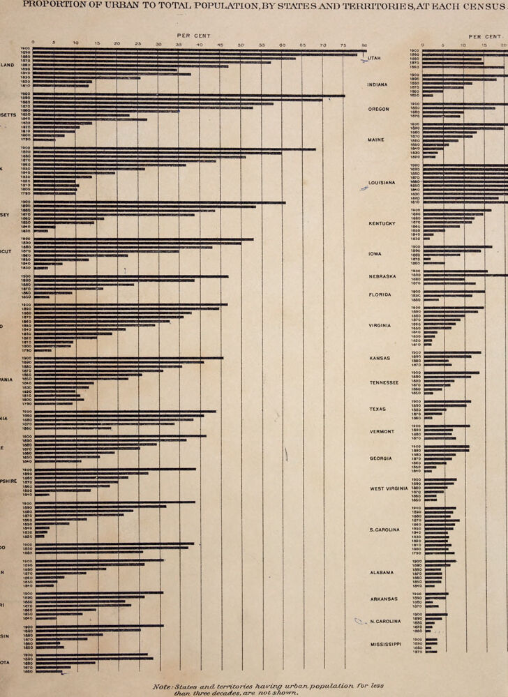
This image is a historical graph illustrating the proportion of urban to total population by U.S. states and territories across different census years, ranging from approximately 1790 to 1900.
- Structure: The data for each state is presented horizontally using bar graphs, with longer bars indicating a higher percentage of urbanization. The states are listed in columns. On the left side are states such as Maryland, New York, and Pennsylvania; on the right side are states like Utah, Texas, and Mississippi.
- Labels: Each bar is labeled with the corresponding census year (e.g., 1790, 1800, and so on). Below the graph, a note states: "States and territories having urban population for less than three decades, are not shown."
- Axis: The top axis is labeled "PER CENT" and ranges from 0 to 80, representing the percentage of the population residing in urban areas.
- Trend: Some states show a clear increase in urban proportion over time, reflecting historical urbanization patterns, while others show slower growth.
This graph visually demonstrates the historical urbanization of different regions in the United States during the 19th century.
Created by gpt-4o-2024-08-06 on 2025-06-14
The image is a historical chart depicting the proportion of urban to total population by states and territories at each census. The data is displayed as horizontal bar graphs for each decade from 1790 to 1890. The chart is divided into two columns, with states and territories listed on the left side of each column. The x-axis represents the percentage of urban population, ranging from 0 to 80 percent. The top portion of the chart includes states like Rhode Island, Massachusetts, New York, Pennsylvania, and others, while the bottom portion includes states like Utah, Indiana, Oregon, Maine, and Louisiana.
Each horizontal line represents the urban population percentage for each decade, providing a visual comparison of urbanization trends over time. There is also a note at the bottom indicating that states and territories having urban populations for fewer than three decades are not shown on the chart. The chart provides a visual representation of how urbanization has evolved in various states from the late 18th century to the late 19th century.
Anthropic Claude
Created by anthropic.claude-3-haiku-20240307-v1:0 on 2025-06-20
This image appears to be a historical chart or graph depicting the proportion of urban to total population in various states and territories of the United States over time. The chart shows the percentage of urban population for each state and territory at different census years, represented by horizontal bars. The states and territories are listed vertically, and the percentage scale is shown along the x-axis. The chart provides a visual representation of the urbanization trends across the country during the time period covered.
Created by us.anthropic.claude-3-5-sonnet-20241022-v2:0 on 2025-06-20
This image is a historical bar chart showing the "Proportion of Urban to Total Population, by States and Territories, at Each Census." The chart appears to be from the late 1800s and displays data for multiple U.S. states over several decades, with percentages ranging from 0 to 80 percent on the horizontal axis.
The data is presented as horizontal bars for each state, with multiple years shown for each state (likely census years), allowing viewers to see the urban population trends over time. States listed include Utah, Indiana, Oregon, Maine, Louisiana, Kentucky, Iowa, Nebraska, Florida, Virginia, Kansas, Tennessee, Texas, Vermont, Georgia, West Virginia, South Carolina, Alabama, Arkansas, North Carolina, and Mississippi.
The chart includes a note at the bottom stating that "States and territories having urban population for less than three decades are not shown."
The visualization effectively shows the urbanization trends across different states, with some states showing significant increases in urban population over time while others show more modest changes. The bars are arranged in a clear, systematic way that makes it easy to compare both between states and across different time periods for the same state.
Meta Llama
Created by us.meta.llama3-2-11b-instruct-v1:0 on 2025-06-13
The image presents a comprehensive chart illustrating the proportion of urban to total population in various states and territories across the United States, categorized by census year. The chart is divided into two main sections: the left side lists the states and territories, while the right side displays the corresponding data.
Chart Structure:
- The chart features a horizontal bar graph with each state or territory represented by a distinct bar.
- The x-axis represents the percentage of urban population, ranging from 0% to 75% in increments of 5%.
- The y-axis lists the states and territories, with each entry accompanied by its respective census year.
Data Presentation:
- The chart provides a detailed breakdown of the urban population percentage for each state or territory across multiple census years.
- The data is presented in a clear and organized manner, allowing for easy comparison between states and territories.
Visual Representation:
- The chart employs a visually appealing design, with black bars on a tan background, making it easy to read and interpret.
- The use of a horizontal bar graph effectively conveys the data, enabling viewers to quickly identify trends and patterns.
Key Observations:
- The chart reveals significant variations in urban population percentages across different states and territories.
- Some states, such as Utah, exhibit a high percentage of urban population, while others, like Vermont, have a relatively low percentage.
- The chart also highlights changes in urban population percentages over time, with some states experiencing significant growth or decline.
Conclusion:
The chart offers valuable insights into the urbanization trends in the United States, providing a comprehensive overview of the proportion of urban to total population across various states and territories. By examining the data, viewers can gain a deeper understanding of the demographic shifts that have occurred over time and identify patterns and trends that may inform future urban planning and development strategies.
Created by us.meta.llama3-2-90b-instruct-v1:0 on 2025-06-13
The image presents a comprehensive chart illustrating the proportion of urban to total population, categorized by states and territories, for each census from 1800 to 1900. The chart is divided into two sections: the left side features states and territories with less than three decades of data, while the right side includes those with more extensive records.
Key Features:
- Title: "PROPORTION OF URBAN TO TOTAL POPULATION, BY STATES AND TERRITORIES, AT EACH CENSUS."
- Chart Structure: The chart consists of two sections, each displaying the proportion of urban to total population for various states and territories.
- Data Range: The chart covers census data from 1800 to 1900.
- Section 1 (Left): This section includes states and territories with less than three decades of data.
- Section 2 (Right): This section comprises states and territories with more extensive records.
Visual Representation:
The chart employs a bar graph format, with each state or territory represented by a series of bars indicating the proportion of urban to total population for each census year. The x-axis represents the percentage of urban population, ranging from 0% to 80%, while the y-axis lists the states and territories.
Conclusion:
In summary, the image provides a detailed visual representation of the proportion of urban to total population in various states and territories across the United States from 1800 to 1900. The chart offers valuable insights into the demographic trends and urbanization patterns during this period.
Amazon Nova
Created by amazon.nova-lite-v1:0 on 2025-06-14
The image is a historical chart titled "Proportion of Urban to Total Population, by States and Territories, at Each Census." It presents a visual representation of the urban population proportion in various states and territories across different census years. The chart includes a series of horizontal bars, each representing a state or territory, with the length of the bars indicating the percentage of urban population relative to the total population. The chart spans from the early 1800s to the late 1800s, with each decade marked by a distinct color or pattern. The chart also includes a note at the bottom stating that states and territories with urban populations for less than three decades are not shown. The chart provides a historical perspective on the urbanization trends in the United States during the 19th century.
Created by amazon.nova-pro-v1:0 on 2025-06-14
The image is a bar graph titled "Proportion of Urban to Total Population, by States and Territories, at Each Census." It displays the percentage of urban population compared to the total population for various states and territories in the United States from 1800 to 1900.
The graph is divided into two main sections. The left section lists the states and territories, while the right section shows the corresponding percentages. Each state or territory has a horizontal bar representing the percentage of urban population at each census year. The years are marked along the top of the graph, ranging from 1800 to 1900.
The states and territories are listed vertically on the left side, and their respective bars extend horizontally to the right, indicating the proportion of urban population. The percentages are marked on the right side, ranging from 0 to 80 percent.
The states and territories are organized alphabetically, starting with Alabama and ending with Wyoming. Some states, like New York and Pennsylvania, show a significant increase in urban population over the years, while others, like Mississippi and Arkansas, show a much smaller increase.
The graph also includes a note at the bottom stating that states and territories having an urban population for less than three decades are not shown. This indicates that the graph only includes data for states and territories that have had a consistent urban population for at least three decades.
Overall, the graph provides a visual representation of the urbanization trends in the United States from 1800 to 1900, highlighting the varying rates of urbanization across different states and territories.
Google Gemini
Created by gemini-2.0-flash on 2025-06-13
Here's a description of the image based on the OCR and visual features:
Overall Description:
The image is a vintage bar graph showing the proportion of urban to total population in various states and territories of the United States at each census. The graph is designed with horizontal bars, each representing a state, with the length of the bar corresponding to the percentage of the population that was urban at the time of each census.
Key elements:
Title: "PROPORTION OF URBAN TO TOTAL POPULATION, BY STATES AND TERRITORIES, AT EACH CENSUS."
Axes:
- The x-axis at the top indicates "PER CENT," presumably representing the percentage of the population that is urban.
- The y-axis lists states and territories.
- The years of the census for each state/territory are listed next to the name of the state/territory.
States/Territories Listed: (Based on OCR, there might be some errors)
- Utah
- Indiana
- Oregon
- Maine
- Louisiana
- Kentucky
- Iowa
- Nebraska
- Florida
- Virginia
- Kansas
- Tennessee
- Texas
- Vermont
- Georgia
- West Virginia
- South Carolina
- Alabama
- Arkansas
- North Carolina
- Mississippi
- OTA LAND
- SETTS
- JERSEY
- CUT
- SEE
- HIRE
- OTA
Note: There's a note at the bottom stating "States and territories having urban population for less than three decades, are not shown."
Visual Characteristics:
- The image appears to be of a scanned document, given the texture and aged appearance.
- The graph is in black and white (or sepia tones), consistent with its age.
- The layout is clean and functional, prioritizing information.
- The font used appears to be a traditional serif font, which is common for older publications.
Created by gemini-2.0-flash-lite on 2025-06-13
The image is a statistical chart illustrating the proportion of urban to total population in the United States, across different states and territories, and at each census. The chart is a series of horizontal bar graphs, with each state or territory listed vertically on the left side, and the percentages labeled horizontally at the top and right sides. Each bar represents the percentage of urban population in a state for a specific year, with the length of the bar corresponding to the percentage. The years are also listed on the chart. The states and territories are arranged alphabetically, with the exception of Utah which is at the top, perhaps for aesthetic or organizational reasons. The note at the bottom specifies that only states and territories with urban populations for more than three decades are shown.
Mistral Pixtral
Created by us.mistral.pixtral-large-2502-v1:0 on 2025-06-13
The image is a historical chart titled "Proportion of Urban to Total Population, by States and Territories, at Each Census." It depicts the percentage of the urban population relative to the total population for various states and territories in the United States over several decades, as recorded in each census from 1870 to 1930.
Key Elements:
Time Span:
- The chart covers the period from 1870 to 1930.
Geographical Coverage:
- The chart includes data for numerous states and territories, listed on the right side of the chart.
Data Representation:
- Each horizontal bar represents the proportion of the urban population for a specific state or territory at each census year.
- The x-axis represents the percentage of the urban population, ranging from 0% to 80%.
Observations:
- Utah: Shows a significant increase in urban population over time, reaching close to 70% by 1930.
- California: Displays a steady increase, with urban population nearing 70% by 1930.
- New York: Consistently high urban population, reaching around 70% by 1930.
- Massachusetts: High urban population throughout the period, nearing 80% by 1930.
- Rhode Island: Similar to Massachusetts, with urban population close to 80% by 1930.
- New Jersey: Shows a high and increasing urban population, reaching around 75% by 1930.
- Connecticut: High urban population, nearing 70% by 1930.
- Illinois: Steady increase, with urban population around 70% by 1930.
- Maryland: Shows a significant increase, reaching around 60% by 1930.
- Other States: Various levels of urban population growth, with some states like Mississippi, North Carolina, and Arkansas showing lower urban population percentages compared to others.
Note:
- The chart mentions that states and territories with an urban population of less than three decades are not shown.
Conclusion:
The chart provides a clear visual representation of the urbanization trend in the United States over a 60-year period, highlighting significant variations among different states and territories. It illustrates the growing urban population in many regions, reflecting the broader trend of urbanization in the country during this time.
Qwen
Created by Qwen/Qwen2.5-VL-7B-Instruct on 2025-07-11
This image is a historical bar chart illustrating the proportion of urban to total population across different states and territories of the United States at various census periods. The chart is segmented into horizontal bars, each representing a different state or territory, and the length of the bars indicates the percentage of the population living in urban areas compared to the total population.
- The horizontal axis represents the percentage of the population that lives in urban areas.
- The vertical axis lists the states and territories, with bars corresponding to each state or territory for different census years. The years shown range from 1790 to 1900.
Key observations:
- The chart shows a general trend of urbanization over time, with the proportion of urban population increasing significantly in most states.
- States with earlier census data generally have shorter bars, indicating a lower percentage of urban population.
- The chart specifies a note at the bottom: "States and territories having urban population for less than three decades are not shown," which implies that some states or territories might not be included if they did not have data for at least three decades.
This visualization provides insight into how population distribution changed over time and can help researchers or historians understand the urbanization trends in the early to mid-19th century in the United States.
Created by Qwen/Qwen2.5-VL-72B-Instruct on 2025-07-11
This image is a historical data visualization showing the proportion of the urban population to the total population for various states and territories of the United States, as recorded in each census from 1790 to 1900. The chart is divided into two sections with states and territories listed on the left and right sides, each accompanied by horizontal bars representing the percentage of the urban population for different census years.
Key Features:
Title and Description:
- The title at the top reads: "PROPORTION OF URBAN TO TOTAL POPULATION, BY STATES AND TERRITORIES, AT EACH CENSUS."
- A note at the bottom mentions that states and territories with an urban population for less than three decades are not shown.
Axes and Scales:
- The horizontal axis is labeled "PER CENT," ranging from 0 to 80.
- The vertical axis lists the states and territories, with the corresponding census years (e.g., 1790, 1800, 1810, etc.) next to each state.
Data Representation:
- Each state or territory has a series of horizontal bars, with each bar representing a specific census year.
- The length of each bar corresponds to the percentage of the urban population for that year.
States and Territories:
- The states and territories are listed alphabetically, with some grouped together in certain sections.
- Examples of states and territories include Utah, Indiana, Oregon, Maine, Louisiana, Kentucky, Iowa, Nebraska, Florida, Virginia, Kansas, Tennessee, Texas, Vermont, Georgia, West Virginia, South Carolina, Alabama, Arkansas, North Carolina, and Mississippi.
Trends and Patterns:
- The chart shows varying trends for different states and territories, with some showing a consistent increase in urban population over time, while others have more erratic patterns.
- The length of the bars generally increases over time, indicating a growing urban population in most states and territories.
This visualization provides a historical perspective on urbanization in the United States during the 19th century and the early 20th century, highlighting the differences in urban development across various regions.