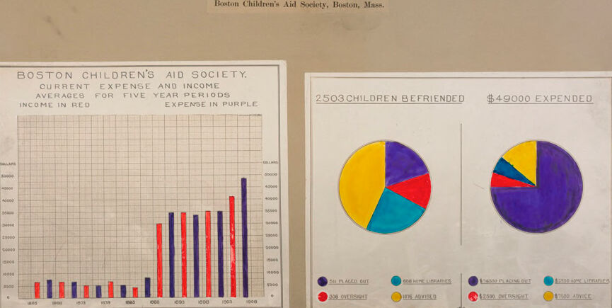
Machine Generated Data
Tags
Color Analysis
Feature analysis
Amazon
Clarifai

Clarifai
| Poster | 63.1% | |
Categories
Imagga
created on 2019-06-05
| text visuals | 91.6% | |
| paintings art | 4.7% | |
| events parties | 3% | |
Captions
Clarifai
No captions written
Salesforce
Created by general-english-image-caption-blip on 2025-05-28
a photograph of a piece of paper with a graphing of a pie chart
Created by general-english-image-caption-blip-2 on 2025-07-05
a piece of paper with a pie chart and a graph
OpenAI GPT
Created by gpt-4o-2024-11-20 on 2025-06-07
This image shows a visual representation of data from the Boston Children's Aid Society, located in Boston, Massachusetts, specifically highlighting financial and service-related statistics.
Left Section (Bar Graph):
- The section displays a graph labeled "Boston Children's Aid Society. Current Expense and Income Averages for Five-Year Periods."
- It compares income (red bars) and expenses (purple bars) across different time periods ranging from 1875 to 1900.
- The y-axis represents monetary amounts in dollars, while the x-axis marks the years in intervals of 5 years.
Right Section (Pie Charts):
- There are two pie charts to the right of the graph:
- The first chart is labeled "2,503 Children Befriended" and breaks down the society's services. Color sections represent proportions of children placed out (purple), home industrialized (yellow), advised (blue), and those under oversight (red).
- The second chart is labeled "$49,000 Expended," showing how funds were allocated for services such as placing out children (purple), home libraries (yellow), oversight (red), and advice (blue).
- There are two pie charts to the right of the graph:
Overall Design:
- The background is a tan or beige tone with noticeable wear, including some tears at the bottom.
- The visuals are hand-drawn and color-coded, featuring simple but clear data visualizations, likely created to communicate organizational achievements and priorities during the early 20th century.
Created by gpt-4o-2024-08-06 on 2025-06-07
The image is a historical infographic from the Boston Children's Aid Society in Boston, Massachusetts. It features three charts on a single board.
On the left side, there is a bar chart titled "Boston Children's Aid Society. Current Expense and Income Averages for Five Year Periods. Income in Red. Expense in Purple." The chart displays financial data over five-year intervals, with red bars representing income and purple bars representing expenses. The period shown ranges from 1865 to 1910, with a noticeable increase in both income and expenses over time.
In the middle, there is a pie chart labeled "2503 Children Befriended." This chart shows the distribution of the types of assistance provided to children:
- Yellow (582) for "Placed Out."
- Purple (805) for "Home Libraries."
- Red (308) for "Oversight."
- Light Blue (101) for "Advised."
On the right, another pie chart is labeled "$49,000 Expended," which details the allocation of the organization's expenses:
- Purple ($25,000) for "Placing Out."
- Yellow ($12,500) for "Home Libraries."
- Red ($5,000) for "Oversight."
- Light Blue ($7,500) for "Advice."
The charts are neatly arranged on the board with clear labels and a simple color scheme to differentiate between categories, reflecting a visual summary of the society's efforts and financials during that period.
Anthropic Claude
Created by anthropic.claude-3-haiku-20240307-v1:0 on 2025-06-11
The image appears to be a report or document from the Boston Children's Aid Society, Boston, Mass. It contains two visualizations - a bar graph showing the "Current Expense and Income" for the society over a five-year period, and two pie charts showing the breakdown of "2503 Children Befriended" and "$49,000 Expended" by the society. The visualizations provide financial and operational data about the activities and expenditures of the Boston Children's Aid Society during this time period.
Created by us.anthropic.claude-3-opus-20240229-v1:0 on 2025-06-11
The image shows two charts from the Boston Children's Aid Society. The chart on the left is a bar graph titled "BOSTON CHILDREN'S AID SOCIETY CURRENT EXPENSE AND INCOME AVERAGES FOR FIVE YEAR PERIODS". It displays the society's current expense and income averages over 5-year periods from 1850 to 1910.
The chart on the right is a pie chart titled "2503 CHILDREN BEFRIENDED $49000 EXPENDED". It breaks down how the $49,000 was spent to help the 2,503 children, with categories including "In Placed Out", "For Home Liabilities", "In Institutions", and "Under Oversight".
The charts are presented on what looks like an aged or vintage paper or document, giving it an historical feel related to the early 20th century time period the data represents.
Created by us.anthropic.claude-3-5-sonnet-20241022-v2:0 on 2025-06-11
This image shows statistical charts from the Boston Children's Aid Society in Massachusetts. There are two main visualizations:
A bar graph showing "Current Expense and Income" averages over five-year periods, with income shown in red and expenses in purple. The graph appears to span from the 1860s to the early 1900s, showing an increasing trend in both metrics over time.
Two pie charts on the right side showing:
- "2503 Children Befriended" - breaking down different categories of aid or services
- "$49,000 Expended" - showing how the money was distributed
The pie charts use a color-coding system with purple, turquoise, red, and yellow sections representing different categories such as "placed out," "home libraries," "oversight," and "advice."
The document appears to be a historical record, likely used for reporting or presentation purposes, showing both the financial aspects and the impact of the society's work with children in Boston during this period.
Meta Llama
Created by us.meta.llama3-2-90b-instruct-v1:0 on 2025-05-24
The image presents a comprehensive overview of the Boston Children's Aid Society's financial performance and activities over a five-year period, from 1882 to 1887. The data is visually represented through two distinct charts: a bar graph and a pie chart.
Bar Graph:
- Title: "Boston Children's Aid Society. Current Expense and Income Averages for Five Year Periods Income in Red Expense in Purple"
- X-axis: Years (1882-1887)
- Y-axis: Dollars ($0-$10,000)
- Data Points:
- Income (red bars): $1,000-$5,000
- Expense (purple bars): $2,000-$6,000
Pie Chart:
- Title: "2503 Children Befriended $49000 Expended"
- Segments:
- Blue: 511 Placed Out
- Red: 308 Oversight
- Yellow: 1598 Advised
- Purple: 2500 Placing Out
- Teal: 1550 Home Libraries
- Red: $2500 Oversight
- Yellow: $7500 Advice
Key Findings:
- The society's income and expenses have fluctuated over the five-year period, with a general increase in both categories.
- The majority of children befriended by the society were placed out (511), followed by those receiving oversight (308).
- The largest expenditure was on placing out children ($25,000), while the smallest was on oversight ($2,500).
Conclusion:
The image provides a detailed analysis of the Boston Children's Aid Society's financial performance and activities during the late 19th century. The data suggests that the society was actively involved in providing support to children in need, with a significant focus on placing them out and providing oversight. The expenditure on these activities was substantial, but the society's income also increased over the five-year period, indicating a growing commitment to its mission.
Created by us.meta.llama3-2-11b-instruct-v1:0 on 2025-05-24
The image presents a comprehensive overview of the Boston Children's Aid Society's financial data for the period spanning 1870 to 1903. The visual representation is divided into two distinct sections, each providing valuable insights into the society's income and expenses.
Section 1: Bar Graph
- Title: "Boston Children's Aid Society. Current Expense and Income Averages for Five Year Periods."
- Subtitle: "Income in Red" and "Expense in Purple"
- X-axis: Years, ranging from 1870 to 1903
- Y-axis: Dollar amounts, with increments of $5,000
- Data:
- Income:
- 1870-1874: approximately $10,000
- 1875-1879: around $15,000
- 1880-1884: roughly $20,000
- 1885-1889: about $25,000
- 1890-1894: approximately $30,000
- 1895-1899: around $35,000
- 1900-1903: roughly $40,000
- Expense:
- 1870-1874: approximately $8,000
- 1875-1879: around $12,000
- 1880-1884: roughly $16,000
- 1885-1889: about $20,000
- 1890-1894: approximately $24,000
- 1895-1899: around $28,000
- 1900-1903: roughly $32,000
- Income:
Section 2: Pie Charts
- Title: "2503 Children Befriended" and "$49,000 Expended"
- Pie Chart 1:
- Segments:
- Placing Out: yellow
- Home Libraries: blue
- Advised: red
- Over Sight: purple
- Data:
- Placing Out: approximately 40%
- Home Libraries: around 30%
- Advised: roughly 20%
- Over Sight: about 10%
- Segments:
- Pie Chart 2:
- Segments:
- Placing Out: yellow
- Home Libraries: blue
- Advised: red
- Over Sight: purple
- Data:
- Placing Out: approximately 40%
- Home Libraries: around 30%
- Advised: roughly 20%
- Over Sight: about 10%
- Segments:
In summary, the image provides a detailed breakdown of the Boston Children's Aid Society's financial data over a 33-year period. The bar graph illustrates the society's income and expenses, while the pie charts offer a visual representation of the allocation of funds towards various activities. The data suggests that the society's income has consistently increased over the years, with a notable surge in the late 1800s. The expenses have also risen, but at a slower rate. The pie charts reveal that the majority of the funds are allocated towards placing out children, followed by home libraries, advised, and over sight.
Amazon Nova
Created by amazon.nova-pro-v1:0 on 2025-05-24
The image shows two graphs on a piece of paper. The paper is placed on a brown surface. The graphs are titled "Boston Children's Aid Society." The graph on the left shows the current expense and income averages for five-year periods. The graph on the right shows the number of children befriended and the amount spent. The graphs have different colors for each category.
Created by amazon.nova-lite-v1:0 on 2025-05-24
The image shows two documents on a beige background. The first document is titled "Boston Children's Aid Society. Current Expense and Income Averages for Five Year Periods." The document shows a graph with a red line representing income and a purple line representing expenses. The graph has a grid with numbers and labels for the years 1865 to 1900. The second document is titled "2503 Children Befriended $49000 Expended." The document shows a pie chart with different colors representing different categories of expenses. The pie chart has a label for each category, including "500 Placed Out," "2500 Home Libraries," "300 Oversight," and "1500 Advice."
Google Gemini
Created by gemini-2.0-flash on 2025-05-22
The image shows two hand-drawn charts related to the Boston Children's Aid Society. The first chart is a bar graph comparing the current expense and income averages for five-year periods. The income is represented in red and the expenses are represented in purple. The years range from 1863 to 1900.
The second chart consists of two pie charts. The pie chart on the left shows how the 2503 children were befriended. The colors in the chart correspond to different services provided: purple for children placed out, cyan for home libraries, red for oversight, and yellow for advice. The pie chart on the right shows how $49,000 was expended. Similarly, the colors represent different expenses: purple for placing out, cyan for home libraries, red for oversight, and yellow for advice.
Created by gemini-2.0-flash-lite on 2025-05-22
Here's a description of the image:
Overall:
The image is a historical presentation likely from the Boston Children's Aid Society. It's a hand-drawn or possibly printed document on a somewhat aged, textured background. The style indicates an early 20th-century feel. The document contains financial and statistical data presented in the form of a line graph and pie charts.
Content Breakdown:
Header: The title "Boston Children's Aid Society, Boston, Mass." appears at the top, indicating the organization and its location.
Line Graph (Left):
- Title: "BOSTON CHILDREN'S AID SOCIETY. CURRENT EXPENSE AND INCOME AVERAGES FOR FIVE YEAR PERIODS. INCOME IN RED. EXPENSE IN PURPLE."
- Data: The graph plots income and expense averages over time (likely every five years, indicated by the "averages for five year periods" description). Income is represented by red bars, while expenses are in purple. The graph's horizontal axis indicates years (1863, 1868, 1873, etc.), and the vertical axis represents dollars.
- Interpretation: The graph visually compares income and expenditure trends, allowing for a look at how the Society's financial situation changed over time.
Pie Charts (Right):
- Titles: Two pie charts are presented. The first, titled "2503 CHILDREN BEFRIENDED", likely shows the allocation of children helped, while the second " $49000 EXPENDED " displays the expenditure distribution.
- Data: Each pie chart is divided into different colored segments, which represent different categories or areas of activity for the Boston Children's Aid Society. Key categories seem to include placing out children, oversight, home libraries, and advice/other assistance.
- Interpretation: These charts provide a visual breakdown of how the Society distributed its resources and the nature of the services it provided to children.
Overall Tone and Purpose:
The document's purpose seems to be to present the Boston Children's Aid Society's financial data, activities, and impact. It likely served as a report for stakeholders, donors, or for internal review. The simplicity of the visual style, the use of hand-drawn elements, and the clear labeling suggest an attempt to make the data accessible and easily understandable.
Mistral Pixtral
Created by us.mistral.pixtral-large-2502-v1:0 on 2025-05-24
The image is a historical document from the Boston Children's Aid Society, Boston, Massachusetts. It presents financial and operational data for the society over a five-year period. The document includes two main visual elements: a bar chart and two pie charts.
Bar Chart:
- Title: "Boston Children's Aid Society. Current Expense and Income Averages for Five Year Periods."
- Color Coding:
- Income is represented in red.
- Expense is represented in purple.
- Data Representation:
- The vertical axis represents dollar amounts ranging from $0 to $70,000.
- The horizontal axis represents different five-year periods.
- The bars show the income and expense for each period, with income generally increasing over time and expenses also rising but at a different rate.
Pie Charts:
Left Pie Chart:
- Title: "2503 Children Befriended."
- Color Coding:
- Dark Blue: Self-placed out.
- Light Blue: In home libraries.
- Red: Board oversight.
- Yellow: Other aided.
- Data Representation: Shows the distribution of the 2503 children helped by the society, categorized by the type of assistance provided.
Right Pie Chart:
- Title: "$49,000 Expended."
- Color Coding:
- Dark Blue: Self-placed out.
- Light Blue: In home libraries.
- Red: Board oversight.
- Yellow: Other aided.
- Data Representation: Shows the allocation of the $49,000 expended by the society, categorized by the type of service or assistance provided.
Overall Summary:
The document provides a visual summary of the Boston Children's Aid Society's financial performance and the distribution of its services over multiple five-year periods. The bar chart illustrates the trends in income and expenses, while the pie charts detail the types of assistance provided to children and the corresponding financial allocations.
Qwen
Created by Qwen/Qwen2.5-VL-7B-Instruct on 2025-07-29
The image is a document from the Boston Children's Aid Society in Boston, Massachusetts, dated 1904. It contains two main sections of graphical data.
Bar Graph on the left:
- The bar graph is titled "Boston Children's Aid Society, Current Expense and Income, Averages for Five-Year Periods."
- The graph shows the average income and expense over a series of five-year periods, with the years listed on the x-axis and the amount in dollars on the y-axis.
- Income is represented in red bars, and expense is represented in purple bars.
- The data spans from the year 1880 to the year 1904.
Pie Charts on the right:
- The top part of the right section states "2503 CHILDREN BEFRIENDED" with a note "$49,000 EXPENDED."
- Below this text, there are two pie charts with separate color-coded sections.
- The pie chart on the left breaks down the number of children befriended into categories:
- Placed Out (purple)
- Home Libraries (blue)
- School Libraries (yellow)
- Oversight (red)
- The pie chart on the right breaks down the expenditure into categories:
- Placed Out (purple)
- Home Libraries (blue)
- School Libraries (yellow)
- Oversight (red)
- Advice (orange)
The document provides a visual summary of the society's financial and operational activities, specifically focusing on the income, expenses, and the number of children they have helped over a period.
Created by Qwen/Qwen2.5-VL-72B-Instruct on 2025-07-29
This image is a historical document from the Boston Children's Aid Society in Boston, Massachusetts. It presents data visualizations related to the organization's activities and financials during a specified period.
Components of the Image:
Bar Graph (Left):
- Title: "Boston Children's Aid Society, Current Expense and Income Averages for Five-Year Periods."
- Colors: Income is represented in red, and expenses in purple.
- Data: The graph shows annual figures from 1865 to 1909, with a grid background for scale. Over time, income and expenses appear to increase, with notable peaks and valleys.
Two Pie Charts (Right):
- Title (Above Pie Charts): "2503 Children Befriended, $49,000 Expended."
- Purpose: These charts illustrate how the $49,000 was allocated for the 2,503 children helped by the society.
- Legend: The legend breaks down the expenditures as follows:
- Dark Blue: $600 placed out.
- Light Blue: $600 home libraries.
- Purple: $16,000 placing out.
- Yellow: $7,500 advised.
- Red: $12,500 oversight.
Document Layout:
- The document has a beige background with visible wear and tear, suggesting it is an old piece of paper.
- The text and charts are neatly arranged, emphasizing the society's financial transparency and impact on children.
This document likely served as a report or presentation to stakeholders, donors, or the public to demonstrate the society’s work and financial management.
Text analysis
Amazon