Machine Generated Data
Tags
Color Analysis
Feature analysis
Amazon
Clarifai

Clarifai
| Tree | 35.4% | |

Categories
Imagga
created on 2019-06-04
| text visuals | 98.1% | |
| paintings art | 1.5% | |
Captions
Microsoft
created by unknown on 2019-06-04
| a close up of a box | 72.3% | |
| a screen shot of a computer | 61.7% | |
| close up of a box | 61.6% | |
Salesforce
Created by general-english-image-caption-blip-2 on 2025-07-05
a map of the city of new york, with a description of the city
Created by general-english-image-caption-blip on 2025-05-04
a photograph of a map of a map of a city
OpenAI GPT
Created by gpt-4o-2024-11-20 on 2025-06-10
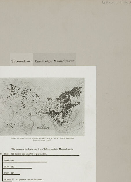
This image presents a historical depiction of tuberculosis in Cambridge, Massachusetts. It is framed with a grey border and features a central white panel containing two distinct elements:
Map of Cambridge detailing tuberculosis impact: The upper portion includes a map labeled "What Tuberculosis Did in Cambridge in Ten Years 1906–1915." The map highlights areas affected by tuberculosis cases, presumably marked by dots. It displays the geographic distribution of tuberculosis-related deaths during the specified time period.
Statistical data on tuberculosis death rates: The bottom section shows a bar graph accompanied by text that illustrates the decrease in tuberculosis death rates in Massachusetts from 1872 to 1930. The death rates per 100,000 population are documented as follows:
- 1872: 445 deaths
- 1900: 281 deaths
- 1910: 180 deaths
- 1920: 114 deaths
- 1930: 57 deaths (projected rate at the current decrease rate)
The image aims to visualize both the geographic and statistical impact of tuberculosis, emphasizing the notable decline in death rates over time.
Created by gpt-4o-2024-08-06 on 2025-06-10
The image displays a historical document related to the incidence of tuberculosis in Cambridge, Massachusetts. The top of the document has the title "Tuberculosis, Cambridge, Massachusetts." There is a map in the central part, labeled "What Tuberculosis Did In Cambridge In Ten Years 1905-1915." It shows the city of Cambridge with numerous black dots, likely representing cases or incidents of tuberculosis within that timeframe. Below the map, there is a text section highlighting the decrease in the death rate from tuberculosis in Massachusetts over several years. Specific death rates per 100,000 of the population are given for different years: 445 in 1872, 281 in 1900, 180 in 1910, 114 in 1920, and a projected rate of 57 in 1930 at the present rate of decrease. The document likely served to illustrate both the impact of tuberculosis in a specific area and the progress made in reducing its mortality rate over time.
Anthropic Claude
Created by anthropic.claude-3-haiku-20240307-v1:0 on 2025-06-14
The image appears to be a historical document related to tuberculosis in Cambridge, Massachusetts. It contains a map of Cambridge that shows the distribution of tuberculosis cases in the city over time, from 1890-1905. The map uses dots to represent the locations of tuberculosis cases. Below the map, there is a chart showing the decrease in the death rate from tuberculosis in Massachusetts over several decades, from 1879 to 1920. The document provides statistical information about the decline in tuberculosis mortality in the state during this period.
Created by us.anthropic.claude-3-5-sonnet-20241022-v2:0 on 2025-06-14
This image shows historical data about tuberculosis in Cambridge, Massachusetts. It contains two main elements:
A map of Cambridge showing what appears to be the distribution of tuberculosis cases over a ten-year period from 1900-1910
A bar graph showing the decrease in tuberculosis death rates in Massachusetts from 1872 to 1930, with rates declining from 365 deaths per 100,000 population in 1872 to much lower rates in subsequent decades:
- 1900-1904
- 1910-1920
- 1920-1924
- 1930- showing 97 deaths at "present rate of decrease"
The map portion shows scattered dots or marks across Cambridge's geography, likely representing individual cases or clusters of tuberculosis. The darker areas appear to indicate higher concentrations of cases. This visualization effectively demonstrates both the geographic distribution of the disease and its declining prevalence over time in Massachusetts.
Meta Llama
Created by us.meta.llama3-2-11b-instruct-v1:0 on 2025-06-10
The image is a page from an old book or document, featuring a map of Cambridge, Massachusetts, and a graph illustrating the decrease in death rate from tuberculosis in the area.
- The title of the page is "Tuberculosis, Cambridge, Massachusetts."
- Below the title, there is a map of Cambridge, Massachusetts, which appears to be hand-drawn or printed on a light-colored paper.
- The map shows the location of various buildings, roads, and other features in the city.
- There are several small black dots scattered throughout the map, which may represent the locations of tuberculosis cases or deaths.
- Below the map, there is a graph titled "The decrease in death rate from Tuberculosis in Massachusetts."
- The graph shows the number of deaths per 100,000 population due to tuberculosis in Massachusetts from 1875 to 1930.
- The graph indicates a significant decrease in the death rate over time, with the number of deaths per 100,000 population dropping from 465 in 1875 to 57 in 1930.
- The background of the page is a light beige color, with a slight discoloration around the edges.
- There are some handwritten notes and markings on the page, including a date (December 21, 1930) and a name (G. Henry).
Overall, the image suggests that the death rate from tuberculosis in Massachusetts decreased significantly over the period from 1875 to 1930. The graph provides a visual representation of this trend, while the map may indicate the geographic distribution of tuberculosis cases or deaths during this time period.
Created by us.meta.llama3-2-90b-instruct-v1:0 on 2025-06-10
The image presents a document titled "Tuberculosis, Cambridge, Massachusetts," which features a map of Cambridge and a bar graph illustrating the decrease in death rates from tuberculosis in Massachusetts between 1872 and 1930.
Map:
The map is centered on the page and displays the city of Cambridge with various areas shaded in black. The shading appears to represent the prevalence of tuberculosis cases within the city. The map also includes a key or legend, but it is not clearly visible due to the image quality.
Bar Graph:
Below the map, a bar graph shows the decrease in death rates from tuberculosis in Massachusetts over several decades. The graph consists of five bars, each representing a different time period:
- 1872-1885: 465 deaths per 100,000 population
- 1900-1921: 251 deaths per 100,000 population
- 1920-1930: 114 deaths per 100,000 population
- 1930-1937: 57 deaths per 100,000 population (at present rate of decrease)
The graph effectively illustrates the significant decline in tuberculosis-related deaths in Massachusetts over the specified time periods.
Document Background:
The document has a beige background with a white border around the edges. There are some faint marks and stains visible on the paper, suggesting that it may be an old or historical document. In the top-right corner, there is a handwritten note that reads "S Healy 91-30/1." This notation likely indicates the document's origin or provenance.
Overall, the image provides valuable information about the prevalence of tuberculosis in Cambridge, Massachusetts, and the decline in death rates from the disease in Massachusetts over several decades.
Amazon Nova
Created by amazon.nova-lite-v1:0 on 2025-06-09
The image shows a page from a historical document that appears to be a report or study on tuberculosis in Cambridge, Massachusetts. The page has a white background with black text and a map of Cambridge in the center. The map shows the locations of deaths from tuberculosis in the city over a ten-year period, with each dot representing a death. The text on the page discusses the decrease in the death rate from tuberculosis in Massachusetts over time, with specific numbers provided for different years. The image also includes a table showing the number of deaths per 100,000 population for each year. The overall tone of the page is informative and data-driven, with a focus on the progress made in reducing tuberculosis deaths in the region.
Created by amazon.nova-pro-v1:0 on 2025-06-09
The image shows a document with a map of Cambridge, Massachusetts, and text. The map is in black and white, and it is titled "Tuberculosis, Cambridge, Massachusetts." The map shows the locations of tuberculosis deaths in Cambridge over a ten-year period, from 1900 to 1910. Each dot on the map represents a death from tuberculosis. The text below the map provides information about the decrease in the death rate from tuberculosis in Massachusetts. It states that in 1872, there were 465 deaths per 100,000 of the population, while in 1910, there were 114 deaths per 100,000 of the population. The text also notes that the death rate from tuberculosis in Massachusetts has been decreasing at a steady rate.
Google Gemini
Created by gemini-2.0-flash on 2025-05-04
Here is a description of the image:
The image features a document titled "Tuberculosis, Cambridge, Massachusetts." It presents information about the impact of tuberculosis in Cambridge and the decline in death rates from tuberculosis in Massachusetts. The document includes a map of Cambridge with black dots indicating deaths from tuberculosis between 1900 and 1915. Below the map, there is a chart showing the decrease in death rate from tuberculosis in Massachusetts over the years:
- In 1872-465 deaths per 100,000 of population.
- 1900-281
- 1910-180
- 1920-114
- 1930-57 at present rate of decrease.
The background appears to be a grey color.
Created by gemini-2.0-flash-lite on 2025-05-04
The image is a historical document focusing on the impact of tuberculosis in Cambridge, Massachusetts. The main section is a white rectangular document with text and data.
The document presents the "decrease in death rate from Tuberculosis in Massachusetts," showing data from 1872 to 1930. It includes a graphic representation of Cambridge in the early 1900s, plotting the distribution of tuberculosis cases.
Above the main section is a title: "Tuberculosis, Cambridge, Massachusetts," and further details. The document also contains a map showing the distribution of tuberculosis cases in Cambridge between 1900 and 1915. The map is marked with dots, likely representing deaths due to tuberculosis. Beneath the map are statistical figures, showing a decrease in death rates per 100,000 population over the years:
- In 1872: 465 deaths per 100,000
- In 1900: 281 deaths per 100,000
- In 1910: 180 deaths per 100,000
- In 1920: 114 deaths per 100,000
- In 1930: 57 deaths per 100,000 (at present rate of decrease).
The document appears to be aged, as evidenced by the slight creases and wear visible in the image.
Mistral Pixtral
Created by us.mistral.pixtral-large-2502-v1:0 on 2025-06-05
The image appears to be a page from a report or document related to tuberculosis in Cambridge, Massachusetts. Here is a detailed summary of the contents:
Title and Location:
- The document is titled "Tuberculosis, Cambridge, Massachusetts."
Map:
- There is a map of Cambridge, Massachusetts, showing the locations where individuals died from tuberculosis over a ten-year period from 1890 to 1899.
- The map is labeled "What Tuberculosis Did in Cambridge in Ten Years: 1890-1899."
- The map is marked with numerous black dots, each likely representing a death due to tuberculosis.
Statistics:
- Below the map, there is a section titled "The decrease in death rate from Tuberculosis in Massachusetts."
- It provides statistical data on the decrease in tuberculosis death rates over different time periods:
- From 1900 to 1920, the death rate decreased from 465 deaths per 100,000 population to 281 deaths per 100,000 population.
- From 1920 to 1940, the death rate further decreased to 180 deaths per 100,000 population.
- From 1940 to 1960, the death rate continued to decline to 114 deaths per 100,000 population.
- By 1980, the death rate had significantly dropped to 7 deaths per 100,000 population, described as the "present rate of decrease."
The document seems to be highlighting the historical impact of tuberculosis in Cambridge and the significant reduction in death rates over time, likely due to advancements in medical treatment and public health measures.
Qwen
Text analysis
Amazon