Machine Generated Data
Tags
Color Analysis
Feature analysis
Amazon
Clarifai

Clarifai
| Poster | 73.3% | |


Categories
Imagga
created on 2019-06-07
| text visuals | 100% | |
Captions
Microsoft
created by unknown on 2019-06-07
| a close up of a piece of paper | 72.3% | |
| close up of a piece of paper | 70.2% | |
| a piece of paper | 70.1% | |
Clarifai
No captions written
Salesforce
Created by general-english-image-caption-blip on 2025-06-13
a photograph of a display of a bulletin board with graphs of data and data
Created by general-english-image-caption-blip-2 on 2025-07-07
a large sheet of paper with graphs and charts
OpenAI GPT
Created by gpt-4o-2024-11-20 on 2025-06-14
This image consists of a collection of charts and graphs analyzing housing conditions in German cities. The title at the top reads, "Housing Conditions, German Cities," indicating the subject matter. The charts display data describing the relationship between tenants' income and the amount of rent paid, as well as trends in housing sizes and rent percentages in various locales.
On the left side:
- There are line graphs labeled "Einkommen und Miete" (Income and Rent), showing how income levels were spent on rent for cities such as Schöneberg (1905) and Essen (1900). The graphs indicate rent as a percentage of income for various income brackets.
On the right side:
- Bar graphs labeled "Einkommen und Miete" show the percentage of income spent on rent in cities such as Hamburg (multiple years) and Breslau (before 1900). These illustrate rent affordability across various income groups over time.
- Additional charts labeled "Wohnungsgröße und Miete" (Housing Size and Rent) compare dwelling sizes with rent amounts in cities like Fürth (1901/1902), Augsburg (1904), and Posen (modern-day Poznań, 1906/1907). These graphs detail how rents vary depending on the size of housing units across different cities.
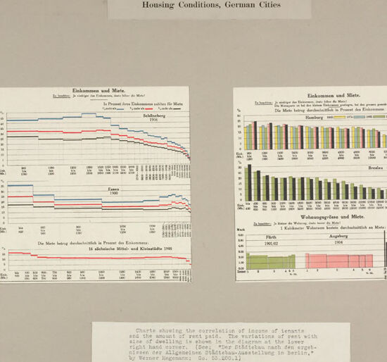
A typed caption at the bottom provides context: "Charts showing the correlation of income of tenants and the amount of rent paid. The variation of rent with size of dwelling is shown in the diagram at the lower right-hand corner [...] by Werner Hegemann." The study seems to have been part of urban planning or housing research.
The overall layout is clean and organized, with labels in German and an explanatory note in English directing the viewer to the intent of the study.
Created by gpt-4o-2024-08-06 on 2025-06-14
The image is a collection of charts related to housing conditions in German cities. It is displayed on a grey background, and the title "Housing Conditions, German Cities" is printed at the top center. There are two groups of charts on the grey background:
Left Panel: It contains multiple line graphs illustrating the relationship between income and rent over a period, for cities such as Schöneberg (1909) and Essen (1900). The y-axis shows percentages (likely of income or rent), while the x-axis represents different years or income levels.
Right Panel: It presents bar graphs and possibly other types of charts, showing rent as a percentage of income for cities like Hamburg from 1896 to 1907, and Breslau from 1907 to 1908. Another set of charts show the size of dwellings and the associated rent, with examples from cities like Fürth (1901/02), Augsburg (1904), and Posen (Südvorstadt, 1905/06).
Below the charts, there is a note stating: "Charts showing the correlation of income of tenants and the amount of rent paid. The variation of rent with size of dwelling is shown in the diagram in the lower right hand corner." It references a document related to the results of the Allgemeiner Städtebau-Ausstellung in Berlin by Werner Hegemann.
The charts are annotated in German and are designed to provide insights into historical housing conditions and economic factors in various German cities around the turn of the 20th century.
Anthropic Claude
Created by anthropic.claude-3-haiku-20240307-v1:0 on 2025-06-20
This image appears to be a set of charts and graphs related to housing conditions in German cities. The main title of the image is "Housing Conditions, German Cities". The charts display information on income and rents, as well as the relationship between income and rent paid by tenants. There are also graphs showing the variation in rents over time for different cities like Hamburg and Berlin. The image seems to be presenting statistical data and analysis on the housing situation in Germany during a particular historical period.
Created by us.anthropic.claude-3-5-sonnet-20241022-v2:0 on 2025-06-20
This image shows a collection of historical charts and graphs related to housing conditions in German cities, specifically focusing on income and rent ("Einkommen und Miete"). The charts appear to be from the early 1900s and display data for several German cities including Hamburg, Breslau, and Essen. The graphs show the correlation between tenant income and rent paid over time, with different colored lines and bar graphs representing various metrics. At the bottom of the image is a caption in English explaining that these charts demonstrate the relationship between tenant income and rent paid. The data visualization style is typical of early 20th century statistical presentations, with clean lines and simple color coding. The overall layout suggests this was part of a larger study or presentation on urban housing conditions in German cities during that period.
Meta Llama
Created by us.meta.llama3-2-11b-instruct-v1:0 on 2025-06-13
The image presents a collection of three charts, each providing insights into housing conditions in German cities. The charts are arranged in a row, with the first two charts on the left and the third chart on the right.
Chart 1:
The first chart, titled "Einkommen und Miete" (Income and Rent), displays a line graph with multiple lines representing different cities. The x-axis is labeled with years from 1900 to 1910, while the y-axis shows income levels ranging from 100 to 1,000. The chart illustrates the relationship between income and rent in various cities during this period.
Chart 2:
The second chart, also titled "Einkommen und Miete," features a bar graph with multiple bars representing different cities. The x-axis lists the cities, while the y-axis shows the percentage of income spent on rent. The chart provides a visual representation of the proportion of income allocated to rent in each city.
Chart 3:
The third chart, titled "Wohnungszahl und Miete" (Number of Rooms and Rent), presents a bar graph with multiple bars representing different cities. The x-axis lists the cities, while the y-axis shows the number of rooms in a dwelling. The chart illustrates the relationship between the number of rooms and rent in each city.
Additional Information:
At the bottom of the image, a paragraph of text provides additional context and information about the charts. The text is written in German and appears to be a description of the data presented in the charts.
Background:
The background of the image is a light gray color, which provides a clean and neutral backdrop for the charts.
Overall:
The image presents a clear and concise visual representation of housing conditions in German cities during the early 20th century. The charts provide valuable insights into the relationship between income, rent, and the number of rooms in dwellings, offering a snapshot of the housing market during this period.
Created by us.meta.llama3-2-90b-instruct-v1:0 on 2025-06-13
The image presents a comprehensive visual representation of housing conditions in German cities, featuring two charts that provide detailed information on various aspects of housing. The title "Housing Conditions, German Cities" is prominently displayed at the top of the image.
Chart 1:
The first chart, situated on the left side of the image, is titled "Einkommen und Miete." It features a line graph with multiple lines representing different income levels, each corresponding to a specific color. The x-axis represents the number of people in a household, while the y-axis displays the amount of rent paid. The chart provides a clear visual representation of how income affects rent payments for households of varying sizes.
Chart 2:
The second chart, located on the right side of the image, is also titled "Einkommen und Miete." This chart features a bar graph with multiple bars representing different income levels, each corresponding to a specific color. The x-axis represents the number of people in a household, while the y-axis displays the amount of rent paid. Similar to the first chart, this chart illustrates the relationship between income and rent payments for households of different sizes.
Additional Information:
Below the charts, a paragraph of text provides additional context and explanation for the data presented. Unfortunately, the text is written in German, making it difficult to understand without translation. However, it appears to discuss the methodology used to create the charts and the significance of the findings.
Conclusion:
In conclusion, the image effectively communicates complex data on housing conditions in German cities through the use of clear and concise charts. The two charts provide a comprehensive overview of the relationship between income and rent payments, allowing viewers to easily compare and contrast different income levels and household sizes. While the accompanying text may be challenging to understand without translation, the charts themselves are self-explanatory and provide valuable insights into the housing market in German cities.
Amazon Nova
Created by amazon.nova-lite-v1:0 on 2025-06-14
The image shows a page from a document titled "Housing Conditions, German Cities." The page contains two charts that illustrate the correlation between the incomes of tenants and the amount of rent they pay. The charts are accompanied by a caption that provides context and explanation for the data presented.
The first chart is titled "Einkommen und Miete" (Income and Rent) and shows the relationship between income and rent for different cities in Germany. The chart displays various income brackets on the x-axis and corresponding rent amounts on the y-axis. The data is presented in a tabular format, with each row representing a different income bracket and each column representing a different city.
The second chart is titled "Wohnungsgröße und Miete" (Living Space and Rent) and shows the correlation between the size of living space and the amount of rent paid. Similar to the first chart, this chart also displays data in a tabular format, with living space sizes on the x-axis and corresponding rent amounts on the y-axis.
The caption provides additional information about the charts, stating that they are based on a diagram by Werner Hegemann titled "Der Bauntteu nach dem ergetenen [sic] recht Allgemein: Ribehe-Ausstellung in Berlin" (The Building According to the Established Right: Housing Exhibition in Berlin). The caption also mentions that the charts are accompanied by a text that explains the correlation between income and rent.
Overall, the image depicts a page from a document that presents data and analysis on housing conditions in German cities, specifically focusing on the relationship between income, living space size, and rent. The charts and accompanying text aim to provide insights into the correlation between these factors and inform discussions on housing policies and affordability.
Created by amazon.nova-pro-v1:0 on 2025-06-14
The image shows two graphs that are titled "Housing Conditions, German Cities." The graphs show the correlation of incomes of tenants and the amount of rent paid. The variations of rent with the size of dwelling are shown in the diagram at the lower right-hand corner. The graphs are in black and white and have different colored lines. The graphs show the data for the years 1900, 1905, and 1910.
Google Gemini
Created by gemini-2.0-flash on 2025-06-13
Here is a description of the image:
The image shows a document titled "Housing Conditions, German Cities". It contains several charts illustrating the relationship between income and rent in various German cities.
On the left side of the document, there are two line charts labeled "Einkommen und Miete" (Income and Rent) for the cities of Schöneberg (1906) and Essen (1900). The charts show the trends of income and rent over a range of income levels. Additionally, there's a bar chart below showing "Die Miete betrug durchschnittlich in Prozent des Einkommens" (The rent averaged as a percentage of income) in 16 Saxon middle- and small-towns in 1905.
On the right side, there are bar charts showing "Einkommen und Miete" (Income and Rent) for Hamburg and Breslau. The charts illustrate the average income and rent for different income levels.
Below the bar charts, there's another chart titled "Wohnungsgrösse und Miete" (Apartment size and Rent). It shows the average cost per cubic meter of living space in the cities of Fürth, Augsburg, and Posen (Poznan).
Below the charts, there's a text explaining that the charts show the correlation of income of tenants and the amount of rent paid. The variations of rent with size of dwelling is shown in the diagram at the lower right hand corner.
Created by gemini-2.0-flash-lite on 2025-06-13
Here's a description of the image:
The image is a historical document, likely a page from a book or publication, concerning "Housing Conditions, German Cities." It appears to be a data visualization, using charts and graphs to present information.
Here's a breakdown of the visible elements:
- Title: "Housing Conditions, German Cities" indicates the subject matter of the page.
- Charts and Graphs: The page features multiple charts with German labels. The graphs show the correlation of income of tenents and the amount of rent paid. The variations of rent with the size of the dwelling is shown in the diagram at the lower right hand corner.
- German Text: There are several phrases and labels in German, such as "Einkommen und Miete" (Income and Rent) suggesting the data presented.
- Source Information: The text at the bottom gives the reference of the image taken from "Der Städtebau nach den ergeb-nissen der Allgemeinen Städtebau-Ausstellung in Berlin" by Werner Hegemann: Do. 53.200.1.
Mistral Pixtral
Created by us.mistral.pixtral-large-2502-v1:0 on 2025-06-13
The image titled "Housing Conditions, German Cities" contains two main sections of graphs and charts that analyze the correlation between income and living conditions, specifically focusing on the size of dwellings in German cities.
Left Section:
- Title: Einkommen und Miete (Income and Rent)
- Graphs:
- Top Graph: Shows the average number of rooms per dwelling in relation to income levels for three cities: Hamburg, Essen, and Breslau. The x-axis represents income levels in Marks, while the y-axis represents the number of rooms. Different colored lines represent each city.
- Middle Graph: Similar to the top graph but focuses on the average rent in Marks per dwelling in relation to income levels. The x-axis represents income levels, and the y-axis represents rent.
- Bottom Graph: Depicts the average number of persons per room in relation to income levels. The x-axis represents income levels, and the y-axis represents the number of persons per room.
Right Section:
- Title: Einkommen und Miete (Income and Rent)
- Graphs:
- Top Graph: Bar chart showing the distribution of income levels among tenants in Hamburg. The x-axis represents different income brackets, and the y-axis represents the number of tenants.
- Middle Graph: Similar bar chart for Breslau, showing the distribution of income levels among tenants.
- Bottom Graph: Titled "Wohnungsgrössen und Miete" (Size of Dwellings and Rent), this bar chart shows the correlation between the size of dwellings and rent in Marks for different cities: Fulda (1904), Essen (1904), and Posen (1905). The x-axis represents the size of dwellings, and the y-axis represents the rent.
Bottom Section:
- Text: Provides an explanation of the charts. It states that the charts show the correlation between income and the size of dwellings. The text mentions that the average size of dwellings is shown in the diagram at the lower left, and the average number of persons per room is shown in the middle left. It also references the general housing conditions in Berlin.
Overall, the image provides a detailed analysis of how income levels affect housing conditions in various German cities, focusing on the size of dwellings, rent, and the number of persons per room.
Qwen
Created by Qwen/Qwen2.5-VL-7B-Instruct on 2025-07-12
The image is a page from a document titled "Housing Conditions, German Cities," which discusses the correlation between the income of tenants and the amount of rent paid in various German cities. The page contains several charts and graphs, each providing data on specific cities and time periods.
The left side of the page includes three line graphs:
- The top graph is labeled "Einkommen und Miete" for Schöneberg in 1906, showing the percentage of income spent on rent for different income ranges.
- The middle graph is labeled "Einkommen und Miete" for Essen in 1900, presenting similar data for rent expenditure as a percentage of income across different income brackets.
- The bottom graph is labeled "Die Miete betrug durchschnittlich in Prozent des Einkommens: 16 sächsische Mittel- und Kleinstädte 1905," which translates to "The rent was 15 percent of the average income: 16 Saxon medium and small cities 1905," indicating an average across several cities.
The right side of the page contains two bar graphs:
- The top graph is labeled "Einkommen und Miete" for Hamburg in 1858, 1874, 1892, 1901, and 1902, showing the percentage of income spent on rent for different income levels across these years.
- The bottom graph is labeled "Wohnungsgrößen und Miete" for Breslau in 1890 and 1900, displaying the rental cost in relation to the size of the dwelling in different years.
At the bottom of the page, there is a note in English explaining the charts and their context, referencing a publication by Werner Hegemann titled "Der Städtebau nach den ergeben Städtebau-Ausstellung in Berlin," which translates to "Urban Planning after the Berlin City Planning Exhibition," with the reference number "Go. 53.200.1."
Created by Qwen/Qwen2.5-VL-72B-Instruct on 2025-07-12
This image presents several charts and graphs analyzing housing conditions in German cities, specifically focusing on the correlation between tenants' income and the amount of rent paid, along with the variations of rent with the size of dwellings. The title "Housing Conditions, German Cities" is prominently displayed at the top.
The left side of the image features three separate line graphs labeled "Einkommen und Miete" (Income and Rent). These graphs represent data from Schöneberg (1906), Essen (1900), and 16 Sächsische Mittel- und Kleinstädte (1905), which translates to 16 Saxon medium and small towns. Each graph shows the percentage of income spent on rent for different income brackets. The notes indicate that the lower the income, the higher the percentage spent on rent.
The right side of the image contains two bar graphs. The top graph is also labeled "Einkommen und Miete" and compares data from Hamburg across different years (1898, 1874, 1892, 1881, 1901) and Breslau for the years 1890 and 1900. The bottom graph is labeled "Wohnungsgrösse und Miete" (Apartment Size and Rent) and shows the cost per cubic meter of living space in Fürth, Augsburg, and Posen for various years and room sizes.
At the bottom of the image, there is a caption that explains the charts, noting that the data is from "Der Städtebau nach den Ergebnissen der Allgemeinen Städtebau-Ausstellung in Berlin," by Werner Hegemann, Go. 53.200.1. This suggests that the data and analysis are based on the results of a general urban planning exhibition in Berlin.
Text analysis
Amazon