Machine Generated Data
Tags
Color Analysis
Categories
Imagga
text visuals | 99.9% | |
Captions
Microsoft
created by unknown on 2019-06-04
a screen shot of a computer | 80% | |
a screen shot of a computer screen | 72.6% | |
a sign on the screen | 63.6% | |
Clarifai
created by general-english-image-caption-blip on 2025-05-15
a photograph of a number of papers with a number of different types of papers | -100% | |
OpenAI GPT
Created by gpt-4o-2024-11-20 on 2025-06-08
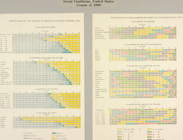
This image is a detailed statistical infographic from the Census of 1900 in the United States, titled “Social Conditions, United States Census of 1900.” The graphic is divided into two sides and provides proportional data about farms of specified areas in 1900. Each side shows visualized information through horizontal bar charts, classified by various criteria.
Left Side:
- Classified by Area: Shows proportions of farms based on size categories in acres.
- Classified by Source of Income: Analyzes farm income sources (e.g., self-sustenance, cash income).
- Classified by Income: Compares the income levels of farms.
- Classified by Race: Illustrates farm data categorized by racial demographics.
Right Side:
- Classified by Tenure: Breaks down farm tenure (e.g., owned versus rented).
- Classified by Rank of Occupants: Represents social or economic rank of farm occupants.
- Classified by Principal Crops: Examines proportions of farms by the crops they produced.
- Classified by Amount of Income: Displays income ranges in relation to acreage.
Color coding is used throughout the bars to represent different categories, like acres of land, types of income sources, races, or crops. This visual is a snapshot of social and agricultural conditions, prominently focusing on farms during the early 20th century. The detailed segmentation of data implies efforts toward comprehensive demographic and economic analysis.
Created by gpt-4o-2024-08-06 on 2025-06-08
The image is a historical data visualization titled "Social Conditions, United States, Census of 1900." It consists of two pages with detailed charts that illustrate the proportion of various attributes related to farms in the United States as recorded in the 1900 census.
The left page contains charts titled "Percentage of the number of farms of specified tenure: 1900." These are classified by:
- Area
- Source of Income
- Income
- Race
Each chart displays data through horizontal segmented bars, with segments colored differently to represent various classifications such as ownership, rented land, mortgage, and areas in acres.
The right page contains charts titled "Proportion of the number of farms of specified areas: 1900." These are classified by:
- Tenure
- Race of Occupants
- Principal Crops
- Amount of Income
Similar to the left page, these charts use color-coded segments in horizontal bars to illustrate the proportional distribution across different factors, including race (white, black, and others), principal crops (such as hay, cotton, tobacco, corn), and ranges of farm income.
The visualization summarizes complex demographic and economic aspects of farming in the United States during 1900, using a mixture of graphical elements to convey the proportions and classifications clearly.
Anthropic Claude
Created by anthropic.claude-3-haiku-20240307-v1:0 on 2025-06-16
The image appears to be a set of statistical charts and graphs from the 1900 United States Census, titled "Social Conditions, United States Census of 1900". The charts provide detailed information on various social and economic factors, such as the number of families, occupations, income levels, and race. The data is presented in a visually organized manner using color-coded bars and grids. This image seems to be a historical document containing valuable statistical information about the social conditions in the United States at the turn of the 20th century.
Created by us.anthropic.claude-3-opus-20240229-v1:0 on 2025-06-16
The image shows social conditions data from the United States Census of 1900. It contains several charts breaking down the population by area, race, nativity, and parent nativity.
The charts are color-coded, using yellow to represent the white population, green for the "negro" (an outdated term) population, and red and blue to distinguish between native-born and foreign-born residents or those with foreign-born parents.
The data is presented for different geographic divisions, including the North Atlantic, South Atlantic, North Central, South Central and Western regions of the United States at that time. It provides a snapshot of the demographic makeup and diversity of the U.S. population around the turn of the 20th century based on the 1900 census data collection and categorizations.
Created by us.anthropic.claude-3-5-sonnet-20241022-v2:0 on 2025-06-16
This image shows statistical charts and graphs from the United States Census of 1900, specifically focusing on "Social Conditions." The data is presented in multiple horizontal bar charts that classify information in different ways, including:
- Classification by area
- Classification by race
- Classification by source of income
- Classification by occupation
- Classification by principal cities
- Classification by amount of income
The charts use different colors to represent various data categories, with a color-coded legend at the bottom. The bars appear to show proportions or percentages, with gridlines helping to read the values. The layout is clean and organized, typical of early 20th-century statistical presentations, with each classification clearly labeled and separated. The data appears to be analyzing various socioeconomic factors across different demographic and geographic categories in the United States at the turn of the century.
Meta Llama
Created by us.meta.llama3-2-90b-instruct-v1:0 on 2025-05-25
The image presents a collection of charts and graphs, titled "Social Conditions, United States Census of 1900." The title is centered at the top of the page in black text. Below the title, two columns of charts are displayed, each with a white background and yellow, blue, pink, and green bars. The charts appear to be related to census data, with labels such as "CLASSIFIED BY AREA," "CLASSIFIED BY SOURCE OF INCOME," and "CLASSIFIED BY RACE OF OCCUPANTS." The charts are arranged in a grid-like pattern, with each chart having a unique set of data points and labels.
The background of the image is a light gray color, which provides a clean and neutral backdrop for the charts. Overall, the image appears to be a visual representation of census data from the year 1900, providing insights into various social conditions and demographics of the time.
Created by us.meta.llama3-2-11b-instruct-v1:0 on 2025-05-25
The image presents a pair of charts, each titled "Social Conditions, United States Census of 1900," which display data on the distribution of farms and households across different regions of the United States in 1900. The charts are organized into two columns, with each column containing multiple rows of data.
Left Column:
- Title: "Percentages of the Number of Farms of Specified Tenures, 1900"
- Data:
- The first row lists the categories of farms by area, including "Less than 1 acre," "1-10 acres," "11-20 acres," and so on, up to "1000 acres or more."
- The second row displays the percentages of farms classified by source of income, such as "Cash tenures," "Credit tenures," and "Uncertain tenures."
- The third row shows the percentages of farms classified by income, with categories ranging from "Less than $100" to "$5000 or more."
- The fourth row presents the percentages of farms classified by back, including "Less than 1 acre," "1-10 acres," "11-20 acres," and so on, up to "1000 acres or more."
Right Column:
- Title: "Proportion of the Number of Farms of Specified Means, 1900"
- Data:
- The first row lists the categories of farms by race of occupants, including "White," "Colored," and "Indian."
- The second row displays the percentages of farms classified by back of occupants, with categories ranging from "White" to "Colored."
- The third row shows the percentages of farms classified by principal crops, including "Wheat," "Corn," "Oats," and so on.
- The fourth row presents the percentages of farms classified by amount of income, with categories ranging from "Less than $100" to "$5000 or more."
Summary:
The image provides a comprehensive overview of the social conditions in the United States in 1900, highlighting the distribution of farms and households across different regions. The charts offer insights into the demographics, income levels, and agricultural practices of the time, providing a valuable historical context for understanding the evolution of American society.
Amazon Nova
Created by amazon.nova-lite-v1:0 on 2025-05-25
This image is a double-page spread from a document titled "Social Conditions, United States Census of 1900." It contains several charts and tables, each displaying data related to the social conditions of the United States during the 1900 census. The charts are color-coded to represent different categories of data, such as income levels, land areas, and crop types. The left page has a title "Percentages of the Number of Farms of Specified Tenures 1900" and shows a bar chart with percentages of farms classified by tenure. The right page has a title "Proportion of the Number of Farms of Specified Areas 1900 Classified by Tenure" and shows a bar chart with proportions of farms classified by area. The bottom of the page has a legend that explains the color coding used in the charts.
Created by amazon.nova-pro-v1:0 on 2025-05-25
The image displays two charts from the "Social Conditions, United States Census of 1900." Each chart is designed to present statistical data in a clear, organized manner.
The left chart is titled "Percentages of the Number of Farms of Specified Tenures, 1900." It is divided into several sections, each representing different classifications of farms based on tenure, source of income, and race. The chart uses a color-coded system to differentiate between various categories, with each bar representing a percentage of farms falling into each category. The categories include classifications such as "Owned and Operated," "Rented and Operated," and "Share Tenants," among others. Each category is further broken down by race, with different colors representing different racial groups.
The right chart is titled "Proportion of the Number of Farms of Specified Areas, 1900." Similar to the left chart, it uses a color-coded system to represent different classifications of farms. This chart categorizes farms based on the area of the farm, the principal crop, and the amount of income. The bars in this chart also represent percentages, showing the proportion of farms that fall into each category. The categories include classifications such as "Less than 10 Acres," "10 to 49 Acres," and "50 Acres and Over," among others. Each category is further broken down by principal crop and income amount, with different colors representing different crops and income levels.
Both charts are designed to provide a comprehensive view of the social and economic conditions of farms in the United States in 1900, highlighting the diversity and complexity of farm tenure, income sources, and racial demographics.
Google Gemini
Created by gemini-2.0-flash-lite on 2025-05-22
This is a historical statistical chart, likely from a census report, focusing on "Social Conditions" in the United States in 1900. It contains a series of bar graphs displaying various agricultural and social data related to farms and farmers. The chart uses a color-coded system. The key to the colors appears at the bottom, denoting different types of farm tenure (e.g., owners, cash tenants, etc.) and the different plot area it is divided into.
On the left side of the image, there are bar graphs classified by:
- Area: Indicating the size of the farms.
- Source of Income: Breaking down income sources for farms (e.g., cotton, tobacco, etc.)
- Income: Reflecting the income levels of the farms.
- Race: Demonstrating the race of farm operators.
On the right side of the image, there are bar graphs classified by:
- Tenure: Showing the types of farm tenure.
- Race of Occupants: Detailing the racial makeup of the farmers.
- Principal Crops: Displaying the types of crops grown by the farmers.
- Amount of Income: Reflecting the amount of income per farmer.
Each bar graph provides data for a particular category, with the bars themselves displaying the percentage of farms within each sub-category. The x-axis of each graph appears to represent a percentage, likely from 0 to 100, while the y-axis is the different aspects they are comparing.
Created by gemini-2.0-flash on 2025-05-22
Here's a description of the image, focusing on its content and structure:
Overall Description
The image shows two side-by-side charts titled "Social Conditions, United States Census of 1900." The charts present statistical data related to farm tenure in the United States, likely from the 1900 census. The information is visualized using horizontal bar graphs.
Left Chart: Percentages of the Number of Farms of Specified Tenures
This chart shows the percentages of farms, classified by various factors, and broken down by type of tenure. The classifications used are:
- Classified by Area: Showing the percentage of farms for different acreage ranges (e.g., less than 3 acres, 3 to 9 acres, 10 to 19 acres, up to 1000 acres and over).
- Classified by Source of Income: Showing the percentage of farms based on their primary income source (e.g., cotton, tobacco, hay and grain, vegetables, livestock, etc.).
- Classified by Income: Showing the percentage of farms based on different annual income ranges.
- Classified by Race: Showing the percentage of farms owned/operated by different racial groups (e.g., Japanese, Chinese, White, and Negro.)
Right Chart: Proportion of the Number of Farms of Specified Areas
This chart is structured with similar horizontal bar graphs. This section shows the proportion of farms classified by
- Classified by Tenure: Showing the percentage of farms based on the type of ownership, such as owners, part owners, or tenants.
- Classified by Race of Occupants: Showing the percentage of farms based on the race of the person in control
- Classified by Principal Crops Showing the percentage of farms based on the crops cultivated, such as dry hay and grain, vegetables, fruit, livestock, etc.
- Classified by Amount of Income: Showing the percentage of farms based on different annual income ranges.
General Observations:
- Data Visualization: The use of horizontal bar graphs allows for a visual comparison of proportions within each classification. Each bar is color-coded to represent different tenure types (owners, managers, cash tenants, etc.)
- Historical Context: The document provides insights into the socio-economic conditions of agriculture in the United States at the turn of the 20th century, particularly concerning land ownership, income sources, and the role of different racial groups in farming.
If you would like, you can ask me to give you more information about a specific element or chart in the image.
Mistral Pixtral
Created by us.mistral.pixtral-large-2502-v1:0 on 2025-05-26
The image shows two pages from the "Social Conditions, United States Census of 1900" report. These pages contain detailed statistical information about farms in the United States, specifically focusing on the distribution of farms based on various classifications.
Left Page: Percentages of the Number of Farms of Specified Tenures, 1900
Classified by Area:
- The chart shows the percentage distribution of farms based on their size in acres.
- Categories include farms under 3 acres, 3-9 acres, 10-17 acres, and so on, up to 1000 acres and over.
- Different tenures are represented by different colors: full owners, mortgaged owners, part owners, tenants, and cash tenants.
Classified by Value of Income:
- This chart breaks down farms by the value of their income in dollars.
- Categories include farms with income less than $250, $250-$499, $500-$749, and so on, up to $5000 and over.
- The same color scheme is used to represent different tenures.
Classified by Income:
- Similar to the previous chart but likely provides a more detailed breakdown or a different perspective on farm income.
Classified by Race:
- This chart shows the distribution of farms by the race of the farm operators.
- Categories include White, Black, Chinese, Japanese, and Indian.
- Different tenures are again represented by different colors.
Right Page: Distribution of the Number of Farms of Specified Acreage, 1900
Classified by Tenure:
- The chart shows the distribution of farms by tenure for different acreage categories.
- Categories include farms under 3 acres, 3-9 acres, 10-17 acres, and so on, up to 1000 acres and over.
- Different tenures are represented by different colors: full owners, mortgaged owners, part owners, tenants, and cash tenants.
Classified by Race of Occupants:
- This chart breaks down farms by the race of the occupants for different acreage categories.
- Categories include White, Black, Chinese, Japanese, and Indian.
- Different colors represent different races.
Classified by Principal Crops:
- The chart shows the distribution of farms by the principal crops grown for different acreage categories.
- Categories include corn, cotton, wheat, oats, hay, tobacco, rice, sugar cane, and other crops.
- Different colors represent different crops.
Classified by Amount of Income:
- This chart breaks down farms by the amount of income for different acreage categories.
- Categories include farms with income less than $250, $250-$499, $500-$749, and so on, up to $5000 and over.
- Different colors represent different income levels.
General Observations:
- The charts use a consistent color scheme to represent different categories such as tenure, race, crops, and income levels.
- The data provides a comprehensive view of the agricultural landscape in the United States in 1900, highlighting variations in farm size, tenure, racial demographics, crop types, and income levels.
- The detailed breakdown helps in understanding the socio-economic conditions and agricultural practices of the time.