Machine Generated Data
Tags
Color Analysis
Feature analysis
Amazon
Clarifai
AWS Rekognition
| Rug | 62.9% | |


Categories
Imagga
created on 2019-06-04
| paintings art | 98.1% | |
| text visuals | 1.5% | |
Captions
Microsoft
created by unknown on 2019-06-04
| a close up of a map | 71.7% | |
| close up of a map | 67.3% | |
| a close up of text on a map | 62.5% | |
Clarifai
No captions written
Salesforce
Created by general-english-image-caption-blip on 2025-05-28
a photograph of a map of the united states of america
Created by general-english-image-caption-blip-2 on 2025-07-07
a map of the united states showing the distribution of the population
OpenAI GPT
Created by gpt-4o-2024-11-20 on 2025-06-10
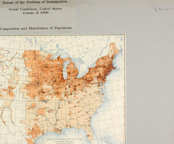
This is a historical map of the United States from the Census of 1900, depicting the composition and distribution of the population with a focus on immigration. The map is titled "Extent of the Problem of Immigration: Social Conditions, United States Census of 1900," and it shows areas of density for foreign-born populations across the country.
The color-coded legend categorizes population density in various ranges with shades of orange. Darker shades represent higher concentrations of foreign-born populations, primarily visible in the northeastern United States, such as cities and urban areas in states like New York, Pennsylvania, and Illinois. By contrast, lighter areas signify lower foreign population density, and vast parts of the western US and rural areas are sparsely populated.
Overall, the map highlights regional patterns of immigration in the early 20th century, showing where foreign-born individuals were more heavily concentrated due to industrialization and urbanization. The background context shows geographic details like state and county boundaries along with longitude and latitude lines.
Created by gpt-4o-2024-08-06 on 2025-06-10
The image is a historical map titled "Density of Foreign Born Population, United States," based on data from the Census of 1900. It is presented on a sheet with the heading "Extent of the Problem of Immigration" and "Social Conditions, United States, Census of 1900."
The map displays the distribution and density of the foreign-born population across the United States at the time. It uses varying shades of brown to indicate different densities, with a key at the bottom left for reference. The shading gradient represents categories such as "Less than 1" to "Over 90" persons per square mile.
The map highlights that higher densities of foreign-born populations were concentrated in the northeastern and midwestern states. Significant concentrations are shown in areas such as New York, Illinois, and other parts of the Great Lakes region. Some areas on the West Coast, particularly in California and Washington, also show moderate foreign-born populations.
Based on the text and map, the image is likely part of a series analyzing social and demographical issues related to immigration in the United States during the early 20th century.
Anthropic Claude
Created by us.anthropic.claude-3-5-sonnet-20241022-v2:0 on 2025-06-17
This is a historical map of the United States from the 1900 Census showing the "Extent of the Problem of Immigration" and "Social Conditions." The map appears to show population distribution and composition across the country, with varying shades of orange/peach coloring indicating different population densities or immigration concentrations. The northeastern United States and areas around the Great Lakes show darker shading, suggesting higher population or immigration density in those regions. The western states appear more sparsely shaded, with some concentrated areas of settlement. The map includes a grid system and appears to be part of a larger study or report on immigration and social conditions in the United States at the turn of the 20th century.
Created by anthropic.claude-3-haiku-20240307-v1:0 on 2025-06-17
This image appears to be a map of the United States showing the "Composition and Distribution of Population" based on the 1900 census. The map uses shades of orange to indicate the population density across different regions of the country. The map shows that the population was concentrated in the northeastern and midwestern states, with more sparsely populated areas in the western and southern parts of the country. The map also includes some geographic features like state boundaries and major bodies of water.
Meta Llama
Created by us.meta.llama3-2-11b-instruct-v1:0 on 2025-06-10
The image presents a map of the United States, titled "Extent of the Problem of Immigration: Social Conditions, United States Census of 1900." The map is divided into states, with each state further subdivided into counties. The counties are shaded in various colors, indicating the population density of each area.
- Title and Legend
- The title is displayed at the top of the image, providing context for the map.
- A legend is located in the bottom-left corner, explaining the color-coding system used to represent population density.
- Map Features
- The map displays the contiguous United States, with Alaska and Hawaii not included.
- The map is divided into states, with each state further subdivided into counties.
- The counties are shaded in various colors, indicating the population density of each area.
- Color-Coding System
- The legend explains that the colors represent different population densities, ranging from low to high.
- The colors used include:
- Light brown: Low population density
- Dark brown: High population density
- Beige: Medium population density
- Population Density
- The map shows that the majority of the population is concentrated in the eastern and midwestern regions of the country.
- The western states, such as California and Oregon, have lower population densities compared to the eastern states.
- The southern states, such as Texas and Florida, have medium to high population densities.
- Conclusion
- The map provides a visual representation of the population distribution in the United States during the 1900 census.
- It highlights the concentration of population in certain regions and the varying population densities across different states and counties.
Created by us.meta.llama3-2-90b-instruct-v1:0 on 2025-06-10
The image presents a map of the United States, titled "Extent of the Problem of Immigration" and subtitled "Social Conditions, United States Census of 1900." The map is accompanied by a key that explains the color-coding system used to represent different population densities. The map appears to be a historical document, likely created in the early 20th century, and provides valuable information about the demographic distribution of the US population at that time.
Key Features:
- Title: "Extent of the Problem of Immigration"
- Subtitle: "Social Conditions, United States Census of 1900"
- Map: A map of the United States, showing the country's geographical boundaries and political divisions
- Color-Coding System: A key that explains the color-coding system used to represent different population densities
- Historical Context: The map appears to be a historical document, likely created in the early 20th century
Conclusion:
The image presents a valuable historical document that provides insight into the demographic distribution of the US population in the early 20th century. The map's color-coding system allows for easy interpretation of the data, making it a useful tool for researchers and historians. Overall, the image is an important resource for understanding the social and demographic changes that occurred in the United States during this period.
Amazon Nova
Created by amazon.nova-lite-v1:0 on 2025-06-07
The image is a map of the United States from the 1900 census. The map shows the composition and distribution of the population across the country. The map is divided into regions, each with a different color representing the population density. The map also includes a legend that explains the color coding and provides information about the population in each region. The map is titled "Extent of the Problem of Immigration" and "Social Conditions, United States Census of 1900."
Created by amazon.nova-pro-v1:0 on 2025-06-07
The image is a map of the United States, showing the density of foreign-born populations in the year 1900. The map is divided into different sections, each representing a state. The density of the foreign-born population is represented by different shades of brown, with darker shades indicating a higher density. The map also includes a legend that explains the different shades and their corresponding population densities.
Google Gemini
Created by gemini-2.0-flash on 2025-05-25
Here's a description of the image:
The image shows a historical map of the United States from the Census of 1900, focusing on "Social Conditions" related to "The Extent of the Problem of Immigration" and the "Composition and Distribution of Population." The map is a color-coded representation of the density of foreign-born populations across the country at that time. Areas are shaded in different colors, ranging from light to dark orange, to indicate different levels of foreign-born population density. A legend or key on the map explains the color scale. The map is placed on a light gray background. The title and other explanatory text are printed above the map.
Created by gemini-2.0-flash-lite on 2025-05-25
Here is a description of the image:
The image is a historical map of the United States showing the "Extent of the Problem of Immigration" and "Composition and Distribution of Population" based on the 1900 Census. It's a colored map, with varying shades of orange/red indicating the density of foreign-born populations. The map shows the continental United States with its states and geographic features.
Here's a breakdown:
- Title/Context: The title at the top indicates this is a map about immigration in the United States, focusing on social conditions and the population distribution as of the 1900 census.
- Color Coding: The color scale is shown to the left of the map. The darker the orange/red, the higher the density of foreign-born individuals in that area. Lighter shades indicate fewer foreign-born residents.
- Geographical Features: The map accurately represents the geography of the United States, including state borders, coastlines, and major bodies of water like the Great Lakes.
- Distribution: Areas with a high concentration of foreign-born residents are in the northeast, around the Great Lakes, and in pockets along the West Coast.
- Historical Significance: This map reflects a time of significant immigration to the United States, and it visually represents the distribution of these immigrant communities. The use of the term "Extent of the Problem of Immigration" hints at a particular viewpoint or concern about immigration at the time.
Mistral Pixtral
Created by us.mistral.pixtral-large-2502-v1:0 on 2025-06-05
The image is a historical map titled "Extent of the Problem of Immigration: Social Conditions, United States, Census of 1900." It depicts the composition and distribution of the foreign-born population in the United States as of the 1900 census.
Key details include:
Geographical Coverage: The map covers the entire United States, including Alaska and Hawaii, although Hawaii is not clearly visible.
Color Coding: The map uses shading to represent the proportion of the foreign-born population in different regions. The legend indicates the following:
- Lightest shade: Less than 5 percent foreign-born.
- Slightly darker shade: 5 to 9.9 percent foreign-born.
- Medium shade: 10 to 19.9 percent foreign-born.
- Darkest shade: 20 percent or more foreign-born.
Distribution Patterns:
- The Northeastern United States, particularly areas around New York, Pennsylvania, and the Great Lakes region, show the highest concentration of foreign-born populations (darkest shades).
- The Midwest, especially states like Illinois, Wisconsin, and Minnesota, also have significant foreign-born populations.
- The Western states, including California, show moderate concentrations of foreign-born residents.
- The Southern states generally have lower concentrations of foreign-born populations, with lighter shades dominating these regions.
Additional Information: The map was prepared by the Department of Commerce and Labor, Bureau of the Census, under the direction of the Superintendent of the Census. It was published in Washington, D.C., in 1902.
This map provides a visual representation of immigration patterns in the United States at the turn of the 20th century, highlighting areas with significant immigrant populations.
Qwen
Created by Qwen/Qwen2.5-VL-7B-Instruct on 2025-07-06
The image is a map titled "Extent of the Problem of Immigration: Social Conditions, United States Census of 1900 - Composition and Distribution of Population." It appears to be an old, possibly historical document, showing the composition and distribution of the U.S. population during the 1900 census. The map uses a color-coded system to indicate the percentage of foreign-born population in each county. The legend at the bottom of the map provides a key for interpreting the colors, ranging from lighter shades for counties with less than 10% foreign-born population to darker shades for counties with 25% or more foreign-born population.
The map covers the entire United States, with states and counties marked, and the colors vary across the map, indicating disparities in the foreign-born population distribution. This type of map was commonly used in the early 20th century to analyze and visualize demographic data, which in this case highlights the immigration patterns and the social conditions of the time.
Created by Qwen/Qwen2.5-VL-72B-Instruct on 2025-07-06
This image is a historical map of the United States from the Census of 1900. The title at the top reads "Extent of the Problem of Immigration: Social Conditions, United States Census of 1900." Below the title, it states "Composition and Distribution of Population."
The map uses various shades of orange and brown to represent different concentrations of population or immigrant groups across the country. The darker shades indicate higher concentrations, while the lighter shades represent lower concentrations. The map includes all 48 contiguous states, with Alaska and Hawaii not yet included as states at the time.
There is a legend in the bottom left corner of the map, which provides a key to the colors used and the corresponding population or immigrant group densities. The map is detailed, showing state boundaries and major geographical features such as lakes and rivers.
The map is framed within a white border, and the overall color scheme is muted, giving it a vintage appearance. The text and the map itself appear to be printed on aged paper, adding to the historical feel of the document.
Text analysis
Amazon