
Machine Generated Data
Tags
Color Analysis
Feature analysis
Amazon
Clarifai
AWS Rekognition
| Rug | 71.9% | |

Categories
Imagga
created on 2019-06-04
| paintings art | 96.9% | |
| text visuals | 3% | |
Captions
Microsoft
created by unknown on 2019-06-04
| a close up of a map | 69.9% | |
| close up of a map | 64.8% | |
| a map with text | 56.8% | |
Clarifai
No captions written
Salesforce
Created by general-english-image-caption-blip-2 on 2025-07-06
a map of the united states showing the distribution of population
Created by general-english-image-caption-blip on 2025-05-04
a photograph of a map of the united states of america
OpenAI GPT
Created by gpt-4o-2024-11-20 on 2025-06-09
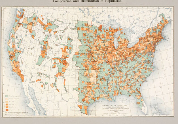
This image is a historical map of the United States from the 1900 Census, titled "Social Conditions, United States Census of 1900: Composition and Distribution of Population." It is color-coded to display population distribution and demographic composition across the country.
The map uses various shades and patterns to represent different population densities or social conditions in various counties. The Eastern United States, particularly near urban centers, is heavily shaded in orange, suggesting a higher population density. The Western regions are predominantly shaded in lighter colors, indicating lower population densities. The map is an example of early data visualization used to geographically represent census data, providing insight into where communities were concentrated at the turn of the 20th century.
Created by gpt-4o-2024-08-06 on 2025-06-09
The image is a historical map of the United States from the Census of 1900, focusing on the social conditions and the composition and distribution of the population. The map uses different colors to indicate the percentages of the population with a foreign parentage by county.
- Light green indicates areas with less than 2% of the population of foreign parentage.
- Darker green shows between 2% to 5%.
- Light orange represents areas with 5% to 15%.
- Orange indicates 15% to 30%.
- Dark orange shows over 30%.
From the map, it is evident that the concentration of foreign parentage is higher in the northeastern part of the country, indicated by more intense orange shades. In contrast, much of the southern and some central parts of the country are shaded light green, indicating a lower percentage of foreign parentage. There are scattered regions of higher percentages (orange) in the Midwest and some parts of the West, particularly on the West Coast and in certain mountainous regions. The map provides a snapshot of the demographic distribution across the United States at the turn of the 20th century.
Anthropic Claude
Created by anthropic.claude-3-haiku-20240307-v1:0 on 2025-06-13
The image appears to be a map of the United States showing the composition and distribution of the population according to the 1900 census. The map uses different shades of orange and green to indicate population density, with the darker shades representing more densely populated areas. The map covers the entire continental United States, providing a detailed view of the geographic distribution of the population at that time.
Created by us.anthropic.claude-3-5-sonnet-20241022-v2:0 on 2025-06-13
This image shows a historical map from the 1900 United States Census titled "Social Conditions, United States Census of 1900" with a subtitle "Composition and Distribution of Population." The map displays the continental United States with different regions colored in light blue/turquoise and orange/coral shades. The eastern half of the country appears to be more densely marked with the orange coloring, while the western regions show a more scattered pattern of both colors. The map appears to be showing population distribution patterns, with the different colors likely representing different demographic or social characteristics. The map includes a grid pattern and appears to be quite detailed in its county-by-county or regional breakdown.
Meta Llama
Created by us.meta.llama3-2-11b-instruct-v1:0 on 2025-05-29
The image presents a map of the United States, titled "Social Conditions, United States Census of 1900," which illustrates the composition and distribution of the population across different regions. The map is divided into various states, each colored according to its population density, with darker shades indicating higher population densities.
- Map Title and Description
- The map is titled "Social Conditions, United States Census of 1900" and subtitled "Composition and Distribution of Population."
- Color-Coded Regions
- The map features a color-coded system, with darker shades representing higher population densities.
- The colors used are orange, green, and blue, although the exact shades are not specified.
- State Boundaries
- The map displays state boundaries, providing a clear visual representation of the country's geography.
- Population Density
- The map shows that the majority of the population is concentrated in the eastern and central regions of the United States.
- The western states have lower population densities, with some areas appearing almost empty.
- Legend
- A legend is provided at the bottom left corner of the map, but it is too small to read clearly.
- The legend likely explains the color-coding system used on the map.
- Background
- The map has a beige background, which provides a neutral contrast to the colored regions.
- Overall Impression
- The map gives a general idea of the population distribution in the United States during the 1900 census.
- It highlights the concentration of population in certain regions and the relatively sparse population in others.
In summary, the image presents a map of the United States that illustrates the composition and distribution of the population across different regions. The map uses a color-coded system to represent population density, with darker shades indicating higher population densities. The majority of the population is concentrated in the eastern and central regions, while the western states have lower population densities. A legend is provided at the bottom left corner of the map, but it is too small to read clearly. Overall, the map gives a general idea of the population distribution in the United States during the 1900 census.
Created by us.meta.llama3-2-90b-instruct-v1:0 on 2025-05-29
The image presents a map of the United States, titled "Social Conditions, United States Census of 1900: Composition and Distribution of Population." The map is divided into sections, each representing a different state or region. The states are colored in shades of orange, green, and blue, with some areas featuring a combination of these colors.
Key Features:
- Title: The title is displayed at the top of the image, providing context for the map.
- Map: The map is the central focus of the image, showcasing the distribution of population across the United States.
- Color Scheme: The use of orange, green, and blue colors helps to differentiate between various regions and populations.
- Legend: A legend is present in the bottom-left corner of the map, explaining the meaning behind the different colors and symbols used.
- Background: The background of the image is a light gray color, which provides a neutral backdrop for the map and its accompanying information.
Overall Impression:
The image effectively conveys information about the composition and distribution of the population in the United States during the 1900 census. The use of color and symbols makes it easy to understand and interpret the data presented.
Amazon Nova
Created by amazon.nova-lite-v1:0 on 2025-05-28
The image is a map of the United States, with a title "Social Conditions, United States Census of 1900" and a subtitle "Composition and Distribution of Population." The map is divided into different sections, each representing a state, and is colored in different shades of orange and green. The map also includes a legend in the bottom left corner, which provides information on the population distribution in the United States. The map appears to be an official document, possibly from a government agency, and is likely used for statistical or research purposes.
Created by amazon.nova-pro-v1:0 on 2025-05-28
The image depicts a map of the United States, illustrating the composition and distribution of the population based on the 1900 census. The map is divided into various regions, each represented by different colors to indicate the population density and composition. The colors range from light green to dark orange, with darker shades indicating higher population densities. The map also includes a legend that explains the color coding and provides additional information about the population distribution.
Google Gemini
Created by gemini-2.0-flash-lite on 2025-05-01
Here's a description of the image:
Overview:
The image is a historical map of the United States. It depicts the "Composition and Distribution of Population" based on the 1900 census. The map uses color-coding to illustrate the proportion of population in cities and towns with more than 2,500 inhabitants.
Key Features:
- Geographic Scope: The map covers the entire continental United States, with the coastal regions of the Pacific Ocean and the Atlantic Ocean visible.
- Color Coding:
- Green: Represents areas where the population is 0 to 5 percent in cities and towns.
- Orange: Indicates a proportion of more than 70 percent of the population living in cities and towns.
- Other colors or shades may represent different proportion categories.
- Density: The map emphasizes that the East Coast and the Midwest are denser, with more significant populations in cities and towns.
- Legend: A small legend in the lower left corner clarifies the meaning of the color-coded information.
Additional Details:
- The map has labels indicating the source: "Social Conditions, United States Census of 1900."
- It also credits Henry Gannett, as the creator of the map.
- The map's style is typical of the early 20th century, with a clear focus on visualizing demographic data.
If you'd like, you can ask me to elaborate on a specific aspect of the map!
Created by gemini-2.0-flash on 2025-05-01
Here's a description of the image you sent:
The image shows a historical map of the United States titled "Social Conditions, United States, Census of 1900: Composition and Distribution of Population." The map is color-coded to indicate the proportion of the population living in cities and towns of more than 2,500 inhabitants in each county.
The colors range from green (indicating less than 5% of the population in urban areas) to orange and red (indicating higher percentages). The Eastern United States, especially the Northeast and areas along the Great Lakes, show a greater concentration of orange and red, signifying a higher proportion of the population living in urban centers. The central and western regions of the US, particularly in the mountainous and plains states, are mostly colored in green and lighter shades, suggesting a predominantly rural population.
The map includes state boundaries and geographical features such as major rivers and lakes. The legend is located in the lower left corner, providing a key to the color coding. The map appears to be a page from a census report or atlas from the early 20th century.
Mistral Pixtral
Created by us.mistral.pixtral-large-2502-v1:0 on 2025-06-04
The image is a historical map from the United States Census of 1900, titled "Social Conditions, United States Census of 1900." The map illustrates the composition and distribution of the population across the United States, specifically highlighting the percentage of the population of foreign parentage (i.e., people with one or both parents born outside the United States).
Key features of the map:
Color Coding:
- The map uses different shades of color to represent varying percentages of the population with foreign parentage.
- Areas with higher concentrations of people with foreign parentage are shaded in darker colors, while those with lower concentrations are shaded in lighter colors.
Geographic Distribution:
- The map shows that the Northeastern and Midwestern regions of the United States have higher concentrations of people with foreign parentage.
- The Southern and Western regions, particularly the Southwest and parts of the Great Plains, show lower concentrations.
- Urban areas, especially along the East Coast and around the Great Lakes, exhibit higher percentages of foreign parentage.
Legend:
- The legend at the bottom left corner explains the color coding, indicating the percentage ranges for each shade.
- The categories range from less than 5% to more than 25% of the population having foreign parentage.
Additional Information:
- The map was prepared by the Department of the Interior, Census Office, under the direction of the Director of the Census.
- It provides a visual representation of the demographic makeup of the United States at the turn of the 20th century, reflecting the significant immigration patterns of that era.
This map is a valuable historical document that offers insights into the demographic landscape of the United States in 1900, highlighting the impact of immigration on the population distribution.
Qwen
Created by Qwen/Qwen2.5-VL-7B-Instruct on 2025-07-28
The image is a historical map from the 1900 United States Census, titled "Social Conditions, United States Census of 1900" and specifically labeled "Composition and Distribution of Population." The map depicts the population density and composition across the United States at that time.
The map uses different shades of color to represent varying densities of population data. The legend at the bottom of the map provides a scale indicating the percentage of the population in each district, with shades ranging from light green (representing the least dense population) to dark orange (representing the most dense population). The map is grid-distributed, with each grid square likely representing a specific region within the United States.
The map highlights the concentration of population in certain regions, with the eastern and midwestern parts of the country showing the highest densities, while the western and southern parts appear less densely populated. The coastal areas also seem to have a higher population density. The map gives a clear geographical representation of how the population was distributed across the country at the turn of the 20th century.
Created by Qwen/Qwen2.5-VL-72B-Instruct on 2025-07-28
This image is a historical map from the United States Census of 1900, titled "Social Conditions, United States Census of 1900: Composition and Distribution of Population." The map visually represents the population distribution across the United States at that time.
The map uses different shades of color, primarily orange and green, to indicate varying levels of population density. The legend in the bottom left corner provides a key to interpret the colors, showing the population per square mile. The eastern part of the United States, particularly the Northeast, is densely populated, as indicated by the darker orange shades. The Western states, especially those further inland, have lighter shades, indicating lower population densities.
The map also includes state boundaries and major geographical features, such as rivers and lakes. The text at the bottom of the map provides additional information about the data represented, including the method of calculation and the source of the information. The map is credited to "Burden Haas & Co., Geographers."
Text analysis
Amazon


