Machine Generated Data
Tags
Color Analysis
Categories
Imagga
| paintings art | 76.8% | |
| food drinks | 17.4% | |
| text visuals | 5.1% | |
Captions
Microsoft
created by unknown on 2019-06-04
| a close up of a sign | 72.9% | |
| a sign on a wall | 58.7% | |
| close up of a sign | 58.6% | |
Clarifai
created by general-english-image-caption-blip on 2025-05-04
| a photograph of a map of the united states of america | -100% | |
Amazon Nova
Created by amazon.nova-lite-v1:0 on 2025-05-28
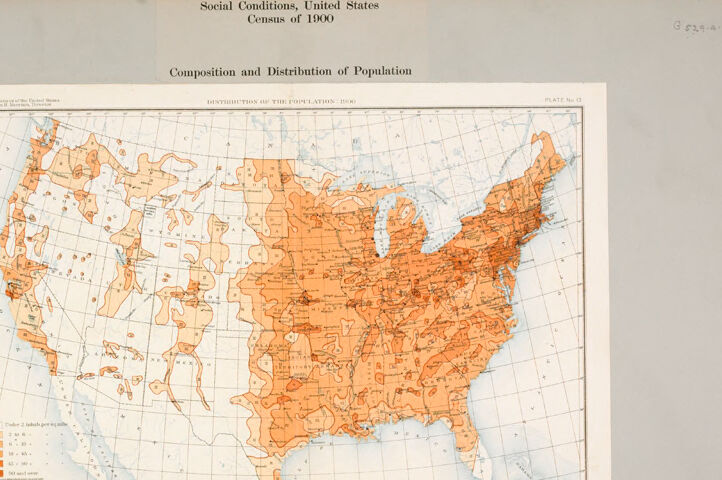
The image is a map of the United States, specifically focusing on the "Composition and Distribution of Population" based on the 1900 Census. The map is divided into various shades of orange, representing different population densities across the country. The title "Social Conditions, United States Census of 1900" is prominently displayed at the top of the image. Below the title, there is a key or legend that explains the color coding used in the map. The map is bordered by a white frame, and the background is a light gray color. The map appears to be part of a larger document or publication, as indicated by the presence of a plate number at the top right corner of the image.
Created by amazon.nova-pro-v1:0 on 2025-05-28
The image is a map of the United States, titled "Social Conditions, United States Census of 1900." It is titled "Composition and Distribution of Population." The map is colored in shades of orange and brown, representing the population density across different regions. The darker shades indicate higher population densities, while the lighter shades indicate lower densities. The map also includes a legend at the bottom, which explains the color coding and the population ranges represented by each shade. The map is surrounded by a white border and is placed on a gray background.
Google Gemini
Created by gemini-2.0-flash on 2025-04-30
Certainly! Here's a description of the image:
The image presents a historical map of the United States titled "Distribution of the Population, 1900," taken from the "Social Conditions, United States Census of 1900." The map is color-coded to represent population density, with different shades of orange indicating varying levels of inhabitants per square mile. A legend on the map explains the different population densities:
- Under 2 Inhab. per sq. mile
- 2 to 6
- 6 to 18
- 18 to 45
- 45 to 90
- 90 and over
The map provides a visual representation of the population distribution of the U.S. during the year 1900, showcasing the concentrations in the East, Midwest, and certain areas of the West. The details of the map include state boundaries, major rivers and lakes, and the grid system for geographical coordinates. The map is affixed to a gray surface.
Created by gemini-2.0-flash-lite on 2025-04-30
Here's a description of the image:
Overall:
The image is a historical map of the United States. It appears to be from the 1900 Census, as indicated by the text at the top: "Social Conditions, United States Census of 1900." The map focuses on the "Composition and Distribution of Population."
Map Features:
- Color Coding: The map uses shades of orange to represent different population densities. The lighter shades indicate lower population densities, while the darker shades represent higher concentrations of people.
- Geography: The map depicts the geographical outline of the United States, including its states, coastlines, and major bodies of water like the Great Lakes.
- Legend: There is a legend in the lower left corner. The legend's categories and associated colors represent different population densities (e.g., the lowest population density is "under 2 inhabitants per square mile").
Additional Details:
- Paper Condition: The map is mounted on a background and may have some minor wear and tear consistent with its age.
- Title: The plate is titled "Distribution of the Population: 1900"
In summary, this image is a historical population density map of the United States, providing insights into the distribution of population during the 1900 Census.
Text analysis
Amazon