Machine Generated Data
Tags
Color Analysis
Feature analysis
Amazon
Clarifai
AWS Rekognition
| Rug | 70.8% | |
Categories
Imagga
created on 2019-06-05
| text visuals | 73.2% | |
| paintings art | 26.3% | |
Captions
Microsoft
created by unknown on 2019-06-05
| a close up of a device | 62.2% | |
| a close up of a piece of paper | 56.9% | |
| close up of a device | 53.5% | |
Clarifai
Created by general-english-image-caption-clip on 2025-07-12
the text of the original document.
Salesforce
Created by general-english-image-caption-blip on 2025-05-29
a photograph of a graph - based graph - based graph - based graph - based graph - based
Created by general-english-image-caption-blip-2 on 2025-07-07
a page from the book titled, 'the history of the united states, from the discovery of
OpenAI GPT
Created by gpt-4o-2024-11-20 on 2025-06-13
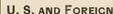
This image is a vintage-style chart titled “Per Cent of Total Income Expended, by Nativity of Head of Family.” It features horizontal bars representing countries or regions of origin for heads of families, categorized by expenditure percentages. The left side lists various countries or regions (e.g., United States, Austria-Hungary, Canada, Denmark, etc.), while the horizontal axis measures percentages ranging from 0 to 100 in increments of 20. Each bar reflects specific expenditure data. Some minor imperfections like stains and discoloration appear on the chart, indicating its age. This seems to be an old sociological or economic data visualization, likely analyzing household spending patterns by nationality.
Created by gpt-4o-2024-08-06 on 2025-06-13
This image is a bar chart titled "Per Cent of Total Income Expended, by Nativity of Head of Family." The chart lists various nativities or countries of origin on the y-axis and shows the percentage of total income expended on the x-axis, with markings at 20, 40, 60, and 80 percent. The countries listed include the United States, Austria-Hungary, Canada, Denmark, England, France, Germany, Ireland, Italy, Netherlands, Norway, Russia, Scotland, Sweden, Switzerland, Wales, "Other Foreign," "Total Foreign," and "U.S. and Foreign." Each country has a horizontal black bar extending across the chart, presumably showing the income expenditure percentage. However, the exact values of the expenditures are not clearly discernible from this image, as all bars appear identical in length, extending to the edge of the chart. The chart itself is printed on a page with a margin around it.
Anthropic Claude
Created by anthropic.claude-3-haiku-20240307-v1:0 on 2025-06-17
This image appears to be a statistical chart or graph titled "Per Cent of Total Income Expended, by Nativity of Head of Family." It shows the percentage of total income expended by families from various countries or regions, including the United States, Austria-Hungary, Canada, Denmark, England, France, Germany, Ireland, Italy, Netherlands, Norway, Russia, Scotland, Sweden, Switzerland, Wales, and "Other Foreign" as well as "Total Foreign" and "U.S. and Foreign" categories. The data is presented in the form of horizontal bar graphs, with the percentages ranging from 20% to 80% across the x-axis.
Created by us.anthropic.claude-3-5-sonnet-20241022-v2:0 on 2025-06-17
This image shows a horizontal bar chart titled "Per Cent of Total Income Expended, by Nativity of Head of Family." The chart compares expenditure patterns across different nationalities, including the United States and various European countries. The x-axis shows percentages from 0 to 80, marked in intervals of 20.
The countries/regions listed include:
- United States
- Austria-Hungary
- Canada
- Denmark
- England
- France
- Germany
- Ireland
- Italy
- Netherlands
- Norway
- Russia
- Scotland
- Sweden
- Switzerland
- Wales
- Other Foreign
- Total Foreign
- U.S. and Foreign
All bars appear to be relatively similar in length, falling between approximately 80-90% of total income expended. This suggests that regardless of national origin, families were spending similar proportions of their total income. The data appears to be from a historical document, given its style and presentation.
Meta Llama
Created by us.meta.llama3-2-11b-instruct-v1:0 on 2025-06-11
The image presents a table titled "PER CENT OF TOTAL INCOME EXPENDED, BY NATIVITY OF HEAD OF FAMILY," which displays the percentage of total income spent by the head of family in various countries. The table is divided into two columns, with the left column listing the countries and the right column showing the corresponding percentages.
Countries and Percentages:
- United States: 80
- Austria-Hungary: 60
- Canada: 40
- Denmark: 20
- England: 20
- France: 20
- Germany: 20
- Ireland: 20
- Italy: 20
- Netherlands: 20
- Norway: 20
- Russia: 20
- Scotland: 20
- Sweden: 20
- Switzerland: 20
- Wales: 20
- Other Foreign: 20
- Total Foreign: 20
- U.S. and Foreign: 20
Observations:
- The United States has the highest percentage of total income spent, at 80%.
- The majority of countries have a percentage of 20%, with the exception of the United States and Austria-Hungary.
- The table does not provide any additional information or context about the data.
Conclusion:
The table presents a comparison of the percentage of total income spent by the head of family in various countries. The United States stands out with the highest percentage, while most other countries have a lower percentage. However, without additional context or information, it is difficult to draw any meaningful conclusions from this data.
Created by us.meta.llama3-2-90b-instruct-v1:0 on 2025-06-11
The image depicts a chart titled "PER CENT OF TOTAL INCOME EXPENDED, BY NATIVITY OF HEAD OF FAMILY." The chart is divided into two columns: "NATIVITY OF HEAD OF FAMILY" and a numerical column ranging from 20 to 80 in increments of 20. The chart features 19 rows, each representing a different country or region, including the United States, Austria-Hungary, Canada, Denmark, England, France, Germany, Ireland, Italy, Netherlands, Norway, Russia, Scotland, Sweden, Switzerland, Wales, Other Foreign, Total Foreign, and U.S. and Foreign.
Each row contains a black bar that extends to a specific point on the numerical scale, indicating the percentage of total income expended by the head of the family for that particular country or region. The chart appears to be a historical document, likely created in the early 20th century, given the inclusion of Austria-Hungary as a separate entity. The chart provides a visual representation of the varying levels of expenditure among different nationalities and regions, allowing for easy comparison and analysis.
Amazon Nova
Created by amazon.nova-lite-v1:0 on 2025-06-09
The image shows a document with a title "Per Cent of Total Income Expended, by Nativity of Head of Family." It contains a table with two columns. The first column lists the countries, and the second column shows the percentage of total income expended by the head of the family in each country. The countries listed are United States, Austria-Hungary, Canada, Denmark, England, France, Germany, Ireland, Italy, Netherlands, Norway, Russia, Scotland, Sweden, Switzerland, Wales, Other Foreign, Total Foreign, and U.S. and Foreign. The percentages are represented by horizontal bars, with the length of the bar indicating the percentage of income expended. The image appears to be a historical document, possibly from the early 20th century.
Created by amazon.nova-pro-v1:0 on 2025-06-09
The image depicts a bar graph titled "Per Cent of Total Income Expended, by Nativity of Head of Family." The graph compares the percentage of total income spent by individuals based on their country of origin. The graph includes 16 countries, including the United States, Austria-Hungary, Canada, Denmark, England, France, Germany, Ireland, Italy, Netherlands, Norway, Russia, Scotland, Sweden, Switzerland, and Wales. The graph also includes a category for "Other Foreign" and "Total Foreign." The graph shows that the percentage of total income spent varies by country of origin, with some countries spending more than others. The graph is a useful tool for understanding the economic behavior of individuals based on their country of origin.
Google Gemini
Created by gemini-2.0-flash on 2025-06-04
Here's a description of the image:
The image shows a bar graph. The title reads: "PER CENT OF TOTAL INCOME EXPENDED, BY NATIVITY OF HEAD OF FAMILY."
The y-axis (listed vertically on the left) represents "NATIVITY OF HEAD OF FAMILY" with the following labels:
- UNITED STATES
- AUSTRIA-HUNGARY
- CANADA
- DENMARK
- ENGLAND
- FRANCE
- GERMANY
- IRELAND
- ITALY
- NETHERLANDS
- NORWAY
- RUSSIA
- SCOTLAND
- SWEDEN
- SWITZERLAND
- WALES
- OTHER FOREIGN
- TOTAL FOREIGN
- U. S. AND FOREIGN
The x-axis (listed horizontally at the top) represents percentages: 20, 40, 60, 80.
Each nativity is represented by a horizontal black bar, whose length corresponds to the percentage of total income expended. Because the bars are solid black without distinct ends, the exact percentage values are difficult to ascertain without reference to a key.
Created by gemini-2.0-flash-lite on 2025-06-04
Here's a description of the image:
Overall Impression:
The image is a black and white chart or graph. It appears to be a statistical visualization, likely from a historical context, given the style and presentation. It seems to focus on income expenditure relative to the origin of the head of a household.
Details:
- Title: "PER CENT OF TOTAL INCOME EXPENDED, BY NATIVITY OF HEAD OF FAMILY." This sets the context of the chart, focusing on how much of a household's income is spent, broken down by the birthplace (nativity) of the household's head.
- Axes: The chart has a single horizontal axis labeled with percentages from 20 to 80. There's an unlabelled vertical axis, which appears to list the various countries of origin.
- Data Representation: The information is conveyed through horizontal bars. The length of each bar indicates the percentage of income expended. Each bar is aligned to a country of origin, listed on the left side of the chart. The black bars are the indicators.
- Categories of Nativity: A list of different countries and categories of origin is shown along the vertical axis. These include:
- United States
- Austria-Hungary
- Canada
- Denmark
- England
- France
- Germany
- Ireland
- Italy
- Netherlands
- Norway
- Russia
- Scotland
- Sweden
- Switzerland
- Wales
- Other Foreign
- Total Foreign
- U.S. and Foreign
- Style/Appearance: The chart is presented in a simple, somewhat old-fashioned style, suggesting it's from an earlier era. The lines are clear and the visual language is clean.
Interpretation (Based on the Information):
The chart visually compares the proportion of income spent by households depending on the country or category of origin of the head of that household. By looking at the horizontal bars, you can identify which groups spent a larger or smaller proportion of their income.
Mistral Pixtral
Created by us.mistral.pixtral-large-2502-v1:0 on 2025-06-06
The image is a bar chart titled "Per Cent of Total Income Expended, by Nativity of Head of Family." It displays the percentage of total income spent by families based on the nativity (country of origin) of the head of the family. The chart includes data for various countries and regions, showing how much of their income these families spend.
The x-axis represents the percentage of total income expended, ranging from 0 to 100 percent. The y-axis lists different countries and regions, including:
- United States
- Austria-Hungary
- Canada
- Denmark
- England
- France
- Germany
- Ireland
- Italy
- Netherlands
- Norway
- Russia
- Scotland
- Sweden
- Switzerland
- Wales
- Other Foreign
- Total Foreign
- U.S. and Foreign
Each bar represents the percentage of total income spent by families from each nativity group. The bars are mostly dark, indicating the proportion of income expended. The lengths of the bars vary, showing differences in spending habits among families from different countries.
From the chart, it appears that families from different nativities have varying levels of income expenditure, with some groups spending a higher percentage of their income compared to others. The specific percentages are not clearly visible due to the dark shading of the bars.
Qwen
Created by Qwen/Qwen2.5-VL-7B-Instruct on 2025-07-28
The image is a bar chart titled "Per Cent of Total Income Expended, by Nativity of Head of Family." It displays the percentage of total income that different nationalities (head of family) allocate to their income expenditures. The chart is divided into two categories: "U. S. AND FOREIGN" and "TOTAL FOREIGN," which further breaks down into specific nationalities.
The bars represent the percentage of income spent, with the categories labeled at the top of the chart. Each bar corresponds to a specific nationality, and the length of the bar indicates the percentage of income spent. The nationalities listed in the chart include:
- United States
- Austria-Hungary
- Canada
- Denmark
- England
- France
- Germany
- Ireland
- Italy
- Netherlands
- Norway
- Russia
- Scotland
- Sweden
- Switzerland
- Wales
- Other Foreign
- Total Foreign
The chart shows that the percentages vary significantly between the nationalities, with the United States and Austria-Hungary having the highest percentages, while other nationalities like Italy, Sweden, and others have lower percentages. The chart also includes a summary at the bottom, "U. S. AND FOREIGN," which combines the data for U.S. and foreign nationalities for comparison.
Created by Qwen/Qwen2.5-VL-72B-Instruct on 2025-07-28
This image is a historical data chart titled "PER CENT OF TOTAL INCOME EXPENDED, BY NATIVITY OF HEAD OF FAMILY." It appears to be a bar chart showing the percentage of total income spent by families, categorized by the country of origin of the head of the family. The chart lists various countries, including the United States, Austria-Hungary, Canada, Denmark, England, France, Germany, Ireland, Italy, Netherlands, Norway, Russia, Scotland, Sweden, Switzerland, Wales, and a category for "OTHER FOREIGN" and "TOTAL FOREIGN." Each country's entry has a corresponding bar that represents the percentage of total income expended. The bars are horizontal and extend from left to right, with numerical markers at 20%, 40%, 60%, and 80% to indicate the scale. The chart also includes a category for "U.S. and FOREIGN," which likely represents the combined data for all listed countries. The visual style and typeface suggest that this is a document from an earlier time period, possibly the early 20th century. The document shows some wear and tear, with creases and stains, indicating its age.
Text analysis
Amazon