Machine Generated Data
Tags
Color Analysis
Feature analysis
Amazon
Clarifai

Clarifai
| Poster | 55% | |
Categories
Imagga
created on 2019-06-07
| paintings art | 83.9% | |
| text visuals | 13.4% | |
| streetview architecture | 2.5% | |
Captions
Microsoft
created by unknown on 2019-06-07
| a close up of text on a white background | 72.9% | |
| a close up of text on a white surface | 70.4% | |
| a close up of text on a black background | 66.9% | |
Clarifai
No captions written
Salesforce
Created by general-english-image-caption-blip on 2025-05-29
a photograph of a map of a map of a city
Created by general-english-image-caption-blip-2 on 2025-07-05
a map of the city of pittsburgh, with the names of the streets and buildings
OpenAI GPT
Created by gpt-4o-2024-11-20 on 2025-06-13
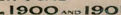
This image is a historical map titled "The Pittsburgh Survey" from 1908, created under the direction of Shelby M. Harrison. It provides a statistical representation of the ratio of new dwellings erected between 1899 and 1901 to the total number of buildings standing as of February 1, 1899, in Pittsburgh.
The map contains numbered regions (labeled I through VII) with different patterns, which correspond to the percentage ranges of new constructions for each area. The key in the lower left explains these patterns:
- I: Less than 3%
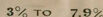
- II: 3% to 7.9%
- III: 8% to 12.9%
- IV: 13% to 15.9%
- V: 16% to 20.9%
- VI: 22% to 29.9%
- VII: 63%
Geographical features and neighborhoods in Pittsburgh are shown, including prominent rivers such as the Allegheny River, Monongahela River, and Ohio River. Each area is shaded or hatched based on its growth in new dwellings.
The map presents historical urban development trends and housing expansion in Pittsburgh during the late 19th and early 20th centuries.
Created by gpt-4o-2024-08-06 on 2025-06-13
The image is a historical map from the early 20th century, titled "The Pittsburgh Survey" under the direction of Shelby M. Harrison, dated 1908. The map illustrates the relationship between the number of new dwellings erected in Pittsburgh during the years 1899, 1900, and 1901, and the total number of buildings standing as of February 1, 1899.
The map displays the city of Pittsburgh, with the Allegheny River to the north and the Monongahela River to the south, converging to form the Ohio River. This iconic confluence is central to Pittsburgh's geography. The map is divided into several numbered zones, each marked with a pattern of lines. These numbered zones are defined in the legend on the lower left corner of the map, which correlates the zone numbers with different percentages representing the ratio of new dwellings to total buildings.
The key indicates seven different categories:
- I: Less than 3%
- II: 3% to 7.9%
- III: 8% to 12.9%
- IV: 13% to 15.9%
- V: 16% to 21.9%
- VI: 22% to 29.9%
- VII: 63%
Each category is represented by a distinct pattern filling the zones, showing varying densities of newly constructed dwellings versus the existing buildings. This map provides a visual representation of urban development in Pittsburgh at that time, highlighting areas of growth and construction. The use of patterns and the map's layout emphasize the geographic distribution of urban development during the specified period.
Anthropic Claude
Created by anthropic.claude-3-haiku-20240307-v1:0 on 2025-06-17
This image appears to be a map of the city of Pittsburgh, showing the ratio of new dwellings erected in 1899, 1900, and 1901 to the total number of buildings standing as of February 1, 1899. The map is divided into different zones, each represented by a shaded pattern that corresponds to a specific percentage range of new dwellings to total buildings. The key at the bottom of the map provides the legend for these percentage ranges. The map provides a visual representation of the urban development and growth patterns in Pittsburgh during that time period.
Created by us.anthropic.claude-3-5-sonnet-20241022-v2:0 on 2025-06-17
This is a historical map titled "The Pittsburgh Survey" from 1908 showing the ratio of new dwellings erected between 1899-1901 compared to the total number of buildings standing as of February 1, 1899. The map uses different shading patterns to indicate various percentages of new buildings, with a key showing eight different levels ranging from "under 3%" (lightest) to "60%" (darkest). The map appears to cover a portion of Pittsburgh, with the Monongahela River visible along the bottom edge. Different neighborhoods or districts are shown with varying patterns of shading, indicating different rates of new construction during this period. The map was created by William M. Harrison and provides an interesting glimpse into Pittsburgh's urban development at the turn of the 20th century.
Meta Llama
Created by us.meta.llama3-2-11b-instruct-v1:0 on 2025-06-11
The image is a map of Pittsburgh, Pennsylvania, showing the ratio of new dwellings erected in 1899-1900 and 1901 to the total number of buildings standing as of February 1, 1899. The map is divided into sections, each representing a different area of the city.
- Key:
- The key on the left side of the map explains the symbols used to represent different percentages of new dwellings.
- The key shows that:
- I: 3% to 7.9%
- II: 8% to 12.9%
- III: 13% to 15.9%
- IV: 16% to 21.9%
- V: 22% to 29.9%
- VI: 39%
- VII: 63%
- Map:
- The map is divided into sections, each representing a different area of the city.
- Each section is shaded according to the percentage of new dwellings in that area.
- The map shows that the majority of the city has a high percentage of new dwellings, with many areas having over 50% new dwellings.
- The map also shows that some areas have a lower percentage of new dwellings, with some areas having less than 10% new dwellings.
- Title:
- The title of the map is "Pittsburgh" and is located at the bottom right of the map.
- The title is written in large letters and is centered on the map.
- Date:
- The date of the map is February 1, 1899, and is located at the top right of the map.
- The date is written in small letters and is centered on the map.
Overall, the map provides a visual representation of the growth and development of Pittsburgh in the late 19th century. It shows that the city was experiencing rapid growth and expansion during this time period, with many new dwellings being built in various areas of the city.
Created by us.meta.llama3-2-90b-instruct-v1:0 on 2025-06-11
The image presents a map of Pittsburgh, Pennsylvania, with a focus on the ratio of new dwellings erected in 1899, 1900, and 1901 to the total number of buildings standing as of February 1, 1899. The map is divided into sections, each representing a different percentage range of new dwellings.
Key:
- Under 3%: Light gray
- 3% to 7.9%: Darker gray
- 8% to 12.9%: Medium gray
- 13% to 15.9%: Lighter gray
- 16% to 21.9%: Darker gray
- 22% to 29.9%: Medium gray
- 39%: Light gray
- 63%: Dark gray
Map Features:
- The map includes a key that explains the color-coding system used to represent the percentage of new dwellings in each section.
- The map also includes a title, "Pittsburgh," and a subtitle, "Map Showing Ratio of New Dwellings Erected in 1899, 1900, and 1901 to the Total Number of Buildings Standing Feb. 1, 1899."
- The map appears to be hand-drawn or printed on a beige background, with black ink used for the text and lines.
- The map is surrounded by a thin border, with a thicker border at the top and bottom.
Conclusion:
The map provides a visual representation of the growth and development of Pittsburgh during the late 19th and early 20th centuries. By examining the map, one can see the areas of the city where new dwellings were being built, and how these areas compared to the overall number of buildings in the city. The map is a valuable resource for historians, urban planners, and anyone interested in the history of Pittsburgh.
Amazon Nova
Created by amazon.nova-lite-v1:0 on 2025-06-09
The image is a historical map of Pittsburgh, Pennsylvania, created under the direction of Shelby M. Harrison in 1898. The map is titled "The Pittsburgh Survey" and shows the city's layout, including various streets, rivers, and landmarks. The map also includes a key that indicates the percentage of new dwellings erected between 1899 and 1901 relative to the total number of buildings standing in February 1899. The key is divided into eight categories, ranging from "Under 3%" to "63%." The map highlights areas with different percentages of new dwellings, providing insight into the city's growth and development during that time period.
Created by amazon.nova-pro-v1:0 on 2025-06-09
The image depicts a map of Pittsburgh, Pennsylvania, titled "The Pittsburgh Survey." It shows the ratio of new dwellings erected between 1899 and 1901 to the total number of buildings standing in February 1899. The map is divided into various sections, each represented by a different color, indicating the percentage of new dwellings in each area. The key on the left side of the map provides a legend for interpreting the colors, with percentages ranging from under 3% to 63%. The map also includes a river running through the city, likely the Allegheny River, and various landmarks and streets are labeled. The map is a historical document, likely created in the early 20th century, and provides insight into the urban development and growth of Pittsburgh during that time period.
Google Gemini
Created by gemini-2.0-flash on 2025-06-03
Here is a description of the image:
This is a vintage map of Pittsburgh from 1908, part of "The Pittsburgh Survey," which was under the direction of Shelby M. Harrison. The map illustrates the ratio of new dwellings erected in 1899, 1900, and 1901 to the total number of buildings standing as of February 1, 1899. The city is divided into various numbered districts, each shaded with a different pattern corresponding to the percentage of new dwellings. A key at the bottom left categorizes these percentages, ranging from "I. UNDER 3%" to "VIII. 63%." The map includes the Ohio, Allegheny, and Monongahela Rivers, with the city's neighborhoods and sections delineated by numbered zones.
Created by gemini-2.0-flash-lite on 2025-06-03
This is a historical map of Pittsburgh, created in 1908 as part of "The Pittsburgh Survey" under the direction of Shelby M. Harrison. The map is titled "Map Showing Ratio of New Dwellings Erected in 1899, 1900 and 1901 to the Total Number of Buildings Standing Feb. 1, 1899."
The map utilizes a color-coded key to represent the percentage of new dwellings in different areas of the city. The key outlines the percentage ranges and corresponding patterns.
The map also shows the geographical layout of Pittsburgh, including the Ohio, Allegheny, and Monongahela Rivers. It provides a visual representation of how urban development was occurring in the city during the late 19th and early 20th centuries. Numbers are scattered throughout the map, possibly corresponding to specific districts or neighborhoods.
Mistral Pixtral
Created by us.mistral.pixtral-large-2502-v1:0 on 2025-06-05
The image is a historical map of Pittsburgh, created by The Pittsburgh Survey and Shelby M. Harrison in 1908. The map illustrates the ratio of new dwellings erected between 1899 and 1901 to the total number of buildings standing as of February 1, 1899.
Key features of the map include:
Geographical Layout: The map shows the layout of Pittsburgh, including the Allegheny and Monongahela rivers, which converge to form the Ohio River.
Districts and Wards: The map is divided into various wards, each marked with a number (e.g., 1, 2, 3, etc.).
Shading and Patterns: Different shading patterns represent the percentage of new dwellings relative to the total number of buildings in each area. The key at the bottom left of the map explains these patterns:
- I: Under 3% (lightest shading)
- II: 3% to 7.9%
- III: 8% to 12.9%
- IV: 13% to 15.9%
- V: 16% to 21.9%
- VI: 22% to 29.9%
- VII: 39%
- VIII: 63% (darkest shading)
High Growth Areas: The darkest shaded areas (VII and VIII) indicate regions with the highest percentage of new dwellings, suggesting significant residential growth in those areas during the specified period.
Low Growth Areas: The lightest shaded areas (I) indicate regions with the lowest percentage of new dwellings, suggesting less residential growth in those areas.
Neighboring Regions: The map also shows parts of the surrounding regions, including Ohio to the west.
This map provides a visual representation of urban development and growth patterns in Pittsburgh at the turn of the 20th century.
Qwen
Created by Qwen/Qwen2.5-VL-7B-Instruct on 2025-07-28
The image is a historical map titled "The Pittsburgh Survey," created under the direction of Shelby Harrison in 1908. The map is a detailed representation of Pittsburgh, showing the ratio of new dwellings erected in 1899, 1900, and 1901 to the total number of buildings standing as of February 1, 1899.
The map is color-coded and hatched with different patterns to indicate the percentage of new dwellings to the total number of buildings. The key provides the percentage ranges for each hatch pattern. The percentages range from "UNDER 3%" to "63%," with each range represented by a different hatch pattern:
- UNDER 3%: Light hatching.
- 3% to 7.9%: A slightly darker hatching pattern.
- 8% to 12.9%: A progressively darker hatching pattern.
- 13% to 15.9%: A denser hatching pattern.
- 16% to 21.9%: A denser hatching pattern.
- 22% to 29.9%: A denser hatching pattern.
- 39%: A very dense hatching pattern.
- 63%: A very dense hatching pattern.
The map includes the Allegheny and Monongahela rivers, and the grid lines and boundaries of the city are clearly marked. The overall color tone of the map is a muted beige, suggesting it is an older document.
Created by Qwen/Qwen2.5-VL-72B-Instruct on 2025-07-28
This is a historical map titled "The Pittsburgh Survey," conducted under the direction of Shelby M. Harrison in 1908. The map is labeled "Pittsburgh" and is a visualization representing the ratio of new dwellings erected in 1899, 1900, and 1901 to the total number of buildings standing as of February 1, 1899.
The map uses different shades and patterns to indicate the percentage of new dwellings relative to the existing buildings. The key on the left side of the map explains the shading patterns, ranging from "under 3%" to "63%." The darker the shading, the higher the percentage of new dwellings.
The map also includes the names of rivers, such as the Ohio River and the Monongahela River, and various numbered and lettered districts or areas within Pittsburgh. The overall layout and design suggest it is a detailed analysis of urban development and housing construction trends in early 20th century Pittsburgh.
Text analysis
Amazon