Machine Generated Data
Tags
Color Analysis
Feature analysis
Amazon
Clarifai

Clarifai
| Poster | 51% | |


Categories
Imagga
created on 2019-06-07
| paintings art | 80.5% | |
| streetview architecture | 12.8% | |
| text visuals | 6% | |
Captions
Microsoft
created by unknown on 2019-06-07
| a close up of text on a white background | 75.5% | |
| a close up of text on a black background | 69.4% | |
| a close up of text on a white surface | 69.3% | |
Clarifai
No captions written
Salesforce
Created by general-english-image-caption-blip on 2025-05-21
a photograph of a map of a map of a map of a city
Created by general-english-image-caption-blip-2 on 2025-07-06
a map of pittsburgh, with the names of the streets and buildings
OpenAI GPT
Created by gpt-4o-2024-11-20 on 2025-06-10
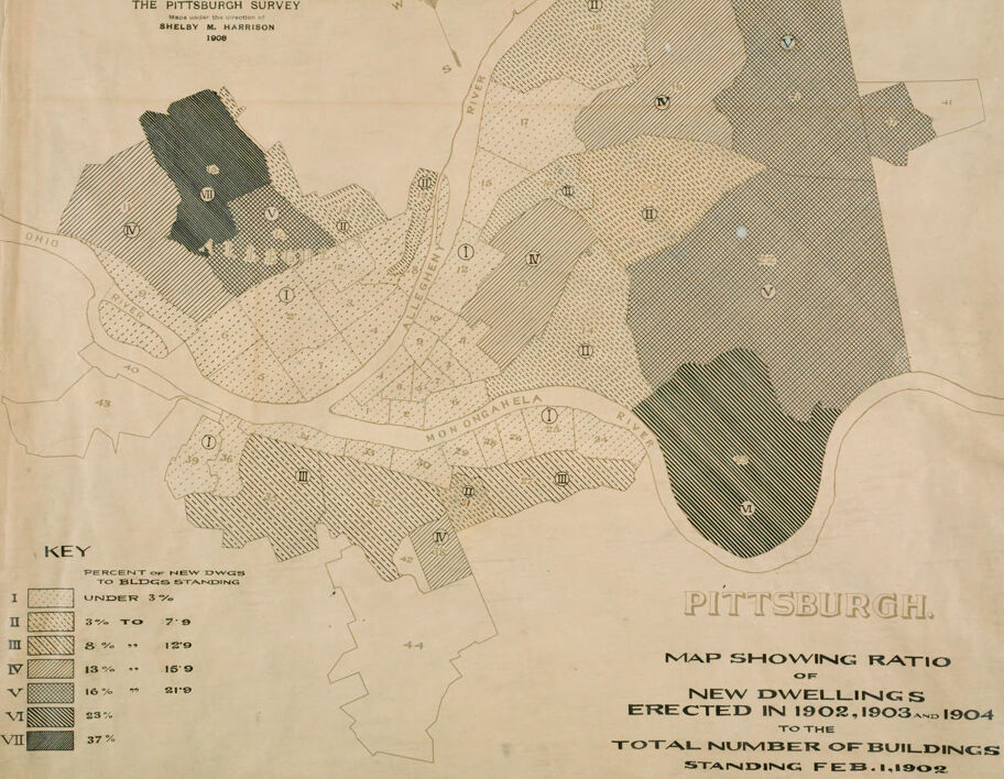
This is a historical map titled "The Pittsburgh Survey" created by Shelby M. Harrison in 1908. The map visually represents the percentage of new dwellings erected between 1902 and 1904 compared to the total number of buildings standing as of February 1, 1902, in various neighborhoods of Pittsburgh, Pennsylvania.
The map is divided into areas labeled with Roman numerals (I, II, III, IV, V, VI, VII) corresponding to the categories in the key. The key explains the percentage ranges for new dwellings:
- I: Under 3%
- II: 3% to 7%
- III: 8% to 12%
- IV: 13% to 15%
- V: 16% to 19%
- VI: 21%
- VII: 37%
Each region is shaded with distinct patterns to represent different percentage ranges. The map also shows key geographic features such as the Ohio, Allegheny, and Monongahela Rivers intersecting Pittsburgh. It provides a snapshot of urban development trends during the early 20th century in Pittsburgh.
Created by gpt-4o-2024-08-06 on 2025-06-10
The image is a historical map titled "The Pittsburgh Survey," drawn by Shelby M. Harrison in 1908. It shows Pittsburgh and its surrounding areas, focusing on the ratio of new dwellings erected in 1902, 1903, and 1904 compared to the total number of buildings standing as of February 1, 1902.
The map is divided into several numbered zones, each with different patterns or shading indicating the percentage of new dwellings relative to the total buildings. A key in the bottom left corner explains these patterns:
- I: Under 3%
- II: 3% to 7%
- III: 8% to 12%
- IV: 13% to 15%
- V: 16% to 21%
- VI: 22% to 37%
- VII: 37%
The map includes the Ohio, Allegheny, and Monongahela Rivers, which are important geographical features of Pittsburgh. The patterns suggest varying levels of housing development in different parts of the city during the early 20th century.
Anthropic Claude
Created by anthropic.claude-3-haiku-20240307-v1:0 on 2025-06-13
This image appears to be a map of Pittsburgh, showing the ratio of new dwellings erected in 1902-1904 to the total number of buildings standing as of February 1, 1902. The map is divided into different sections, with each section shaded to indicate the percentage of new dwellings in that area. The key at the bottom provides the legend for the shading, ranging from less than 3% to 37% or more new dwellings. The map itself depicts the various neighborhoods and districts within Pittsburgh, with the shading patterns providing a visual representation of the distribution of new construction across the city during that time period.
Created by us.anthropic.claude-3-5-sonnet-20241022-v2:0 on 2025-06-13
This is a historical map from "The Pittsburgh Survey" created by Shelby M. Harrison in 1908. It shows the ratio of new dwellings erected in Pittsburgh between 1902-1904 compared to the total number of buildings standing as of February 1, 1902.
The map uses different shading patterns to indicate various ratios of new construction:
- Level I: Under 3%
- Level II: 3% to 7%
- Level III: 8% to 12%
- Level IV: 13% to 16%
- Level V: 17% to 21%
- Level VI: 23%
- Level VII: 37%
The map shows different sections of Pittsburgh, including areas along the Ohio River, and uses these shading patterns to indicate where the most new construction was taking place during this period. The darker shaded areas represent the highest percentages of new construction relative to existing buildings. This type of map would have been valuable for understanding urban development and growth patterns in early 20th century Pittsburgh.
Meta Llama
Created by us.meta.llama3-2-11b-instruct-v1:0 on 2025-06-10
The image depicts a map of Pittsburgh, Pennsylvania, specifically highlighting the distribution of new dwellings constructed between 1902 and 1904. The map is divided into sections, each representing a different percentage of new dwellings to existing buildings.
- Key:
- I: 3% to 7.9%
- II: 8% to 12.9%
- III: 13% to 15.9%
- IV: 16% to 21.9%
- V: 22% to 37%
- Map Showing Ratio of New Dwellings Erected in 1902, 1903, and 1904 to the Total Number of Buildings Standing February 1, 1902
- The map shows the distribution of new dwellings in different areas of Pittsburgh.
- The areas with the highest percentage of new dwellings are located in the western and southern parts of the city.
- The areas with the lowest percentage of new dwellings are located in the eastern and northern parts of the city.
- Pittsburgh
- The map also includes a key that explains the different percentages of new dwellings to existing buildings.
- The key is located in the bottom-left corner of the map.
- Total Number of Buildings Standing February 1, 1902
- The map provides a visual representation of the growth and development of Pittsburgh during this period.
- It highlights the areas that experienced significant growth and those that remained relatively stable.
Overall, the map provides valuable information about the growth and development of Pittsburgh during the early 20th century. It highlights the areas that experienced significant growth and those that remained relatively stable, providing insights into the city's urban planning and development patterns during this period.
Created by us.meta.llama3-2-90b-instruct-v1:0 on 2025-06-10
This image is a map of Pittsburgh, Pennsylvania, titled "Map Showing Ratio of New Dwellings Erected in 1902, 1903 and 1904 to the Total Number of Buildings Standing Feb. 1, 1902." The map is divided into sections, each representing a different percentage of new dwellings erected during the specified period. The percentages range from under 3% to 37%, with corresponding shading patterns to visually represent the data.
The map also includes a key that explains the shading patterns and their corresponding percentages. The key is located in the bottom-left corner of the map and provides a clear and concise explanation of the data being presented.
Overall, this map appears to be a historical document that provides information about the growth and development of Pittsburgh during the early 20th century. It may have been used by urban planners, historians, or researchers to understand the city's evolution and make informed decisions about future development.
Amazon Nova
Created by amazon.nova-lite-v1:0 on 2025-06-07
The image is a historical map titled "Pittsburgh Survey" created under the direction of Shelby M. Harrison in 1908. The map focuses on the city of Pittsburgh and its surrounding areas, particularly highlighting the ratio of new dwellings erected between 1902 and 1904 to the total number of buildings standing as of February 1, 1902.
The map uses a key to represent different percentages of new dwellings to the total number of buildings. The key ranges from 3% to 37%, with each percentage represented by a distinct color or pattern. The map itself is divided into various sections, each marked with a number corresponding to a specific area within Pittsburgh.
The map shows the geographical layout of the city, including the Monongahela River, Allegheny River, and other notable landmarks. The map's design is simple yet effective, with clear labeling and a well-organized layout that allows for easy interpretation of the data presented.
Overall, the map serves as a valuable historical document, providing insight into the urban development and growth of Pittsburgh during the early 20th century. It highlights the significant changes that occurred in the city's housing landscape within a relatively short period of time, offering a glimpse into the city's past and its evolution over the years.
Created by amazon.nova-pro-v1:0 on 2025-06-07
The image is a map of Pittsburgh with a key on the left side. The key has a percentage of new dwellings built under 3% to 37%. The map is divided into sections, each with a number and a percentage of new dwellings built. The map also has a title that reads "Pittsburgh Map Showing Ratio of New Dwellings Erected in 1902, 1903, and 1904 to the Total Number of Buildings Standing Feb. 1, 1902."
Google Gemini
Created by gemini-2.0-flash on 2025-05-25
Here's a description of the image:
The image is an old, slightly faded map titled "Pittsburgh. Map Showing Ratio of New Dwellings Erected in 1902, 1903 and 1904 to the Total Number of Buildings Standing Feb. 1, 1902". The map is part of "The Pittsburgh Survey" conducted under the direction of Shelby M. Harrison in 1908. It depicts a section of Pittsburgh with the Allegheny, Monongahela, and Ohio Rivers clearly marked.
The map is divided into numbered zones (e.g., 1, 2, 3, etc.) within the city's boundaries. Each zone is shaded with a different pattern. A key in the lower left corner correlates these patterns to the percentage of new dwellings to buildings standing. The categories are:
- I: Under 3%
- II: 3% to 7.9%
- III: 8% to 12.9%
- IV: 13% to 15.9%
- V: 16% to 21.9%
- VI: 23%
- VII: 37%
A compass is also shown on the top-center of the map, indicating North, South, East, and West. The map appears to be printed on aged paper.
Created by gemini-2.0-flash-lite on 2025-05-25
This image is a vintage map of Pittsburgh, created as part of the Pittsburgh Survey in 1908. The map illustrates the ratio of new dwellings erected between 1902 and 1904 in relation to the total number of buildings standing on February 1, 1902.
Key features of the map:
- Geographic Representation: The map depicts the geographical layout of Pittsburgh, with visible features like the Ohio, Allegheny, and Monongahela Rivers that define the city's boundaries.
- Color-Coded Areas: The map is divided into areas, each of which is shaded with a different pattern and is linked to a key on the bottom left corner. The key indicates the percentage of new dwellings to buildings that are standing.
- Percentage Ranges: The key uses different shades/patterns to represent specific percentage ranges, indicating the growth rate of new dwellings in different areas. For example, a darker shade might represent a higher percentage of new dwellings compared to the total buildings in that area.
- Labels and Numbers: The map has labels for the rivers, "PITTSBURGH" prominently displayed, and numbered blocks.
- Directional Compass: The presence of a compass rose (N, E, S, W) at the top center, indicates the direction of the map.
- Survey Information: The top of the map contains information about "THE PITTSBURGH SURVEY," the director being Shelby M. Harrison, and the year 1908.
Overall Impression: The map is a visual representation of Pittsburgh's growth dynamics at the beginning of the 20th century, reflecting the residential developments and their distribution within the city limits. The shading patterns and key enable viewers to compare the relative growth rates across different areas.
Mistral Pixtral
Created by us.mistral.pixtral-large-2502-v1:0 on 2025-06-05
The image is a historical map titled "Pittsburgh: Map Showing Ratio of New Dwellings Erected in 1902, 1903, and 1904 to the Total Number of Buildings Standing Feb. 1, 1902." It was created by The Pittsburgh Survey and authored by Shelby M. Harrison in 1908.
The map uses different shading patterns to represent the percentage of new dwellings constructed between 1902 and 1904 relative to the total number of buildings standing on February 1, 1902. The key to the map indicates the following categories:
- I: Under 3% (lightest shading)
- II: 3% to 7%
- III: 8% to 12%
- IV: 13% to 16%
- V: 16% to 21%
- VI: 22%
- VII: 37% (darkest shading)
The map covers the area of Pittsburgh, Pennsylvania, and includes the Ohio River and the Monongahela River, which are significant geographical features. Various wards within the city are numbered (e.g., 1, 2, 3, etc.).
The different shading patterns across the map indicate the distribution of new construction during the specified period, highlighting areas of significant growth and development. The darkest shaded areas, representing the highest percentage of new dwellings, are located in the northern and western parts of the city, while lighter shaded areas, indicating lower percentages of new dwellings, are scattered throughout the rest of the map.
This map provides a historical snapshot of urban development in Pittsburgh during the early 20th century, illustrating where the city was expanding and growing.
Qwen
Created by Qwen/Qwen2.5-VL-7B-Instruct on 2025-07-28
This is a historical map titled "The Pittsburgh Survey," created under the guidance of Shelby M. Harrison in 1908. The map shows Pittsburgh, and it is specifically a visualization of the ratio of new dwellings erected in 1902, 1903, and 1904 to the total number of buildings standing as of February 1, 1902.
The map uses different shading and patterns to represent various ranges of new dwelling percentages. The key on the left side of the map explains the different shading patterns and the corresponding percentages of new dwellings to buildings standing. The percentages range from under 3% to 37%.
The map is divided into numbered regions, likely corresponding to different areas of Pittsburgh. The Ohio River is clearly marked in the western part of the map, and the Allegheny River is also visible, separating some of the regions. The Monongahela River is at the bottom right of the map. The map provides a historical perspective on the urban development and growth of Pittsburgh during the early 20th century.
Created by Qwen/Qwen2.5-VL-72B-Instruct on 2025-07-28
This image is a historical map titled "The Pittsburgh Survey," created by Shelby M. Harrison in 1908. It is labeled "Map Showing Ratio of New Dwellings Erected in 1902, 1903, and 1904 to the Total Number of Buildings Standing Feb. 1, 1902." The map depicts the city of Pittsburgh, with the Ohio, Allegheny, and Monongahela rivers clearly marked.
The map uses a key to indicate the percentage of new dwellings built in relation to the total number of buildings standing. The key is divided into seven categories, ranging from "under 3%" to "37%," each represented by different shading patterns.
The map shows various regions of Pittsburgh, with different shading patterns indicating the percentage of new dwellings in each area. The rivers and some major landmarks are labeled, providing geographical context. The overall design is simple and functional, focusing on the data representation.
Text analysis
Amazon