Machine Generated Data
Tags
Color Analysis
Feature analysis
Amazon
Clarifai
AWS Rekognition
| Rug | 62.4% | |

Categories
Imagga
created on 2019-06-05
| text visuals | 98.9% | |
Captions
Microsoft
created by unknown on 2019-06-05
| a close up of a map | 69.6% | |
| close up of a map | 64.9% | |
| a map with text | 54.2% | |
Clarifai
No captions written
Salesforce
Created by general-english-image-caption-blip on 2025-05-20
a photograph of a map of a city with a map of the city
Created by general-english-image-caption-blip-2 on 2025-07-05
a map of chicago showing the city's population
OpenAI GPT
Created by gpt-4o-2024-11-20 on 2025-06-09
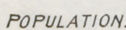
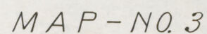
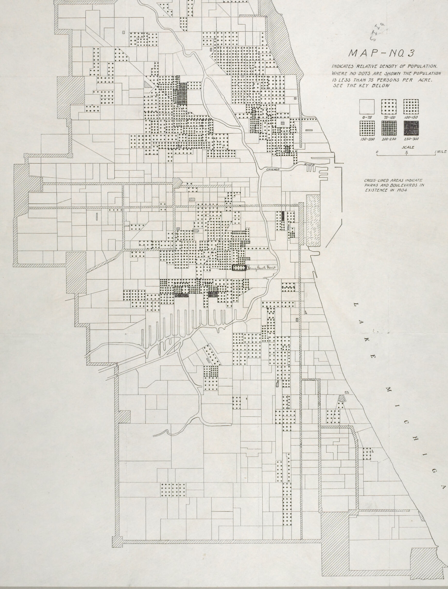
This image is a map illustrating relative population density in Chicago, Illinois, likely during the early 20th century. The map is labeled "MAP No. 3" and includes an explanation for interpreting population density using dots. Different densities are represented as follows:
- 0-50 persons per acre: Few dots scattered sparsely.
- 50-100 persons per acre: Denser clusters of dots.
- 100-150 persons per acre: Even more concentrated.
- 150-220 persons per acre or more: Highest concentration of dots.
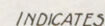
The map highlights urban areas where population density is highest and shows less densely populated regions toward the city's edges. Blank areas indicate locations where the population is less than 5 persons per acre. Cross-hatched sections represent parks and boulevards as they existed in 1904.
Lake Michigan is labeled on the eastern boundary, providing geographic context. Roads and property boundaries are faintly shown to structure the city, with major streets and rivers cutting through the map. This historical map visually conveys where populations were concentrated and the urban-rural distinction during this time period.
Created by gpt-4o-2024-08-06 on 2025-06-09
The image is a historical map titled "Map No. 3," which represents the relative density of population in Chicago's wards and regions. The map uses a pattern of squares and dots to indicate population density per acre in different areas. The map includes a legend with three categories:
- Squares with no dots, representing areas with a population density of less than 3 persons per acre.
- Squares with three different dot densities indicate higher population density: 3-150, 150-220, and 220-360 persons per acre.
The map features a grid layout with demarcated areas, likely corresponding to the neighborhoods and wards of Chicago. Lake Michigan is labeled on the map's right side, indicating that it is the eastern boundary. Cross-lined areas indicate parks and boulevards in existence as of 1904, which helps to date the map and provide historical context. The style of the map is simple and functional, focusing on the visual representation of population density without using color, which was likely common in maps from the early 20th century.
Anthropic Claude
Created by anthropic.claude-3-haiku-20240307-v1:0 on 2025-06-13
This image appears to be a map showing the relative density of population in a certain area. The map is divided into a grid, with each square representing a specific population density range. The legend indicates that the darker the square, the higher the population density in that area. The map also includes some geographic features, such as roads and bodies of water, to provide context. Overall, this map seems to be a tool for visualizing and analyzing population distribution in the region depicted.
Created by us.anthropic.claude-3-5-sonnet-20241022-v2:0 on 2025-06-13
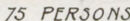
This is Map No. 3, which shows the relative population density of what appears to be Chicago, with Lake Michigan visible on the right side. The map uses different dot patterns to indicate varying levels of population density, with a key showing ranges from 0-75 persons per acre (blank spaces) up to 250-300 persons per acre (darkest pattern). The map appears to be historical, showing the city's population distribution at a particular point in time.
The density patterns show concentrated population in the central areas of the city, with less dense areas toward the edges. A river system (likely the Chicago River) can be seen running through the city. Cross-hatched areas on the map indicate parks and public places that existed at the time.
The map is drawn in black and white, with a simple linear scale shown, and uses different dot densities to create a visual representation of where people were concentrated within the city boundaries. It's a good example of early urban demographic mapping techniques.
Meta Llama
Created by us.meta.llama3-2-11b-instruct-v1:0 on 2025-05-29
The image presents a map of Lake Michigan, specifically focusing on the area around Chicago, Illinois. The map is divided into sections, each representing a different density of population. The key in the top-right corner explains that the dots indicate the relative density of the population, with no dots showing a population of less than 75 persons per acre. The map also includes a scale and a legend to help interpret the data.
Key Features:
- Map Title: MAP - NO. 3
- Key: Indicates relative density of population, with no dots showing a population of less than 75 persons per acre.
- Scale: 1 mile = 1 square
- Legend: Cross-lined areas indicate parks and boulevards in existence in 1904.
- Map Section: Divided into sections, each representing a different density of population.
- Population Density: Dots indicate relative density of population, with no dots showing a population of less than 75 persons per acre.
- Lake Michigan: Located on the right side of the map.
- Chicago, Illinois: The city is not explicitly labeled but is implied by the presence of the lake and the surrounding areas.
Visual Description:
- The map is a light gray color with black lines and text.
- The key and legend are located in the top-right corner.
- The map is divided into sections, each representing a different density of population.
- The dots are scattered throughout the map, with more densely populated areas having more dots.
- The lake and surrounding areas are visible on the right side of the map.
Conclusion:
The map provides a visual representation of the population density in the area around Lake Michigan, specifically focusing on the region around Chicago, Illinois. The use of dots to indicate population density allows for a clear comparison of the different areas. The map also includes a key and legend to help interpret the data, making it easier to understand the information presented.
Created by us.meta.llama3-2-90b-instruct-v1:0 on 2025-05-29
The image depicts a map of a region, likely a city or town, with various features and symbols. The map is titled "MAP - NO. 3" and includes a key that explains the different symbols used to represent population density.
Key:
- The key indicates that the map uses dots to represent population density, with no dots indicating areas with less than 10 persons per acre.
- The key also shows the scale of the map, which is 1 mile.
Map Features:
- The map shows the outline of the region, including roads, rivers, and other geographical features.
- The map also includes symbols for different types of land use, such as residential, commercial, and industrial areas.
- Some areas on the map are shaded or colored, which may indicate different levels of population density or other characteristics.
Overall:
- The map appears to be a historical document, possibly from the early 20th century.
- It provides valuable information about the population density and land use patterns of the region at the time it was created.
- The map could be useful for researchers, historians, or urban planners interested in understanding the development of the region over time.
Amazon Nova
Created by amazon.nova-lite-v1:0 on 2025-05-28
This map depicts the relative density of population in Chicago, Illinois, in 1904. The map is divided into sections, each representing a different population density. The sections are labeled with numbers and letters, and the population density is indicated by the number of dots in each section. The map also includes a key that explains the meaning of the different symbols used on the map. The map is a valuable resource for understanding the demographic landscape of Chicago in the early 20th century.
Created by amazon.nova-pro-v1:0 on 2025-05-28
The image is a map titled "MAP-N03" that indicates the relative density of population in a specific area. The map is presented in black and white and includes a key for interpreting the population density. The key shows different symbols representing various population densities per acre. The map also includes cross-lined areas that indicate parks and boulevards that existed in 1904. The map is divided into several sections, each representing a different area with varying population densities. The map also includes a scale to indicate the distance between different areas.
Google Gemini
Created by gemini-2.0-flash-lite on 2025-05-01
This is a vintage map titled "MAP - NO. 3" that illustrates the relative density of population in a city. The map uses a dot system to represent population density, with the absence of dots indicating an area with less than 75 persons per acre. The key indicates the density ranges for different dot representations: 75-100, 100-150, 150-200, 200-250, and 250-300. The map also indicates parks and boulevards, represented by cross-lined areas, that were in existence in 1904. The city in the map is Chicago, Illinois, as shown by the shoreline of Lake Michigan.
Created by gemini-2.0-flash on 2025-05-01
Here's a description of the image:
The image is a black and white map titled "Map No. 3". According to the text on the right side of the image, the map indicates the relative density of population. The map appears to show a city, possibly Chicago given the indication of Lake Michigan on the right-hand side.
The map is divided into blocks, possibly representing city blocks or land parcels. Each block contains a varying number of dots that visually represent the population density. Areas without dots indicate a population of less than 75 people per acre. A legend is provided to explain the dot density, with different dot patterns representing different population ranges (0-75, 75-100, 100-150, 150-200, 200-250, and 250-300). There is a scale bar provided to estimate distances.
Areas marked with cross-lines indicate parks and boulevards as of 1904.
Mistral Pixtral
Created by us.mistral.pixtral-large-2502-v1:0 on 2025-06-04
The image is a historical map labeled "Map - No. 3." It depicts the relative density of population in a specific urban area. The map uses a series of dots to indicate population density, where each dot represents a certain number of persons per acre. The key provided on the map explains the dot density:
- Areas with no dots have a population density of less than 15 persons per acre.
- Lightly dotted areas represent a density of 15-40 persons per acre.
- Moderately dotted areas represent a density of 40-150 persons per acre.
- Heavily dotted areas represent a density of 150-400 persons per acre.
- Areas with solid black represent a density of over 400 persons per acre.
Additionally, the map uses cross-lined areas to indicate parks and boulevards within the city.
The map is oriented with north at the top and includes a scale for reference, though the exact scale is not clearly readable in the image. The map appears to cover a significant portion of a city, showing various neighborhoods and their respective population densities.
Overall, the map provides a visual representation of population distribution within the city, highlighting areas of high and low density and marking significant green spaces.
Qwen
Created by Qwen/Qwen2.5-VL-7B-Instruct on 2025-07-28
This image is a map titled "Map No. 3." It appears to be a demographic map, specifically indicating the relative density of population within an urban area. The map uses a key to interpret the density, with different dot patterns representing various ranges of population per square acre (a unit of land area). The legend indicates the following ranges:
- No dots: less than 75 persons per acre
- Light dots: 75-100 persons per acre
- Medium dots: 100-150 persons per acre
- Dark dots: 150-200 persons per acre
- Very dark dots: 200-250 persons per acre
- Darkest dots: 250-300 persons per acre
The map shows the outline of a city, with the Chicago River and Lake Michigan labeled. The area is divided into smaller sections, and the density of dots within each section corresponds to the population density as described in the legend.
Additionally, the map notes that cross-lined areas indicate parks and boulevards in existence in 1904, suggesting that this map is from that year. The scale of the map is indicated at the bottom right, showing that 1 inch represents 1 mile. The map is oriented with North at the top, as indicated by the compass rose in the bottom right corner. The map's title and legend are located on the upper right side of the image.
Created by Qwen/Qwen2.5-VL-72B-Instruct on 2025-07-28
This image is a detailed map, labeled "MAP NO.3," which appears to illustrate the relative density of population in a specific area, likely a city near a lake. The map uses a dot-density method to indicate population density, with more dots representing higher population density. The legend on the right side of the map provides a key for interpreting the population density, ranging from 0-75 persons per acre to 250-300 persons per acre.
The map also includes cross-lined areas that indicate parks and boulevards in existence in 1904. There is a scale provided at the bottom right, which helps to determine distances on the map. The map appears to be oriented with north at the top, and it shows a coastline along the right side, indicating proximity to a body of water labeled "LAKE MICHIGAN."
The map is intricately detailed with various grid lines and shapes, likely representing different districts or areas within the city. The Chicago River is also marked on the map, running through the city. The overall style of the map suggests it is a historical document, possibly used for urban planning or demographic studies.
Text analysis
Amazon