Machine Generated Data
Tags
Color Analysis
Feature analysis
Amazon
Clarifai
AWS Rekognition
| Rug | 64.7% | |

Categories
Imagga
created on 2022-06-04
| text visuals | 98.4% | |
Captions
Microsoft
created by unknown on 2022-06-04
| timeline | 53.4% | |
Clarifai
No captions written
Salesforce
Created by general-english-image-caption-blip-2 on 2025-07-06
a bar graph of the number of people in the world
Created by general-english-image-caption-blip on 2025-05-04
a photograph of a chart of a chart of the world's most popular chart of the world
OpenAI GPT
Created by gpt-4o-2024-11-20 on 2025-06-09
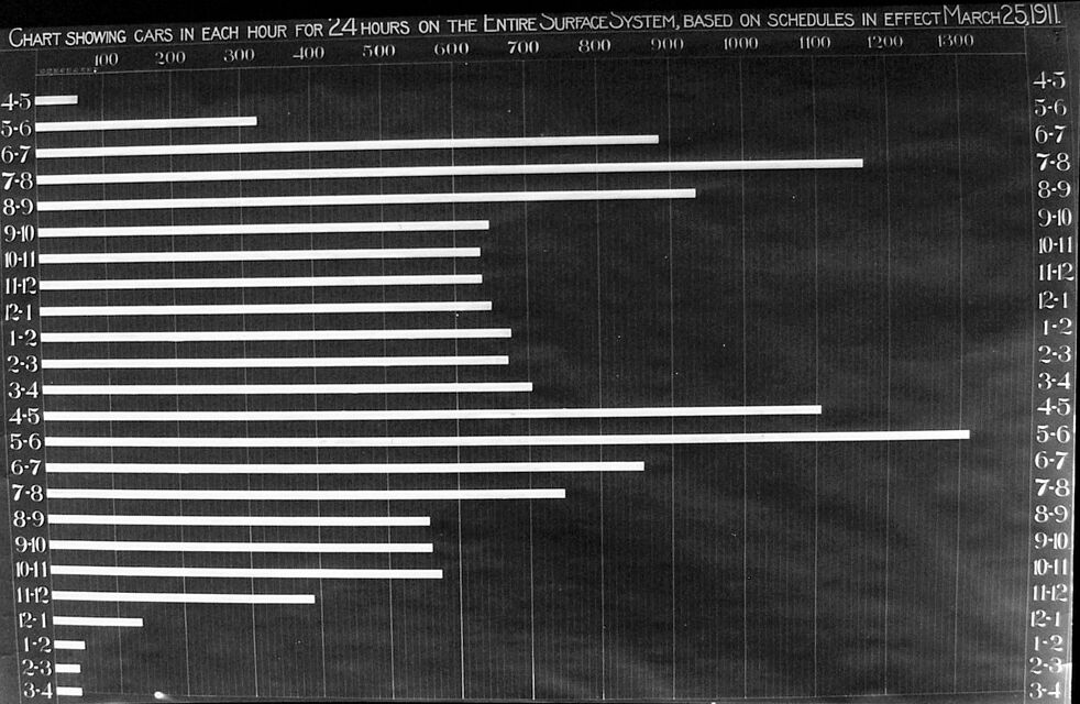
This image depicts a horizontal bar chart from March 25, 1911, showing the number of cars operating in each hour across a 24-hour period on an entire surface transportation system.
- The x-axis represents the number of cars, ranging from 0 to about 1300.
- The y-axis is categorized into time intervals, with labels such as "4-5," "5-6," etc., to denote each hour of the day. These time intervals are listed on both the left and right sides of the chart for clarity.
- Each horizontal bar corresponds to the count of cars for a given hour. The bars vary in length, indicating fluctuations in the number of cars operating across different hours.
The chart illustrates a clear pattern where fewer cars operate in the early morning hours (e.g., 4 AM to 6 AM), with a noticeable peak later in the day, likely during rush hours, before tapering off at night. The formatting and monochromatic style of the chart reflect its historical nature, making it an example of data visualization techniques from the early 20th century.
Created by gpt-4o-2024-08-06 on 2025-06-09
The image is a historical bar chart from March 25, 1911, showing the number of cars scheduled on the entire surface system over a 24-hour period. The horizontal axis represents the number of cars, ranging from 0 to 1300, while the vertical axis lists the hours of the day in two columns, covering the time span from 4 AM to 4 AM the next day, which is likely a 24-hour cycle.
Each horizontal bar corresponds to the number of cars scheduled during each hourly interval, with the bars varying in length to represent differing numbers of cars at various times of the day. The chart indicates peaks and troughs in car availability, typical of transit systems adapting to fluctuating demand through the day.
The longest bar appears between the hours of 4-5 PM and 5-6 PM, suggestive of a higher volume of cars during the peak afternoon hours, possibly due to increased commuter traffic. In contrast, the shortest bars are seen between late night and early morning hours, indicating fewer cars in circulation during times of lower demand.
Anthropic Claude
Created by anthropic.claude-3-haiku-20240307-v1:0 on 2025-06-13
The image appears to be a chart showing the number of cars in each hour for a 24-hour period on an entire surface system, based on schedules in effect as of March 25, 1911. The chart displays a grid with time intervals on the vertical axis and car counts on the horizontal axis. The bars in the chart represent the number of cars at each time interval.
Created by us.anthropic.claude-3-5-sonnet-20241022-v2:0 on 2025-06-13
This is a historical bar chart from March 25, 1911, showing the number of cars (presumably streetcars or transit vehicles) in operation during each hour over a 24-hour period on an "Entire Surface System." The chart uses horizontal bars to display the number of cars in service, with hours marked on both the left and right sides in one-hour increments (4-5, 5-6, 6-7, etc.).
The data shows peak service periods during what appears to be rush hours, with the longest bars occurring during the 5-6 PM (17:00-18:00) period and another significant peak in the morning hours. The number of cars in service is much lower during the very early morning hours (2-4 AM), as indicated by the shortest bars on the chart.
The scale across the top appears to go from 100 to 1300, measuring the number of cars in service. The chart is presented in a black and white format, typical of documents from that era, with a dark background and white or light-colored bars and text.
Meta Llama
Created by us.meta.llama3-2-90b-instruct-v1:0 on 2025-05-30
The image presents a chart illustrating the number of cars in each hour for 24 hours on the entire surface system, based on schedules in effect as of March 25, 1911. The chart is divided into two sections: the left side displays the hours from 4:00 AM to 12:00 PM, while the right side shows the hours from 1:00 PM to 11:00 PM.
Left Side (4:00 AM - 12:00 PM)
- The chart features a series of horizontal bars, each representing a specific hour.
- The length of each bar corresponds to the number of cars on the surface system during that hour.
- The hours are listed on the y-axis, ranging from 4:00 AM to 12:00 PM.
- The x-axis displays the number of cars, with values ranging from 0 to 600.
Right Side (1:00 PM - 11:00 PM)
- The chart continues with the same format as the left side, displaying the hours from 1:00 PM to 11:00 PM.
- The length of each bar represents the number of cars on the surface system during that hour.
- The hours are listed on the y-axis, ranging from 1:00 PM to 11:00 PM.
- The x-axis displays the number of cars, with values ranging from 0 to 600.
Key Observations
- The chart shows a significant increase in the number of cars on the surface system during peak hours (7:00 AM - 9:00 AM and 4:00 PM - 6:00 PM).
- The number of cars decreases during off-peak hours (10:00 PM - 4:00 AM).
- The chart provides valuable insights into the traffic patterns on the surface system during different times of the day.
Overall, the chart offers a clear visual representation of the number of cars on the surface system throughout the day, highlighting peak and off-peak hours.
Created by us.meta.llama3-2-11b-instruct-v1:0 on 2025-05-30
The image presents a black-and-white chart titled "Chart Showing Cars in Each Hour for 24 Hours on the Entire Surface System, Based on Schedules in Effect March 25, 1911." The chart is divided into two main sections: the left side lists hours from 4:00 AM to 12:00 AM, while the right side displays numbers from 4-5 to 3-4.
Key Features:
- Hours: The left side of the chart is labeled with hours, ranging from 4:00 AM to 12:00 AM.
- Numbers: The right side of the chart features numbers, starting from 4-5 and progressing to 3-4.
- Bars: Horizontal bars are used to represent the number of cars in each hour, with the length of the bar corresponding to the number of cars.
- Data: The chart provides data on the number of cars in each hour for 24 hours, based on schedules in effect on March 25, 1911.
Visual Representation:
The chart effectively visualizes the data, making it easy to compare the number of cars in each hour. The use of horizontal bars allows for a clear representation of the data, with the length of the bar indicating the number of cars.
Conclusion:
In summary, the image presents a chart that displays the number of cars in each hour for 24 hours, based on schedules in effect on March 25, 1911. The chart uses horizontal bars to represent the data, making it easy to compare the number of cars in each hour.
Amazon Nova
Created by amazon.nova-lite-v1:0 on 2025-05-28
The image is a black-and-white chart titled "CHART SHOWING CARS IN EACH HOUR FOR 24 HOURS ON THE ENTIRE SURFACE SYSTEM, BASED ON SCHEDULES IN EFFECT MARCH 25, 1911." The chart is structured with a grid that shows the number of cars in each hour over a 24-hour period, with the hours ranging from 4:5 to 3:4 the next day. Each row corresponds to a specific hour, and the columns represent different counts of cars, with numbers increasing from left to right. The chart appears to be a historical document, likely used for analyzing or planning purposes in the context of transportation or logistics.
Created by amazon.nova-pro-v1:0 on 2025-05-28
The image is a chart showing the number of cars in each hour for 24 hours on the entire surface system, based on schedules in effect from March 25, 1911. The chart is divided into two main sections: the left side shows the number of cars for each hour from 4:50 to 11:50, and the right side shows the number of cars for each hour from 12:00 to 23:00. The chart uses a combination of numbers and lines to represent the data. The numbers on the left side of the chart represent the number of cars in each hour, while the lines on the right side of the chart represent the number of cars in each hour. The chart shows that the number of cars in each hour varies throughout the day, with the highest number of cars occurring between 7:00 and 8:00 and the lowest number of cars occurring between 1:00 and 2:00.
Google Gemini
Created by gemini-2.0-flash-lite on 2025-05-01
Here's a description of the image:
Type: The image is a historical graph or chart.
Title: The chart is titled "CHART SHOWING CARS IN EACH HOUR FOR 24 HOURS ON THE ENTIRE SURFACE SYSTEM, BASED ON SCHEDULES IN EFFECT MARCH 25, 1911."
Content: The chart is a horizontal bar graph representing the number of cars in operation on a surface transportation system during a 24-hour period. The bars extend horizontally, with the length of each bar indicating the number of cars. The Y-axis on the left and right sides of the graph labels the time slots (e.g., 4-5, 5-6, 6-7, etc.). The X-axis has numerical values from 100 to 1300, likely representing the number of cars.
Style: The graph is rendered in a simple, likely hand-drawn, style with thick white bars against a dark background. The text is written in a clear, easy-to-read font.
Overall Impression: The graph provides a snapshot of the operational data on a specific transportation system, offering historical insight into car scheduling and usage.
Created by gemini-2.0-flash on 2025-05-01
Here is a description of the image:
The image shows a horizontal bar chart from March 25, 1911, displaying the number of cars in each hour for 24 hours on the entire surface system. The title reads: "Chart showing cars in each hour for 24 hours on the entire surface system, based on schedules in effect March 25, 1911".
The X-axis ranges from 100 to 1300, with increments of 100, representing the number of cars. The Y-axis is labelled with the time intervals: 4-5, 5-6, 6-7, and so on, representing each hour of the day. The white horizontal bars indicate the number of cars in service during each hourly interval. The chart has a dark background with white text and bars.
Mistral Pixtral
Created by us.mistral.pixtral-large-2502-v1:0 on 2025-06-04
The image is a bar chart titled "Chart Showing Cars in Each Hour for 24 Hours on the Entire Surface System, Based on Schedules in Effect March 25, 1911." It displays the number of cars operating in each hour of a 24-hour period.
Here's a detailed breakdown of the chart:
Time Intervals: The chart is divided into 24 one-hour intervals, starting from 4-5 AM and ending at 3-4 AM the next day.
Number of Cars: The horizontal axis represents the number of cars, with increments of 100, ranging from 0 to 1300.
Data Representation: Each bar represents the number of cars operating during a specific hour.
Observations:
- Early Morning (4-5 AM to 6-7 AM): The number of cars is relatively low, starting at around 100 cars and increasing gradually.
- Morning Peak (7-8 AM to 9-10 AM): There is a significant increase in the number of cars, peaking at around 900 cars during the 8-9 AM hour.
- Midday (10-11 AM to 3-4 PM): The number of cars remains relatively high but starts to decline slightly, staying around 700 to 800 cars.
- Afternoon (4-5 PM to 6-7 PM): There is another peak, with the number of cars reaching around 900 to 1000 cars during the 5-6 PM hour.
- Evening (7-8 PM to 11-12 PM): The number of cars decreases gradually but remains significant, around 600 to 700 cars.
- Night (12-1 AM to 3-4 AM): The number of cars drops significantly, falling to around 100 to 200 cars.
Patterns:
- There are two major peaks in the number of cars: one in the morning (around 8-9 AM) and another in the late afternoon (around 5-6 PM).
- The number of cars is lowest during the early morning hours (4-5 AM to 6-7 AM) and late-night hours (12-1 AM to 3-4 AM).
This chart provides a clear visual representation of the daily fluctuations in the number of cars operating on the surface system based on the schedules in effect on March 25, 1911.
Qwen
Created by Qwen/Qwen2.5-VL-7B-Instruct on 2025-07-11
The image is a bar chart representing the number of cars in service over a 24-hour period on the entire surface system of a transit or train system, as of March 25, 1911. The chart has a grid pattern and is divided into hourly intervals, with the x-axis representing hours (from 4:45 AM to 1:30 PM) and the y-axis representing the number of cars, measured in units that appear to be in the hundreds. The bars extend across the chart, indicating the number of cars in service for each specific hour. The longest bars are in the 5:00 to 7:00 AM and 7:00 to 8:00 AM intervals, suggesting higher levels of activity during these hours. The chart is likely used for analyzing traffic patterns and scheduling purposes.
Created by Qwen/Qwen2.5-VL-72B-Instruct on 2025-07-11
This image shows a historical chart titled "Chart Showing Cars in Each Hour for 24 Hours on the Entire Surface System, Based on Schedules in Effect March 25, 1911." It is a horizontal bar graph that represents the number of cars (presumably public transit vehicles like streetcars) in service during each hour of a 24-hour period.
The x-axis represents the number of cars, ranging from 100 to 1,300, while the y-axis represents the time of day, divided into hour-long intervals from 4:30 AM to 3:45 AM. Each bar corresponds to a specific hour, indicating the number of cars in service during that hour. The bars are longer during peak hours, likely representing higher demand for public transportation, and shorter during off-peak hours. The chart provides a visual representation of the distribution of public transit vehicles throughout the day.
Text analysis
Amazon